|
|
|
Showing 3391 - 3400 of ~8163 |
| Image |
Comment |
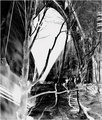
| 02/05/2010 07:35:07 PM | The Last Buildby melissamp99Comment: Greetings from the Critique Club!
I love the feel of this shot, the timelessness of it. It could have been taken 50 years ago or yesterday. The heaviness of the fabric and the helmet are great. Composition is sound, can't really fault it, and the ambient light off the sparks is wonderful. The rebar, mist/smoke, all really add up to a terrific industrial/environmental portrait.
With high contrast, people will either love or hate it. I think the high C works well here in the b/w. Settings look fine for a shot of this nature. Though shots of people do well on this site, that usually means a visible face too! Had you caught your colleague with his welding mask raised, you may have scored far higher.
Overall a vastly underappreciated shot. Just remember that when it comes to Free Studies, tack on another .5 to your score, because that's generally what your shot would have done in a challenge to which it was suited.
Feel free to PM me with any questions,
Susan |
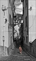
| 02/05/2010 07:19:49 PM | a l o n eby nivlekComment: Greetings from the Critique Club!
Ah, selective desat, love or hate it as the commenters made obvious. I like it so long as it works for the shot, and as I personally did a shot very like this for precisely the same reason - to highlight a little girl's aloneness - I am very taken with it. The tall buildings flanking her and the b/w give almost a Hitchcockian feel to the shot, like something awful might happen to her. But not yet.
Yes, the usual rule of thirds is *dangerously* close to being violated here. Good! Rules should be bent every so often. The light is a little hard, but helps highlight how alone she is imho. The swing of her dress, one foot lifted, swing of her hands and pigtail...she looks like she has a sense of purpose about her. As a child I was a loner too, and she seems to have that same sense of confidence about her. I don't sense trepidation or fear on her part.
Overall, I think this shot should have placed much higher with the carefreeness of the girl standing out in stark contrast to her surroundings.
Feel free to PM me with any questions,
Susan |  Photographer found comment helpful. Photographer found comment helpful. |
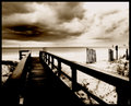
| 02/05/2010 06:50:59 PM | Stormy Vacationby organicComment: Greetings from the Critique Club!
A nicely composed shot, great dof and there is a sense of place here, like the sepia...but to my eye the pp is very heavy-handed. Almost looks like you tried to turn the shot into a charcoal sketch. Interesting to see how the commenters see this shot as either a dark and foreboding scene, or as softly lit and pretty!
For a landscape (OK, seascape) your settings look quite high. F.6, fine...but an ISO of 400 and shutter speed of 250 seem better suited to capturing a squirmy child than a largely stationary scene. A tripod would have been a huge help here, as would have going down to your lowest ISO and going to a much, much slower shutter speed. Yes, that would have resulted in blur from scudding clouds and rollings waves...but the pier would have stayed in sharp contrast to both.
Overall, a decent shot, but you might want to think more about the shot and less about how to improve it in pp.
Feel free to PM me with any questions,
Susan
|
| 02/05/2010 06:41:58 PM | Torn...by WishingdoveComment: Greetings from the Critique Club!
I think the tones in this portrait are excellent. The light on the far side of the face away from the camera is a little strong and flattens things a little. ISO seems a little high at 1600...surely 400 or even 200 would have been adequate. Good use of leading lines with her eyes.
Background is a little blah, but if there were something interesting to look at, the eye would have been drawn away from her. I like the perspective and expression.
Overall, an unconventional portrait of a girl thinking, but it works well. Good work!
Feel free to pm me with any questions,
Susan | | Photographer found comment helpful. |
| 02/04/2010 08:40:09 PM | The Last Monkey by kellmak10Comment: Greetings from the Critique Club!
First of all, you have a very good eye for a shot. I had a Barrel of Monkeys as a child, too, and remember well the frustration of getting that last monkey onto the chain. You do not need a fancy camera or know Photoshop inside out. Your camera settings tell me that you know what you're doing in terms of the basics. Just stick with what you are already doing in terms of execution.
In terms of concept, this site tends to favour the obvious. Here the act of delicacy is not obvious enough - a shot of, say, the edge of the barrel and just that curved palm part, with the last monkey's face just showing...that's how I probably would have shot these props for this challenge.
Otherwise, you are doing just enough pp to accentuate the shot without the pp being noticeable.
Overall, stick with what you are already doing. You have the basics and technicals down, just make ideas for future challenges more obvious, and you will do fine. And if you need a good laugh, go to my portfolio and check out my earliest challenge entries - you'll feel much better :-)
Feel free to PM me with any questions, and look forward to critiquing more of your shots!
Susan
| | Photographer found comment helpful. |
| 02/04/2010 01:10:36 PM | A public placeby hajekaComment: I gave this a 5 in voting mostly due to the snapshot feel. The pov is promising, I think a lot more could have been done to close-crop the graffiti and eliminate the tree, sky, car, building (or most of it). Having said that, I also like the patterns in the screen at the top of the structure. | | Photographer found comment helpful. |
| 02/04/2010 01:06:03 PM | Defaceby EstimatedEyesComment: I gave this a 6 in voting because I think the comp is interesting and dynamic enough to hold the eye, but edges very close to being too busy. I agree that a little more of a focal point, maybe the PA speaker in the upper right, could have been used to advantage as it seems to be the only graffiti-free item! Good work. | | Photographer found comment helpful. |
| 02/04/2010 01:02:41 PM | www.iandent.netby raishComment: Hmmm...very interesting angle, I have to agree that the snow doesn't really do much here. The tilted horizon is fun, though many here seem allergic to tilts and fun stuff like that. I gave you a 5. Ah well keep shooting, that's what TS is for! | | Photographer found comment helpful. |
| 02/04/2010 01:00:12 PM | big brotherby bmartuchComment: I think the centredness of the eye - and what an eye it is! - probably freaked out a few voters. Very colourful piece of eye candy, though :-) | | Photographer found comment helpful. |
| 02/04/2010 12:58:00 PM | les graffeursby skewsmeComment: This is a very cool shot, I love extreme POVs. The invert treatment adds an interesting dimension and makes you look a little harder for the guys, which is probably too much work for most voters! I gave you a 5. | | Photographer found comment helpful. |
|
Showing 3391 - 3400 of ~8163 |
Home -
Challenges -
Community -
League -
Photos -
Cameras -
Lenses -
Learn -
Help -
Terms of Use -
Privacy -
Top ^
DPChallenge, and website content and design, Copyright © 2001-2026 Challenging Technologies, LLC.
All digital photo copyrights belong to the photographers and may not be used without permission.
Current Server Time: 06/17/2026 05:58:31 PM EDT.
|