|
|
|
Showing 2521 - 2530 of ~8163 |
| Image |
Comment |
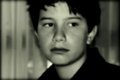
| 01/05/2012 11:47:53 AM | E L E V E Nby NeatComment: out of focus, badly lit, subject looks like he'd rather be elsewhere. |  Photographer found comment helpful. Photographer found comment helpful. |
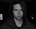
| 01/05/2012 11:46:45 AM | Focusedby mrbig65Comment: ...or just plain angry. He looks a second away from punching you out. | | Photographer found comment helpful. |
| 01/05/2012 11:45:35 AM | Waiting for Daddyby ambakerComment: Hmmm nice shot but there is just too much softening going on. She looks waxy, not natural. At her age there shouldn't be any need for pp on the skin. | | Photographer found comment helpful. |
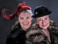
| 01/05/2012 11:43:32 AM | Les Femmesby tangueraComment: I love this shot of two wonderful, cheery old dolls enjoying themselves. Well done! 9 | | Photographer found comment helpful. |
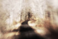
| 01/05/2012 11:36:07 AM | path and woodby posthumousComment: Greetings from the Critique Club!
First impression: I like the lensbaby effect and your subject matter. The lack if colour where colour is expected adds to the surreal dreamlike effect. No wonder so many commenters want to go down that path and see what's around the corner.
Artistic: I'm a fan of zoomblur and similar effects, so I'm a sucker for the lensbaby here. I might have burned out the hot patches flanking the path about midway as they are a little distracting. Otherwise I love the feel of hurtling through the woods, especially with the oncoming trees in focus and the foreground blurred.
Technical: Composition is a little too centred, but the shape and contrast of the path against the bleached trees help give the illusion of dynamism. And you really can't go wrong with ambient light, like the striping of the trees' shadows on the path ahead.
Overall: I sense a posty metaphor here but I can't express it well enough. Too bad this didn't score higher, I would have thought it an easy 6.
Feel free to PM me with any questions
Susan | | Photographer found comment helpful. |
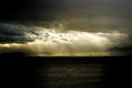
| 01/05/2012 11:27:21 AM | Corporate responsibility & employement , Petrolchemical plants & leukemiaby mcaldoComment: Greetings from the Critique Club!
First impression: I call this a 'Hand of God' shot, with the beams of light from the dark cloud coming down to light up the giver of these, as you describe them, poisoned gifts.
Artistic: A very good capture of what's going on...but it's all so tiny!! The viewer has to look to find the subject. It looks like a landscape/seascape shot with a petrochemical company thrown in to break up the horizon. The execution is good but the concept is a little bit of stretch. A title more along the lines of simply 'Chemicals and Cancer' may have worked better, and if you had been able to get someone with leukemia in the foreground (or shot them separately and dropped them in)...that could have made it that much more of a powerful image. We're seeing the cause of the cancer but not the effect.
Technical: This being an outdoor shot, you're a bit limited in terms of comp. A bit centred, could have used more thirds, also burning the highlights in the sky would help kill the glare. And the sheer distance from your subject makes it just too small, unless you cropped way in, which might not have been feasible.
Overall: You did get a pretty good score for this image, so well done. Keep shooting and good luck!
Feel free to PM me with any questions.
Susan | | Photographer found comment helpful. |
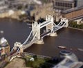
| 01/04/2012 10:16:11 AM | "Honey, I shrunk the Bridge!"by m_a_r_cComment: Sorry but this is not an original image captured by you. Just because you manipulated it does not make it yours. IMHO you are not only looking at a DQ, but possibly being kicked off the site for good too. |
| 01/03/2012 04:47:17 PM | reshapedby lobrinComment: Greetings from the Critique Club!
First impression: Very reminescent of a nude I shot some years ago, so definitely evoked some fond memories! Though, if memory serves, that entry didn't do very well either. Nudes can be either reminescent or porn, if poorly done, or of erotica, which is tasteful, and into that category is where I would put this. What I am having trouble seeing if the correlation to science, which probably accounts for your low score.
Artistic: I like the use of the hands to protect and conceal, but there seems to be some chromatic aberration (ie purple fringing) between the fingers of the right hand. Like the tilt of the torso to add dynamism to what could otherwise be a fairly static shot. The hands look almost a little large for a woman, but I am guessing that you may have shot at a slightly downward angle.
Technical: Definitely like the composition, the tilt of the torso adds interest to the shot. Great DOF, brings out all the details, and your lighting is controlled enough that there are no glarey areas. A minor nitpick: I can see you can't have cropped out the area in question without hurting your comp, but as this was an Advanced challenge you could have cloned out that teeny bit of bg visible over her shoulder.
Overall: Your title is Reshaped, but it's hard to see. A missing breast altogether, concealed by a hand, would tell an entirely different story. I can't quite see enough to notice a scar left by breast augmentation. I think this image may have done better in b/w. Using blue on nudes just doesn't seem to work unless you're going for a moonlit shot, and as mentioned by mariuca, seems to give it a bit of a corpselike feel.
Feel free to PM me with any questions.
Susan | | Photographer found comment helpful. |
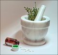
| 01/02/2012 07:48:59 PM | A history of pharmacyby H-GComment: Greetings from the Critique Club!
Artistic: I think you did a fine job of capturing both the past and present of pharmacology here, this is the kind of shot that could easily get cluttered up, but I'm glad you kept with the less is more principle. The stalks of thyme lead nicely to the cap's green lining...and I know that mortar and pestle are marble, because they have to be very solid. (I have a white marble one too :-)
Technical: Compositionally I like the angle of the pestle leading to the bottle and spilled pills. Looks like you shot with a single light source (skylight maybe?.) A reflector, bounced into the back left area, would help even out the bg. Reflectors are fairly inexpensive and even a pie plate or sheet of aluminum foil will do a decent job. I can see by your settings that you're trying to cover all bases by having a very deep DOF, but that in turn has cut down on your light, leading to underexposure, which will always show up any noise. And as I also shoot Nikon I am too familiar with noise issues. So if you don't want to raise the ISO, you have to learn to expose for the shot. You need more light, so don't be afraid to go for a longer exposure, use a second light source, or open up the aperture. Don't be afraid of overexposing a bit, as black can always be added later.
Overall: A very promising image, just play a little more with the light. You're on the right track, just work at balancing out the amount of light. Especially if you're going to do studio work, you need to light both the background and your subject. There are plenty of excellent tutorials here, and you don't need expensive equipment.
Feel free to PM me with any questions,
Susan Message edited by author 2012-01-02 19:54:41. | | Photographer found comment helpful. |
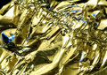
| 01/01/2012 08:56:32 PM | The Molten Hillsby GeneralEComment: Hey there Paul,
Oh Lordy,I would get an SC member's image to critique! 8-O So here goes:
Artistic: Looks like a cool idea just waiting for a little something more, maybe some painting with light, just to make it pop and come alive, to draw more attention to the shapes. I think voters may have had difficulty seeing the more apparent metal-on-metal shots, which dominate the challenge. That would also help explain the lack of comments :-/
Technical: I like the 3/4 overhead perspective, reminds me of a shot of a Rockies taken from a plane. Composition is decent, with the blue in the bottom left draws the eye first, then the 'range' in the right bg. And shooting something as highly reflective as metal can add both glare and missed focus, as metal can be soft or hard. A little burning on one side of the hills may have heped a bit. Also, wondering what this would look like in b/w?
Overall: I like the way you take risks, but still stick with what rings true with you. Not a bad attempt, but maybe try some of the suggestions and see how things shake out.
Feel free to PM me with any questions,
Susan | | Photographer found comment helpful. |
|
Showing 2521 - 2530 of ~8163 |
Home -
Challenges -
Community -
League -
Photos -
Cameras -
Lenses -
Learn -
Help -
Terms of Use -
Privacy -
Top ^
DPChallenge, and website content and design, Copyright © 2001-2026 Challenging Technologies, LLC.
All digital photo copyrights belong to the photographers and may not be used without permission.
Current Server Time: 05/23/2026 09:50:21 PM EDT.
|