| Image |
Comment |
| 01/19/2012 01:18:34 PM |
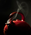
Teapot Study #37 by Dr.ConfuserComment: Greetings from the Critique Club!
First impression: Aw dang I have to critique an image that won a blue?! Find the crop a little off, not being quite a rectangle or a square, but that's fairly minor. I liked the quietness of the teapot and the smoke wisping up and curling around.
Artistic: Very simple shot and proof that the KISS principle is what works best. Looks shot at stove/table shot so not an extreme POV, but wonder what it might have looked like shot just a hair lower down and pointing up.
Technical: Already mentioned the crop seems a little wonky, but the DOF is indeed shallow and the way the smoke wafts back over the handle from the focal point of the spout makes a trail for the eye to follow. Nice studio lighting. Might have wanted to burn out a few of the spots of glare, but it doesn't seem to have hurt your score :-)
Overall: Personally I would have tried a few stops down just to see what the effect would have been, how much more of the pot would have come into focus. Also wondering what it would look like with a tighter and yes, square crop - there seems to be awful lot of negative space in the bottom right corner.
Pity your wife didn't appreciate your sacrificing a teapot for a shot, but just think, now you can use it just for making Lapsang Souchong!
Feel free to PM me,
Susan |
 Photographer found comment helpful. Photographer found comment helpful. |
| 01/19/2012 12:55:45 PM |
Coffeeby dali_lama_2kComment: Greetings from the Critique Club!
First impression: As noted in my original comment, the darkness of this image makes oit difficult to see details.
Artisitic: I do like the inside of the coffee cups being red and you trying to catch and emphasize the curved redness, but it needs a bit more.
Technical: You shot wide open, which is rarely a lens' best aperture; arguably it gave you too shallow a dof as the handle of the closest mug is oof and looks disconnected from the rest of the mug. Yet the leading edge of the one on the left is also in focus so the effect is a little puzzling. I think for a shot like this your ISO is far too low; 200 would probably have been fine. Your shutter speed is fine, though a tripod comes in handy when shooting slow. At this stage you don't need anything fancy, just enough to keep your camera stable. Glad you diffused the flash to help take down highlights.
Overall: Not a bad shot and I imagine this setup would be easy enough to replicate. Grab an inexpensive tripod, possibly a shutter release too, and learn to love the manual focus button. Then shoot and experiment, it's the only surefire way to learn.
Feel free to PM me,
Susan |
| Photographer found comment helpful. |
| 01/18/2012 05:49:07 PM |
Man in the Mirrorby gyabanComment: Hah, even shredded I still recognize you Christophe the Conqueror! Or should that be Conjuror? |
| Photographer found comment helpful. |
| 01/18/2012 05:38:18 PM |
Red Velvetby Ja-9Comment: Greetings from the Critique Club!
First impression: Surprised this image didn't place higher as it's very dpc friendly.
Artistic: Love the Fibonacci spiral and the tiny drops of water, and the contrast really makes the colours pop. Good comp and lush textures. I think your commenter on the roses being overdone may have a point. Still it's a lovely image.
Technical: Almost wonder if you used too short a DOF? Most lenses aren't at their best wide open, often their sweet spot is a few stops down *whew try saying that 5 times fast! :-)*
Overall: Very pleasing shot, sad that it didn't do better. Maybe try reshooting at different fstops and slow your shutter speed accordingly. Never hurts to mess around and see what else might work.
Feel free to PM me
Susan |
| Photographer found comment helpful. |
| 01/18/2012 05:30:56 PM |
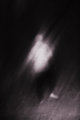
do a little danceby posthumousComment: Greetings from the CC!
Artistic: Interesting capture though I never would have guessed it to be a cyclist, due to the darkness and amount of blur. His back being to the camera makes it difficult to really say anything. Not being able to see his face means we don't know if he's tired, jubilant, bored, sad, misrable etc.
Technical: The b/w seems to bring out a lot of noise - going up to 1600 ISO may have helped. Comp centred and a little dull.
Feel free to PM me
Susan |
| Photographer found comment helpful. |
| 01/18/2012 09:00:49 AM |
Emergenceby gyabanComment: Gorgeous work of art, Christophe! And huge congrats to your lovely wife too, you have her to thank for her knowledge of equine anatomy to put together such an amazing piece. Huge congrats! |
| Photographer found comment helpful. |
| 01/17/2012 06:09:46 PM |
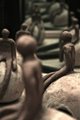
Mirror Mimicby talzamComment: Greetings from the Critique Club!
First impression: This wonky little crowd of clay people and the way you turned them into multiple images really stuck with me during voting; I gave you a 6.
Artistic: There is a very constrained feel to this shot which forces the viewer to look past the figures, esp the foremost oof one - takes guts to present an image like that here! - and the middleground figure seems to be turned to the mirrors. But what's he looking at? Same with the one on the left slumped forward a bit, as they have no discernible faces. All very intriguing and makes people look longer.
Technical: I do think the composition is compelling, but wonder if shooting with less of the first figurine would have helped your score a bit. He takes up some room and looks headed out of shot anyway :-) Your lighting looks fine for the shot and the lack of poppy colours makes this one stand out. The mirror trick is achingly simple and so effective, good work!
Overall: Excellent job, I think this shot was severely underrated as it isn't blatantly obvious what is going on. Keep up the good work, continue to shoot what you like and enter what you like.
Feel free to PM me
Susan |
| Photographer found comment helpful. |
| 01/16/2012 10:36:06 PM |
Kill the casualties, before you quit! by littlemavComment: OMG Katie, is that you doing the ol' broad thing again?! Too frickin funny woman! 10
ETA Man you sure like your Crown Royal! Dare you to send this to them as an ad idea ;-) |
| Photographer found comment helpful. |
| 01/16/2012 12:25:47 PM |
DistantColoursby LMahoneyComment: Greetings from the Critique Club
First impression: Unappealing snapshot with an odd white balance.
Artistic: If you're seeing a murky yellow sky on your LCD but see an orange sky through your viewfinder, something needs correcting. I like the gull balancing out the comp, but the main impression is flat and drab. Lacks the pop factor so loved here.
Technical: Good use of thirds and meets the challenge, but your ISO looks awfully low for what seems to have been very poor light. Also the viewer has to search a little to realize it's a lighthouse in the distance. Everything is just too small and too distant.
Overall: Not a bad attempt, but I think you need to do some homework on lighting and white balance. Keep shooting and entering!
Feel free to PM me.
Susan
|
| Photographer found comment helpful. |
| 01/16/2012 11:58:35 AM |
|
| Photographer found comment helpful. |
Home -
Challenges -
Community -
League -
Photos -
Cameras -
Lenses -
Learn -
Help -
Terms of Use -
Privacy -
Top ^
DPChallenge, and website content and design, Copyright © 2001-2026 Challenging Technologies, LLC.
All digital photo copyrights belong to the photographers and may not be used without permission.
Current Server Time: 05/23/2026 07:36:49 PM EDT.