|
|
|
Showing 1191 - 1200 of ~8163 |
| Image |
Comment |
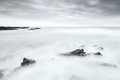
| 11/02/2015 05:40:54 PM | White seaby GudjonottoComment: Greetings from the Critique Club!
I like the idea you're pursuing here. It looks like you have a great setting to work with. I have to really look to see if it's been converted to b/w. The main problem, though, are the strong expanses of white and lack of contrast. I can see by your settings that 30 seconds is a pretty long exposure, esp at only f11. One of two things had to change to bring more out of this image: either shorten your exposure time, probably by 15 seconds, or increase your dof and take it down as far as your lens can manage - f25, f32.
Or a combo of both, say like something f15 at 15 seconds for a starting point then adjusting from there. You may want to look at work by fellow DPCers  marnet marnet and  Cuttooth Cuttooth, both of whom tend to use long exposure for seascapes to great effect. Check out the settings they use. And if they don't list them in their photographer's notes, you can always pm them and ask.
I hope this critique has been helpful, feel free to PM me with any questions.
Susan |
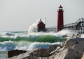
| 11/02/2015 05:31:23 PM | Grand Haven Stormby DrakeComment: Greetings from the Critique Club!
Nice dynamic shot of waves crashing up against the lighthouses, love the railing/walkway? along the top of the breakwater, spray everywhere, great green tones there in the waves like jade and peridot. The green contrasts perfectly with the red of the buildings and both colours echo the relative monochrome of the sky. I'm also a fan of the low pov which looks well-used here. I might have wanted to give it a little hit of contrast and saturation to bring out those hues some more, but that's my opinion.
But I do find the oof rocks in the foreground do suck some of the great energy out of this otherwise nicely focused, sharp image. Obviously you don't want to risk getting caught by those waves, but had there been a way to skirt around them for a less-obstructed view - or just managed to raise your pov a bit to avoid the bulk of them - I think this pic would have easily made the top ten. If they were completely unavoidable you could have tried focus stacking and taken a shot of only the rocks, in focus. But if you shot handheld, as your settings seem to indicate, that would be tough to accomplish.
Hey, it only just finished out of the TT and has two faves, so nothing to sneeze at there!
Hope this has been useful to you, feel free to PM me with any questions.
Susan |  Photographer found comment helpful. Photographer found comment helpful. |
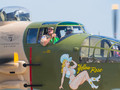
| 10/30/2015 08:04:02 PM | The Yellow Rose of Texasby PhocalComment: Greetings from the Critique Club!
I have to admit to some feelings of conflict over this image. On the one hand, from an artistic stand, I understand the tradition of painting pinups on the noses of bombers and fighters, and the plain and simple fact that most aviators are male. But this shot seems to be more about the full-bodied Yellow Rose than the men in the cockpit. A closer crop of them that either omitted or minimized the Yellow Rose may have resulted in a lower score, but one truer to the idea of the challenge. I just feel that the Rose is stealing the spotlight in all her flawless glory from the much more weathered men flying her!
The hard lighting on the men seems to show a high-noon shadow or close to that, but I honestly think it works to advantage here on the man in the cockpit window closest to us. Some more contrast could have helped separate the glass of the plane from the background, which looks like a hazy summer day. Comp feels a little on the snapshot side; I think a little more planning could have resulted in a much better shot.
Hope this critique has been helpful, feel free to PM me
Susan
| | Photographer found comment helpful. |
| 10/25/2015 07:01:39 PM | | | Photographer found comment helpful. |
| 10/24/2015 09:33:35 PM | Evening Rideby MelethiaComment: Gorgeous pic, hope your student friend got something half as good :-) | | Photographer found comment helpful. |
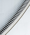
| 10/23/2015 05:38:07 PM | Stairs illusion by clickodakComment: Originally posted by sidpixel:
Hello from the Critique Club
An appealing image that meets the challenge well.
A great example of simplicity working at its best, I love that you have had the creative vision to see the potential to invert the image and present it in this intriguing and appealing way, its adds much more interest to the image. The subtle lighting and tones are perfect for the subject with those gorgeous reflections of the treads, the golden tint of the rail supports, the lighter lower half against the darker upper half of the tank, its all working so well together.
There are no problems at all with your composition here Marcel, the diagonal is the binding and dynamic force that holds it all together, the portrait orientation is the right choice with the treads support going perfectly from corner to corner. The image shows that you have taken the time and care to get it right and its paid off hugely.
Your ribbon and new PB are both very well deserved and the satisfying thing is this all your own work, all entirely down to yourself alone without any pre-entry collaboration, very well done Marcel. Next goals, 7+ and a blue? Congratulations, Sid. |
+1 on all counts. Painfully simple, doesn't need to be anything more or pp'd up the wazoo. Huge congrats on the yellow! | | Photographer found comment helpful. |
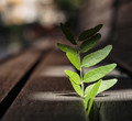
| 10/19/2015 06:38:43 PM | Power of the Sunby clickodakComment: Greetings from the Critique Club!
I can see where you're going with this, Marcel, and this kind of image is quite a popular metaphor for strength - the tiny little plant forcing its way up through a huge rock and perhaps even splitting it asunder (although very slowly) as it grows. Clearly the sun is playing a major part here but in this case, in terms of light, sadly it isn't helping very much. The top part of the plant is in shadow, the exposure on the leaves immediately below the shadows is quite good, but the rest of the plant is a little flat, there is no sense of depth and dimension which gives life to a photo. I'm guessing the sun was a little high in the sky?
Comp is quite basic and works for the simplicity of the shot. I was surprised to see that this was shot at f.5, I would have thought it was a stop or two down like f2.8. I think the bokeh works. If only the sun had cooperated a little more, in a couple more hours' time or so (esp at this time of year) when the light was lower and perhaps shot so the plant was backlit and glowing...that's what voters wet their panties over ;-)
Hope this has been helpful, feel free to pm me with any questions.
Susan | | Photographer found comment helpful. |
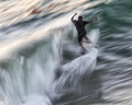
| 10/19/2015 06:28:56 PM | The Turnby PhocalComment: Greetings from the Critique Club!
I should have guessed this was one of yours, Ronnie...as others have already noticed, the biceps on her are something else! Frankly I love this shot, I'm surprised it didn't ribbon. The relative softness of the backdrop of rooster tail, coupled with the lines of her body, the flying ponytail, the concentration on her face. Even the knee brace tells its own story, obviously this girl is one not to be easily stopped despite having done something to her knee, probably while she was doing exactly what she is doing right now.
The only thing I don't like is that blue-and-black thing on the line to the left. Even though the towrope obviously continues out of frame, for me that one little thing kind of halts the otherwise nice clean lines here prematurely.
Otherwise a very well-deserved top ten finish and hey, you even beat out a nekkid cyclist with this! ;-)
Susan | | Photographer found comment helpful. |
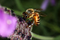
| 10/18/2015 09:22:28 AM | Honey Beeby dewdodesignComment: Greetings from the Critique Club!
Nice enough macro of a bee, I've tried shooting the little beasts and it's not easy cause they wiggle around so much! Insects are very bad at taking direction :-)
However, it really doesn't meet the challenge description of being a profile or side view. Voters here tend to be very literal and if you look at the challenge winners and HMs, well, you can see that they are all profiles, not an overhead 3/4 shots. It would have been far better to track after the bee as much as possible and shoot til you got a true side view. And if, despite all your best efforts, you just can't get a good shot - either choose a different subject or simply opt to not enter.
Apart from that, the giant oof blotch of purple to the left with the circular highlight detracts greatly from your subject. It would have been hard to crop out and cloning it out would have a lot of work, which is all the more reason to change angles and not let such extraneous details detract from your subject.
Hope this critique has been of help, feel free to pm me with any questions.
Susan |
| 10/14/2015 08:43:13 PM | Do what you areby clickodakComment: Greetings from the Critique Club!
I can see what you're trying to do here, Marcel, but only after reading your explanation in Photographer's comments. It's just a bit too obscure - some maple leaves on a book with a lens nearby. Comp is a little careless, nothing really blends and flows together. This looks like a shoehorn entry, a shot just to have something to enter. Hey, I've shot my share of shoehorns so I know what I'm talking about!!:-)
I'm sure the book is a great read and I will look for it at my local library, but if you want to help promote the book or the idea that it helps to find your career through your personality type...that's a very tough one to shoot without a lot of thought and planning beforehand. It's a fairly abstract idea and most challenges here are relatively concrete concepts.
Feel free to PM me with any questions
Susan | | Photographer found comment helpful. |
|
Showing 1191 - 1200 of ~8163 |
Home -
Challenges -
Community -
League -
Photos -
Cameras -
Lenses -
Learn -
Help -
Terms of Use -
Privacy -
Top ^
DPChallenge, and website content and design, Copyright © 2001-2026 Challenging Technologies, LLC.
All digital photo copyrights belong to the photographers and may not be used without permission.
Current Server Time: 07/26/2026 06:26:42 AM EDT.
|