|
|
|
Showing 1171 - 1180 of ~8163 |
| Image |
Comment |
| 11/09/2015 07:37:29 AM | Thor's Wellby mykolearyComment: Greetings from the Critique Club!
Wow that IS cool! Very dramatic scene. Lots of good tones there in the water and sky, barely any blown-out highlights on the crests of the waves. Hard to say how you could have shot this any better, considering the lens you were using, which would limit you somewhat. If being higher up from the Well were an option, to allow a better view of the water pouring in, it could be worth trying to capture this again; such a location deserves a POV worthy of it :-)
Hope this has been helpful, feel free to PM me with any questions
Susan |
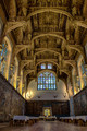
| 11/08/2015 09:01:57 AM | Hampton Palace Great Hall-by elsmainComment: Greetings from the Critique Club!
Lovely shot, excellent exposure and tremendous amount of detail; love that I can see detail in the tapestries and various stag antlers. Wonderful job of focus stacking. The comp obviously shows off that great barrel-vaulted ceiling to advantage, and the light glowing through the stained glass is awesome. I only wish that same window had been saturated a bit more to show off the glorious colours only hinted at here. The relative mononchrome of ceiling and muted toned of walls and floor leave me begging for some poppy eye candy to linger on.
Overall a great shot, why it finished so low is something of a head-scratcher. Possibly cause the white tablecloths seem to hint at something about to happen and it's like a set, ready to go, but the actors haven't yet arrived. I think that little injection of life into the shot would help drive home the sheer scale of the place with a human form to gauge against it.
Hope this has been helpful
Susan |  Photographer found comment helpful. Photographer found comment helpful. |
| 11/08/2015 08:53:33 AM | Alphaby PhocalComment: Greetings from the Critique Club!
Holy liftin, you don't hold back when you shoot wildlife...I think I speak for many of us when I warn you to PLEASE be careful when shooting beasties from the dinosaur age! There's a reason why they're still around millions of years later.
Ok lecture done. Now, sadly without seeing more of the bg as proof, there is just no way to look at this pic and see that the alligator is actually in the wild and not a zoo critter. After all zoo enclosures are always kept pretty clean and just never look real enough to pass as the wild. True we can see some mud and shoots, but imnsho you have to show more to drive the point home.
Very cool pic, like the bokeh well-used to isolate the eyes. The b/w is an interesting choice, I wouldn't mind seeing the colour version for comparison. The fact that you seem to be at eyelevel with this guy is scary, and may add to the impression that this is a zoo shot, cause surely nobody would try to get this shot in the wild...right? I wish there had been some way to catch him bellowing and menacing you, sure sounds like he really meant to chase you off, if not make you dinner.
Hope this has been helpful
Susan | | Photographer found comment helpful. |
| 11/08/2015 08:42:47 AM | m a j e s t i cby Ja-9Comment: Greetings from the Critique Club!
Wow, that's ISO 800? Looks great, and that Tamron seems to be doing a sweet job too :-) Nice postcard-type shot, very scenic, good framing with the branches flanking you. For some reason I really like the boulder in the lower right; it gives the shot some weight to help compete with the white of the clouds/mountaincaps and complements the reflection of that big stormcloud next to it. The blown whites are my only real nitpick.
Compositionally it's quite centred, so I find that it could use just that little extra something to fill in the middle...a swimming moose or beaver, not something necessarily big, but just there, just enough to leave a few ripples on the water's surface, something to draw the eye and leave the onlooker wondering what they just missed seeing.
Hope this has been helpful
Susan | | Photographer found comment helpful. |
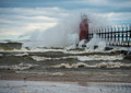
| 11/08/2015 08:34:39 AM | Windy Day at Grand Havenby DrakeComment: Greetings from the Critique Club!
Hmm thought I recognized that lighthouse ;-) Nice sharp punchy colours, though it's rather daring to have two red objects of the same hue in the pic as they're competing with each other for attention - my eyes are racing along the catwalk between the two going 'OOh! Aaah!' at each end, then back again. The crests of the waves are a little blown out, part of the problem with shooting tidal waters on a sunny day. Decent postcard-y shot.
More dof or a faster shutter speed might have helped a bit. Some would say to use an ND filter but then, you're shooting through another layer of glass, and it would be a shame to compromise the sharpness of that lens. Composition is straightforward but risks being cluttery with essentially two focal points at the right and left thirds. I'm npt super-crazy about the sandy shore as it's oof; focus stacking may be worth trying.
Hope this has been helpful
Susan | | Photographer found comment helpful. |
| 11/06/2015 07:31:52 PM | South Haven Light (circa 1872)by DrakeComment: Greetings from the Critique Club!
Very nice shot, great crashing waves over the lighthouse and the breakwater/railing/lights line leads the eye straight there. Love the glowing red light in lighthouse, automatically leads the eye to a focus point.
But I think it would have done much better in Seascapes and Landscapes, as this is what it looks more like than a tribute to a recognized historic landmark. Here, the lighthouse is diminished by all the natural forces happening around it. It's playing a supporting role, not the lead. If you look at the front page and what won and placed in the top 5, you can see that the subject just fills the frame. DPC voters tend to be a very literal crowd; they want to see a historic landmark in all its glory, you better give it to them!
I know you were working with ambient conditions, also my favourite to work with. I think cropping out the sand on the lower part of the frame would have helped, you could have left just enough for the seagull to play in :-)
Feel free to PM me
Susan | | Photographer found comment helpful. |
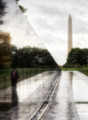
| 11/06/2015 07:19:38 PM | r e f l e c t i o n s by Ja-9Comment: Greetings from the Critique Club!
OMG I'm old....I can remember when the Wall went up, I believe I can even remember who came up with the design! Reminesceses aside, I think this is a great image and should have placed much higher. Great use of thirds, great lighting, dynamic angles, the shimmering effect of water on the Wall and walkways, the lady's reflection...all nicely done and not over-processed, which is too easy to do.
Maybe too many voters (DPC is an American site, after all) felt the Wall was competing too much with the Monument, which is relegated to the bg, and didn't like that aspect, perhaps they felt the Monument was more important. All I can say is, too bad for them! I think you caught a beautiful moment here, and shame on those who didn't.
Feel free to PM me
Susan | | Photographer found comment helpful. |
| 11/06/2015 07:12:35 PM | Prehistoric Templeby PangurbanComment: Greetings from the Critique Club!
I've always loved the mystique of this site and thus recognized Stonehenge straight away, I've seen it in person for myself and the first watercolour I ever bought from my Mum was of Stonehenge. So not at all surprised to see this finished in the TT.
The light is absolutely gorgeous, full of great tones, it looks more like an African scene til you scroll down and see the distinct forms of the Henge, against a backdrop of woods which you rarely see in most images of Stonehenge.
I think the only thing that cost you points with the voters was too much sky. If you crop out the top quarter - the band of dark clouds - at the top of the image, the eye instinctively seeks a heavier/darker area to ground the image, and finds it there, in the Henge itself. As it stands I think the two compete with each other too much.
Hope this has been helpful, feel free to PM me,
Susan | | Photographer found comment helpful. |
| 11/06/2015 07:05:05 PM | Via Bellingeriby bizzottoComment: Greetings from the Critique Club!
I try to make my cfritiques helpful, and in order to do so in this case I will have to be a little harsh.
This is basically just a snapshot, meaning a photo quickly shot withouut together without thought as to lighting, framing, composition etc. Exposure is adequate. There also seems to be a lack of any post-processing going on.
The big problem is, that the subjects' backs are to us, so we cannot see their faces and get an idea as to who they are as people. Especially as you say they are gypsies...well then, what in their faces would betray them as such to us? Is that Louis Vuitton bag real, or a fake? Many DPC members are North American and any Romany are in the larger metropolitan centres; as someone living in a small town I simply cannot relate to this image and looking at the votes, I don't think many others did either.
Feel free to PM me with any questions
Susan |
| 11/04/2015 08:24:25 AM | | | Photographer found comment helpful. |
|
Showing 1171 - 1180 of ~8163 |
Home -
Challenges -
Community -
League -
Photos -
Cameras -
Lenses -
Learn -
Help -
Terms of Use -
Privacy -
Top ^
DPChallenge, and website content and design, Copyright © 2001-2026 Challenging Technologies, LLC.
All digital photo copyrights belong to the photographers and may not be used without permission.
Current Server Time: 07/26/2026 04:55:43 AM EDT.
|