|
|
|
Showing 1111 - 1120 of ~8163 |
| Image |
Comment |
| 12/09/2015 06:14:58 PM | How to wear a stylish hatby primabarbaraComment: Greetings from the Critique Club!
Very nice portrait, your subject has an interesting face and the muted tones of the bg and his clothes don't detract from him. Looks like he should be in an Old Dutch Masters painting. Nice soft ambient lighting. I'm a sucker for rustic stuff like this. The composition is appealing, you've given him plenty of room all around but most importantly, in front of him so he has some space to stare into :-) The bokeh is lmost invisible, with the slightly oof foreground shoulder betraying itself once you see the other shoulder.
The only thing I don't like is the hat eating his face. It's black, clearly a matte material like wool, and maybe there wasn't much to work, with but it would have been nice to see some hints of the shape of his head below. Still, just a minor nitpick, but I have to find something to whine about! :-O
Feel free to PM me with any questions
Susan |  Photographer found comment helpful. Photographer found comment helpful. |
| 12/09/2015 06:05:54 PM | Turbanby doctabrezComment: Greetings from the Critique Club!
For a portrait shot in ambient light (possibly with a little help from a popup flash?), with so much white dominating the pic, you did a great job of avoiding really badly blown-out areas. This is a somewhat safe portrait in that it doesn't take any risks; he is facing the camera straight on and the portrait crop places his face in the middle third. The difference between the two shoulders - one is fully in the frame, the other barely visible - is a little discombubulating, just throws off the eye enough to make the viewer wonder what isn't quite right. In fact the right side of his face is indeed slightly higher than the other. Getting his eyes level, and thus the whole orientation of his body, would have helped. However he is nice and tack-sharp, so no complaints there :-)
In terms of the challenge I can see this confusing many people here. Most DPCers live in the Western Hemisphere and simply aren't familiar with subtle things like the turban and its signifcance. Is it the colour? The way it's wrapped? What is it about it that makes it old-fashioned? There needs to be a little more to the story here, it's like catching just the last scene in a movie, and trying to figure out what it was about. You need to be a little more obvious, as that's the kind of thing that goes over here.
Keep up the good work, please continue entering (and commenting) and do feel free to PM me with any questions.
Susan | | Photographer found comment helpful. |
| 12/09/2015 08:16:24 AM | |
| 12/09/2015 08:12:50 AM | | | Photographer found comment helpful. |
| 12/09/2015 08:10:57 AM | | | Photographer found comment helpful. |
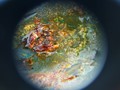
| 12/08/2015 09:50:16 PM | Druidia by LeahsLenzComment: Greetings from the Critique Club!
Like most of your commenters, I found myself wondering wtf this could be. Your descrip says the planet was created using a washer and chicken grease...interesting choice of matter to choose to build a planet with! Mostly I think that the very abstract nature of this shot, and the big blob of grease, were just a little too off-putting to the voters and most people in general. The colours are not appealing, there is no attempt at composition or any kind of lighting. This looks like a snapshot and the score reflects that. Yes, there are indeed some insidious individuals here who pursue their own vision, is  posthumous posthumous and  tnun tnun...but they know the basics upon which to build their visions. And both have won ribbons here.
To be perfectly honest, you have a lot to learn about the very basics before you can expect your scores to improve. I'm guessing this was shot on Auto (aka green camera) mode, meaning that the camera made all the choices for ISO, shutter speed and aperture. If you plan to become any kind of photographer, you MUST learn your settings. No two ways about it. There are masses of excellent books out there and tutorials of all kinds on the Internet, so if you really want to be serious, start studying. Turn your camera's knob to the very skeery M (for manual - meaning YOU make all the choices for ISO, aperture and shutter speed), buy a cheap tripod, and get cracking.
More importantly, if you really want to do well here, start with the images on the last page and look at the images that beat you in this challenge, and see if you can start to see why they do progressively better and better until you're on the front page. By then you should be able to see what images won, and why.
Sorry that this has had to be a bit hardcore, but that's how it is here. This is a very tough site to do well on. Many DPCers are serious hobbyists at the very least and more than a few are working pros.
Feel free to PM me
Susan |
| 12/08/2015 08:11:27 PM | Beautiful Brideby bennettjamieComment: Nice enough pic but her dress is very bleached out, the window is a huge distraction and I think her smile is forced - she looks very posed, very stiff through her entire body. She looks like she just wants to get married already! | | Photographer found comment helpful. |
| 12/08/2015 08:07:12 PM | The Ring and The Lilliesby bennettjamieComment: I think your image is interesting, but just not compelling enough to do very well here. Which is the star, the flower or the ring? IMNSHO they are competing for attention and honestly the stones set in the ring are mostly just a blown-out mess of white. And the shallow dof on the petals just leads the eye all over the place, never a good thing.
We can't see any detail of the stones, let alone the settings. I can see you're trying to be artsy with the shallow dof, but with such a badly rendered ring, it's just not doing any favours for you here. From my own experience, sometimes you have to take at least 200 shots to get a shot like this right, and be prepared to take 200 more. Right in that the ring is tack-sharp, we should be able to see what cut the diamonds are, and if you're really good, you can even get some of the individual facets to spark back at you. Message edited by author 2015-12-08 20:08:22. | | Photographer found comment helpful. |
| 12/08/2015 08:00:14 PM | November Galeby DrakeComment: Greetings from the Critique Club!
Hmmm I know that lighthouse...can't say I blame you for using it, it's clearly very accessible for you in all Lake Michigan's moods. Watch the highlights on the crashing waves though, bleachy is never that good as it doesn't convey a sense of depth. Even worse it's bright, so it draws attention to itself, rather than help highlight the star of the show, the lighthouse.
I'm glad on a personal level to see that you paid attention to a critique or two back of this same lighthouse and elevated yourself so there are no oof rocks in the foreground. The oof bush and rocks are just fine, though, they add interest and depth to the scene; the sharpness on the walkway and lighthouse are a huge boon here.
Just one word of warning: beware that this lighthouse, shot from this angle, doesn't become a visual cliche. Otherwise it could become tired and lacking novelty, so explore the coastline a little more. Maybe check out  Bear_Music Bear_Music's port - he lives in Cape Cod and though his processing gives him away most of the time, he makes sure he works every single inch of coastline he can get to!
Keep up the good work!
Susan | | Photographer found comment helpful. |
| 12/08/2015 07:52:36 PM | Sea cliffsby GudjonottoComment: Greetings from the Critique Club!
Wow, what an improvement in terms of technique from the last time I critiqued an image of yours. Always heartening to see my advice being taken seriously!
This is absolutely gorgeous - it looks like what Cuttooth would produce if he went to Iceland as this is very like his style with the focus stacking, lovely colours and contrast of dark tonal rocks with cold swirling fog/clouds, shot during a lovely warm orange/red sunrise/sunset. And that's a huge compliment, I'm sure Mark is way up there in terms of overall ribbon winners here.
Composition is great, nice high horizon, there aren't any blown-out highlights (though towards the right it does start to teeter in that direction but doesn't fall into the abyss) and you got a sheen to kill for on the rocks - that is just magical. I do believe you've found your stride, now keep it up! And congrats on a very well-deserved top ten finish, you just barely were squeezed out of an HM. Next time....;-)
Susan |
|
Showing 1111 - 1120 of ~8163 |
Home -
Challenges -
Community -
League -
Photos -
Cameras -
Lenses -
Learn -
Help -
Terms of Use -
Privacy -
Top ^
DPChallenge, and website content and design, Copyright © 2001-2026 Challenging Technologies, LLC.
All digital photo copyrights belong to the photographers and may not be used without permission.
Current Server Time: 07/25/2026 10:24:24 PM EDT.
|