|
|
|
Showing 1021 - 1030 of ~8163 |
| Image |
Comment |
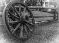
| 01/03/2016 07:36:37 PM | Wheel of time abandonedby clickodakComment: Greetings from the Critique Club!
Bonjour Marcel, comme ca va? (Sorry I can't get all the accents in where they should be ;-). Your English is much better than my French or even Franglais will ever be!
Very nice photo, well thought out with a nice, big, detailed wagon wheel dominating the image. FWIW I've never before seen a wagon wheel with those sets of double rivets before, and I've seen a lot! Good leading lines leading to it, good exposure, good use of thirds. I am glad that the small glimpses of houses seem to be older houses, and not very modern ones, which would ruin the feel of this shot.
I have to admit that I am not a big fan of vignettes, so many bad photogs use them as a crutch to prop up their own work, hoping to awe the viewer with a vignette. I don't think this image needs a white vignette; though I don't hate it, I can't say I'm a fan of it either. A commenter mentioned a dark vignette. Might be interesting, if you still have the original image, to dig it up and try it with a darker vignette and see the difference. Could make all the difference in the future!
Hope this helps,
Susan |
| 01/02/2016 09:38:30 PM | Misty Winter Lake by docjonnyComment: Greetings from the Critique Club!
Lovely dreamy feel with all those gradient tones of blue. The mist and calm adds so much eeriness, it's almost too serene...I keep expecting to see a monster emerging from the water to set all kinds of chaos going! :-) Small wonder you got a top ten here, you should be proud. This pic is proof that not all images need to be heavily blasted with saturation to do well, that much subtler work is just as beautiful.
Congrats again on the top ten and hope this has been helpful,
Susan |  Photographer found comment helpful. Photographer found comment helpful. |
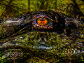
| 01/01/2016 09:27:02 AM | The Watcher in the Mountainby PhocalComment: Greetings from the Critique Club!
Delightfully creepy, there is something so primitive and malevolent here, and helps that the hide around the eye contrasts so well with the glassiness of the eye. Pity it came in so low, I think voters were expecting to see more flip'n'blend, as many are quite elaborate. The pp seems a little heavy for you, but sometimes a challenge like this calls for a little more in the post tricks area. I still like this one just fine :-) Trying to figure out if it's the lighting or pp but the purpley areas on the gator really give me the chills for some reason.
Keep up the good work and be careful around them big swamp critters!
Susan
|
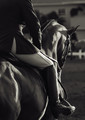
| 12/31/2015 09:45:46 PM | Fames Promiseby boocowskiComment: Greetings from the Critique Club!
Hehe, funny to see that I am also the only post-challenge commenter here. I am a retired horse trainer with a background in eventing, which includes dressage. Love, love, love everything about the horse and rider: great light on them, love the lines, the fantastic exposure, I think you were wise to desat. But the oof bg details are distracting which weakens the impact of what you have. Burning the bejeezus out of the bg may have worked best especially on the fencing at the end of the arena, where it meets the horse's eye.
I am very impressed that you got this detail at f2.8, I'm guessing a 70-200mm? Anyway, you got a magnificent capture here, and to be honest I never would have guessed an Arabian as this is not the sort of discipline you tend to see them in.
Great work, please keep it up and continue entering!
Susan | | Photographer found comment helpful. |
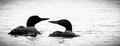
| 12/31/2015 09:38:40 PM | Spotted Elegance by FraksterComment: Greetings from the Critique Club!
Love these loons, they can be so difficult to shoot without getting too much washout or too many dead black areas on them. You want to give the voters as much reason as possible to see your image at its best. The main problem with this image is the size, it's so small on the short side that it's at a huge disadvantage as other are entering their images at the maximum allowed size. Not sure if the vignetting is intentional but some love it, others not so much.
Find this image to be a bit underexposed - may have been a better idea to sacrifice the shutter speed for one a little slower, and/or the aperture a bit wider, to allow in more light for what looks like a slightly backlit subject.
Otherwise a very good attempt, please keep submitting entries!
Susan |
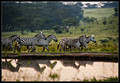
| 12/31/2015 07:18:42 PM | time for homeby tigerluongComment: Greetings from the Critique Club
Yes, this critique is only about 16 months late, but better late than never :-)
This pic has many elements that both help and detract from the subject. The colours and soft lighting are fantastic and the subject matter intriguing, and you have near-perfect reflections in the water. This should be close to the top of the pile as voters here tend to like the exotic species in their own habitat as opposed to an obvious zoo.
But, you've probably already seen the numerous comments saying that the car in the background, with those bright red taillights, is a HUGE distraction. It gives a sadly modern/urban feel to the shot and takes away from those lovely zebras. I did some informal hand-cropping and had you isolated that group of three zebras at the front, cropping out below those awful taillights so we see only the scenery, the zebras and their diminishing reflections, you could have had a top ten image.
I do hope you're still shooting, and hope that this critique may help lure you back to DPC.
Susan | | Photographer found comment helpful. |
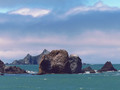
| 12/31/2015 07:10:59 PM | At The Edgeby sfaliceComment: Greetings from the Critique Club!
Ahahaha, so we finally meet, Alice...;-) This would be a great shot taken later or earlier in the day but as it stands it has something of a high-noonish feel to it. The colours and hues are nice, the composition OK but would have preferred to see one of the two sets of rocks slightly oof or blurred to give more depth. I do like that the bg rocks look almost like shale and seem to be composed of something quite different than the foreground ones. You have enough tones going on that you could probably have gone b/w and possibly done a lot better with this shot. Traditionally, land and seascapes tend to dominate in FSs...but that also makes them exceptionally tough to do well in.
Hope this has been helpful
Susan | | Photographer found comment helpful. |
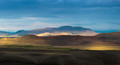
| 12/31/2015 06:57:41 PM | Beautiful Southby olbolComment: Greetings from the Critique Club!
Very nice landscape, great colours and tones, but I'm not seeing a real focal point to draw me in. Landscapes do tend to do very well during Free Studies...but they have to be magnificent to do well. This is a good postcard-type pic, well-exposed and inoffensive, but that is also its weakness as it lacks that WOW! factor, which this site favours.
You live in a heaven-sent country for photography; keep on exploring it and shoot at different seasons, times of day, different lenses, during the night, during the morning, and see what you can do.
Hope this helps
Susan | | Photographer found comment helpful. |
| 12/31/2015 06:51:37 PM | b u r d o xby bmilneComment: Greetings from the Critique Club!
As a former horse trainer I know exactly what burdox are all about; I've teased so many burrs out of manes and tails and forelocks and overgrown coats that, unless you wear an old slicker, you're going to be covered in the remains of your work. Best thing is get them out and then use ShowSheen but you probably already know this. Even better yet, go and uproot burdock plants in the fall fom the pastures when they're brown and brittle - they'll pull out easily.
Ok. Onto the critique. Damn shame that this did so poorly but glad to see Poshumous recognized what you were doing and gave you a Posty, which is almost as coveted as a *real* ribbon here. I believe the main problem here is that most probably see only an oof mess. I know a horse's tail and rump when I see them! You know enough to know that you could have made this much more obvious, but didn't, hence the Posty. Composition is cleverly done, exposure is spot on, but being oof has landed you in position for the much-coveted brown ribbon...think I still have the gif for it as I have had some browns come my way too :-)
I can't imagine where in the world you are now, but I hope you are shooting and learning and having a fine old time!
Susan
|
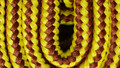
| 12/31/2015 01:20:40 PM | Bootlaceby gminkComment: Greetings from the Critique Club!
Nice and sharp, the off-centred composition works, good textures, and the colours are poppy. Personally I wouldn't have told voters what the item was - guessing what something is part of the fun. Glad to see you took care to get the wb correct, a lot of people are content to let the camera's auto wb do all the work.
However I think your exposure time was a little too long, and without something to diffuse the glare from any kind of bulb, you're going to get some glare as you can see in the highlights. f.22 seems a little much, as does ISO 800; a tiny aperture and a high ISO, combined with a long exposure time..why? ISO 100, f.5.6 and 1/10th probably would have been more than adequate and helped kill those glarey bands of highlight.
Hope this helps
Susan |
|
Showing 1021 - 1030 of ~8163 |
Home -
Challenges -
Community -
League -
Photos -
Cameras -
Lenses -
Learn -
Help -
Terms of Use -
Privacy -
Top ^
DPChallenge, and website content and design, Copyright © 2001-2026 Challenging Technologies, LLC.
All digital photo copyrights belong to the photographers and may not be used without permission.
Current Server Time: 07/25/2026 07:31:25 PM EDT.
|