| Image |
Comment |
| 02/22/2007 09:17:01 AM |
Unityby bradfdentonComment: Very touching. I wish it was a little bit bigger though. |
| 02/22/2007 09:16:00 AM |
He loves me, He loves me notby JackieKComment: I really like this. The only thing distracting to me is the out of focus foreground. I Love a shallow dof, but I feel like maybe if you had cropped a little different and had eliminated a bit of the blur, it may have worked a little better for me. |
| 02/22/2007 09:14:10 AM |
Eternalby hizcutieComment: Hmmm...cute idea...although it looks mostly out of focus to me. I wish the ring was sharper so we could see the beautiful details of it. |
 Photographer found comment helpful. Photographer found comment helpful. |
| 02/22/2007 09:12:46 AM |
|
| Photographer found comment helpful. |
| 02/22/2007 09:12:02 AM |
.... as delicate as a flowerby shadeeuaComment: The pic is a little too small. But I love the lighting on the flower. The composition is good as well. Just wish it was bigger so I could see it better. |
| 02/22/2007 09:11:01 AM |
Rosewoodby crazydaisyComment: The picture looks a little out of focus to me. Although I really like the composition..just wish it was a little more in focus. |
| Photographer found comment helpful. |
| 02/22/2007 09:08:01 AM |
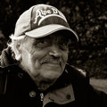
Mr. v. S.by hannekeComment: It turned out lovely. The lighting on his face is lovely, as well as the details. And his expression....wonderful. |
| Photographer found comment helpful. |
| 02/21/2007 11:00:22 PM |
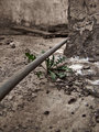
Strongby UrfaKComment: I really like this shot. The green just pops up out of nowhere (literally). I love how that is the only real color here. The rest of the pic has a very "forgotton" feeling to it, but the weed gives the lonely area a bit of life. And for some reason, I just LOVE the pole. It makes me wonder what it's from and how it got there. I like it alot. |
| Photographer found comment helpful. |
| 02/21/2007 10:53:54 PM |
|
| Photographer found comment helpful. |
| 02/21/2007 10:52:04 PM |
blue skyby thomaspeopleComment: I think the composition is very nice. I do think though that the cars and the shadows at the bottom of the pic, take away from it. Maybe getting a bit closer to the center building to avoid the foreground would have helped a bit. I really like the building on the left, kind of leaning into the pic. |
| Photographer found comment helpful. |
Home -
Challenges -
Community -
League -
Photos -
Cameras -
Lenses -
Learn -
Help -
Terms of Use -
Privacy -
Top ^
DPChallenge, and website content and design, Copyright © 2001-2026 Challenging Technologies, LLC.
All digital photo copyrights belong to the photographers and may not be used without permission.
Current Server Time: 07/19/2026 05:44:35 AM EDT.