| Image |
Comment |
| 10/09/2006 03:48:54 AM |
|
 Photographer found comment helpful. Photographer found comment helpful. |
| 10/08/2006 07:44:35 AM |
Peering to Infinity by DrAchooComment: Congratulations once again, Jason... you've had a great run of artistic inspiration lately. You understand well how to connect with viewers, particularly through your use of color and attention to detail. What will you do for an encore? |
| Photographer found comment helpful. |
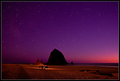
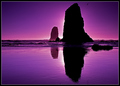
| 10/08/2006 07:38:52 AM |
View from Ecola Point, Sunsetby Bear_MusicComment: Congrats on the high placing for this super image and another 7+ image. You superbly extracted the great beauty out of this view. Top notch technicals, as always. Cannon Beach, Oregon has provided a lot of inspiration for high placing images recently. Two in the top four in this challenge. |
| Photographer found comment helpful. |
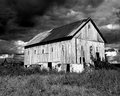
| 10/08/2006 07:07:57 AM |
Old Barn and Fall Skyby bbower1956Comment: Beautifully captured dramatic sky and building. Meets challenge exceptionally well. Foreground oversharpening acts as a distraction. |
| Photographer found comment helpful. |
| 10/07/2006 02:04:01 PM |
|
| Photographer found comment helpful. |
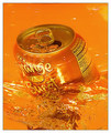
| 10/07/2006 02:01:23 PM |
Orange Burstby photobuddyComment: Like this captured. Great concept. Composed decent. Nice perspective. Good sharpness and detail.
Like the idea to enhance the orange for effect, that makes a good marketing tool, but unfortunately the 'Nutrition Facts' display comes out making the orange color cast most apparent to viewers. Rotating the can to put that out of sight might be a good idea. |
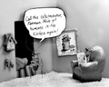
| 10/07/2006 01:48:12 PM |
Breakfast, Lunch, and Dinnerby JackRyanComment: Ahhhhh, yes... a well balanced daily diet! I didn't know you were a health nut.
Creative idea. DPCers always like humourous creativity. Lighting on the bottles is just fine. The muted blue backgound works very well with the bottles and its lighting is well balanced. Usually having the subject that close to a wall isn't such a good idea but in this case it works because of the light reflections from the bottles adding to background interest.
Color is a little weak. Saturating that gold and adding a bit more contrast would give it more punch. The biggest technical issue you must overcome first, though, is with the foreground... it is overexposed. That can be reduced nicely with Shadow/Highlight in CS2 or with twiddling a variety of basic legal adjustments in PS7. The detail is there, you just need to bring it out. The foreground is an issue in any case because it looks artificial, especially where the sand meets the wall. Adding some plant greenery would add more interest to the composition and maybe cover up the sand/wall seam. ;)
Looks like dinner is either slightly tilted left or lens distortion is making it look like it. That is a slight distraction. |
| Photographer found comment helpful. |
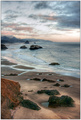
| 10/04/2006 02:24:39 AM |
Heliotrope Shoalsby DrAchooComment: Cheater.. cheater.. cheater! No fair sneaking over to Cannon Beach and taking pictures at sunset. LOL!
Congrats on another well deserved blue. I like your judicious use of RAW conversion parameters in your image processing. That is what set this picture apart from the others. |
| Photographer found comment helpful. |
| 09/25/2006 06:17:55 PM |
|
| Photographer found comment helpful. |
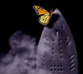
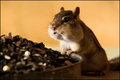
| 09/22/2006 12:12:05 PM |
Infestedby rox_roxComment: Congrats on your first 7! This is a very creative image in the true spirit of Gary Larson. Hard to believe it has been so long since his comic strip has been discontinued. You captured his warped sense of humor perfectly. |
| Photographer found comment helpful. |
Home -
Challenges -
Community -
League -
Photos -
Cameras -
Lenses -
Learn -
Help -
Terms of Use -
Privacy -
Top ^
DPChallenge, and website content and design, Copyright © 2001-2026 Challenging Technologies, LLC.
All digital photo copyrights belong to the photographers and may not be used without permission.
Current Server Time: 07/17/2026 06:59:21 PM EDT.