| Image |
Comment |
| 02/04/2008 02:05:30 PM |
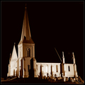
Community Faithby SherwinJamesComment: Very pretty picture and very nice toning. I think that certain areas of this photo are just a little to dark. Great work though! |
 Photographer found comment helpful. Photographer found comment helpful. |
| 02/04/2008 02:03:58 PM |
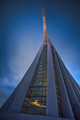
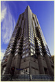
skyscraper by mb2006Comment: Very nice sky, and good color. Nice exposure as well. Its a fine subject, but I feel that this was approached in such a stereotypical angle. It would have worked better if you would have shot different angles, shot just the reflections in the windows, or something |
| Photographer found comment helpful. |
| 02/04/2008 02:00:37 PM |
Marriott Marquis New Yorkby treyvusComment: I think a longer exposure to throw the people out of focus would have helped as they are very distracting, but the lines and colors are beautiful |
| Photographer found comment helpful. |
| 02/04/2008 02:00:33 PM |
1615 Architectureby NigelComment: great work! I like the angle, and it has strong textures. After the challenge, I would definatley do some burning to the sky to ad even more texture! |
| Photographer found comment helpful. |
| 02/01/2008 06:30:00 PM |
|
| Photographer found comment helpful. |
| 02/01/2008 06:29:11 PM |
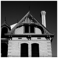
Oldways...by sudhiComment: Maybe a little to contrasty in the windows, and to bright on the bricks. Feels like it may have lost some texture because of that. Very good crop though, and a great shot! |
| 02/01/2008 06:28:31 PM |
|
| Photographer found comment helpful. |
| 02/01/2008 06:27:28 PM |
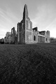
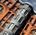
Beautifully Detailedby Dr.ConfuserComment: great color and texture. I applaud your different approach in making this crooked, but feel like you went into the middle ground. I think you should have eather left it straight, or go pretty much COMPLETELY sideways with it. Still nice work |
| Photographer found comment helpful. |
| 02/01/2008 06:26:15 PM |
P I N N A C L E by ericwooComment: BEAUTIFUL sky, color and reflection. The streetsign and light take a lot away though. I think getting just past those, and shooting from a very low stance would have made a great shot even better |
| Photographer found comment helpful. |
| 02/01/2008 06:25:28 PM |
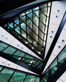
The Officeby spencerwoodComment: Great picture. Love the colors especially. Makes you wonder what it really is (as far as where in the building/which part of a building) Usually I think that is bad, but this shot does it so well. Love it love it! |
| Photographer found comment helpful. |
Home -
Challenges -
Community -
League -
Photos -
Cameras -
Lenses -
Learn -
Help -
Terms of Use -
Privacy -
Top ^
DPChallenge, and website content and design, Copyright © 2001-2026 Challenging Technologies, LLC.
All digital photo copyrights belong to the photographers and may not be used without permission.
Current Server Time: 07/16/2026 05:48:53 PM EDT.