| Image |
Comment |
| 02/05/2008 06:22:51 PM |
Cinderella's Padby bobdaveantComment: Its a very nice shot, and good technically. My only problem with this is that its such a stereotypical postcard shot of this. Some different angles, waiting for a different lighting pattern on it, or different approach would have made this much stronger. |
 Photographer found comment helpful. Photographer found comment helpful. |
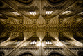
| 02/05/2008 06:21:55 PM |
Winchester Cathedralby g3lawrenceComment: Beautiful angle, and great lens choice! Looks like a giant spiderweb. Could easily just be the natural colors, but if you toned this, that looks great too! STRONG work! |
| Photographer found comment helpful. |
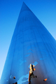
| 02/05/2008 06:19:42 PM |
The Spireby smr78Comment: Its an interesting shot, but I must admit I really had to study it, as the reflection at the bottom just looks awkward. I love the tones and vanashing point, but wonder if cropping the reflection out may have helped. |
| Photographer found comment helpful. |
| 02/05/2008 06:18:31 PM |
Seaworthyby briantammyComment: I like the silohuette idea, but it still does look just a little underexposed. Interesting subject and idea, different from the rest. Good shot. |
| Photographer found comment helpful. |
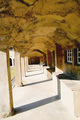
| 02/05/2008 06:17:37 PM |
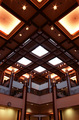
MoravianTile Worksby digifotojoComment: The texture on the ceiling is great, and this definately has some potential. I think stepping to the left a hair, and shooting down the wall more, eliminating the outside of the archways would have helped (or perhaps just cropping). Also, it feels to overexposed. |
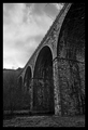
| 02/05/2008 06:16:26 PM |
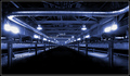
The Archesby alpharichComment: Interesting subject for sure, but I like it. The exposure and conversion to BW looks great. I think that perhaps getting lower, and angling the camera up a hair, to make the bridge just look TOWERING would have been a cool approach and angle, though what you have is very nice! |
| 02/05/2008 06:15:17 PM |
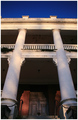
Pillars of Lightby saintkristopherComment: Very nice angle, and approach. I think I would have either used some fill, or lightened some things up as well. Good work |
| 02/05/2008 06:13:05 PM |
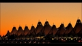
Modern Canvasby BradComment: Beautiful shot! Sky is great, very intriging subject, and the lighting on the bottom is pretty cool. Great work! |
| Photographer found comment helpful. |
| 02/05/2008 06:12:30 PM |
Diamondsby PiechProductionsComment: nice patterns and lines. Seems a bit dark to me, so lightening it up would help. Colors are very pretty though, and the angle is nice. Good work! |
| 02/05/2008 06:11:43 PM |
I N D U S T R I A L by kmp238Comment: Definately industrial. Love the look of this. Very dark, and different, but a clean shot. It definately is cold, and kind of puts you "in the shot". Good work! |
Home -
Challenges -
Community -
League -
Photos -
Cameras -
Lenses -
Learn -
Help -
Terms of Use -
Privacy -
Top ^
DPChallenge, and website content and design, Copyright © 2001-2026 Challenging Technologies, LLC.
All digital photo copyrights belong to the photographers and may not be used without permission.
Current Server Time: 07/15/2026 08:00:20 PM EDT.