| Image |
Comment |
| 05/10/2006 02:30:53 AM |
|
 Photographer found comment helpful. Photographer found comment helpful. |
| 05/10/2006 02:18:33 AM |
|
| 05/10/2006 02:11:08 AM |
|
| 05/10/2006 02:05:31 AM |
mosqueby ColonolComment: Love this photo, but the receding line of the bushes on the right and the gray pillar on the left are distracting to me... I think it would look better with these two elements cropped out. Still great though. |
| Photographer found comment helpful. |
| 05/10/2006 01:59:24 AM |
|
| 05/10/2006 01:58:18 AM |
|
| Photographer found comment helpful. |
| 05/10/2006 01:56:44 AM |
|
| 05/10/2006 01:55:56 AM |
|
| Photographer found comment helpful. |
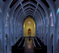
| 05/10/2006 01:55:23 AM |
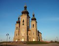
The Spiresby ColeyComment: I love the architecture, but I think the building loses some of its power by having too many distracting elements around. I think I would've liked it more if the photo were cropped in much closer around the church. Still like it though - 7 from me. |
| Photographer found comment helpful. |
| 05/10/2006 01:51:17 AM |
|
Home -
Challenges -
Community -
League -
Photos -
Cameras -
Lenses -
Learn -
Help -
Terms of Use -
Privacy -
Top ^
DPChallenge, and website content and design, Copyright © 2001-2026 Challenging Technologies, LLC.
All digital photo copyrights belong to the photographers and may not be used without permission.
Current Server Time: 07/15/2026 09:51:16 PM EDT.