| Image |
Comment |
| 04/25/2007 01:52:08 AM |
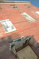
the restaurantby humanprotocoldroidComment: Like the muted colours but the top left highlight distracts and unbalances the picture because the right hand top corner is dark. |
| 04/25/2007 01:50:55 AM |
|
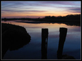
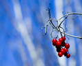
| 04/25/2007 01:50:05 AM |
Low Tideby wildirisComment: Very serene but a bit heavy in the shadows and not too third'sy |
 Photographer found comment helpful. Photographer found comment helpful. |
| 04/25/2007 01:49:02 AM |
|
| Photographer found comment helpful. |
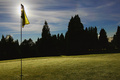
| 04/25/2007 01:47:08 AM |
On Courseby seriocomicComment: Nice capture - I had a similar problem with my entry in that the picture looked more balanced with the main subject not on the third - I feel this has the same problem - Looks good but not on the third. |
| Photographer found comment helpful. |
| 04/25/2007 01:44:50 AM |
|
| Photographer found comment helpful. |
| 04/25/2007 01:43:48 AM |
|
| Photographer found comment helpful. |
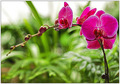
| 04/25/2007 01:43:05 AM |
Peters Flowersby HeiSchComment: Nice capture - Like the colours and shape. Nice. I am sure you will get a few comment son the fuzzy out of focus look but it's not too bad. |
| Photographer found comment helpful. |
| 04/25/2007 01:41:09 AM |
|
| Photographer found comment helpful. |
| 04/25/2007 01:40:18 AM |
|
Home -
Challenges -
Community -
League -
Photos -
Cameras -
Lenses -
Learn -
Help -
Terms of Use -
Privacy -
Top ^
DPChallenge, and website content and design, Copyright © 2001-2026 Challenging Technologies, LLC.
All digital photo copyrights belong to the photographers and may not be used without permission.
Current Server Time: 07/21/2026 08:51:23 PM EDT.