|
|
|
Showing 241 - 250 of ~977 |
| Image |
Comment |
| 07/30/2006 02:48:29 AM | IMG_1056-01.jpgby DevonTComment: I think I like this one a little better than the one you posted in the forum. The other one was a sweet capture of the little guy in action, but this one is a bit easier to look at because there is more focus and less blurry foreground. I'd add a tad bit of sharpening, but probably only for the web, the photo is probably fine otherwise, especially for printing, again, you could probably bump your contrast just a little, but that's it, your colors are really nice and the composition is great |  Photographer found comment helpful. Photographer found comment helpful. |
| 07/30/2006 02:45:51 AM | IMG_0610-01.jpgby DevonTComment: very cool, I'd put a fake sky in, maybe use a gradient, also clone out the little left over tree spots on the left edge, seletively bump the contrast of the mountain up a little, and voila, nice shot | | Photographer found comment helpful. |
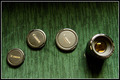
| 07/30/2006 02:43:01 AM | Photogrphers Beltby DevonTComment: Originally posted by amandalore:
hmm.. is this like O'Rians belt? (sorry for spelling) I love the texture and color of your background, nice composition too, bumping to 8, I just like the overall feel of this photo, can't put my finger on it though |
Yup, I did comment... and still like this shot, still love the background, can't believe how many people didn't get it, especially with the title | | Photographer found comment helpful. |
| 07/30/2006 02:41:02 AM | IMG_1055-01.jpgby DevonTComment: how cute! you must be such a patient person... awesome capture, I'd name him for your title, something like Twinky, lol, you don't hafta listen to me, great photos btw, I loved your lens cap entry, too bad a lot of people didn't get it, that was the first thing I thought of though (actually, I think I commented during voting, gonna go check now) | | Photographer found comment helpful. |
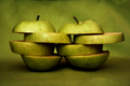
| 07/27/2006 07:36:10 PM | Variable geometry by MontagueComment: squeeze lemon juice onto the apple slices to keep them from browning so quick, btw, this is a really cool photo, creative and matches the BG really well | | Photographer found comment helpful. |
| 07/27/2006 07:28:40 PM | | | Photographer found comment helpful. |
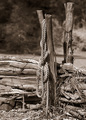
| 07/26/2006 09:47:42 PM | Parallelby meo729Comment: Ok...
Initial thoughts: neat image with a different perspective, definitely meets the challenge; however, DPCers like to see dramatic looks or some kind of human element, or something to try and strike the coveted "wow" factor. With this pic, you're left to create that with shadows and highlights
Subject & background: well, there's not much background, but the subject is a fairly common one that I think you've made stand out a bit more by using a twist on the angle
Angle, framing & composition: this was hit or miss for your voters, I think it's a tossup as to whether a voter will like this or not, but I don't think that the tilted framing did too much "harm" to your score. The photo does seem balanced in its composition, which is a plus
Focus, clarity & DOF: it seems that your photo is focused well enough, but there is not enough contrast to really bring that out, so at a glance, it seems soft, your DOF also seems about right, but again, only when you really look
Lighting & exposure: these look right to me also, you might have tried waiting until the light was more harsh to add some interest, but I think this is good enough to work with
Post processing: Here is where I think the problem came, you earned a pretty good score, but with a little different processing, I think you could have bumped this photo up just a bit
now, I have been using the desat tool to convert my photos to B&W and then try to bump the contrast, but I've just learned a better way to do it. Go to adjustments -> gradient map -> and choose the black to white one (you may need to click reverse), then if you click on the gradient color inside the rectangle box that shows you which one you chose, it will bring up another tool box where you can mess around with the sliders. I've noticed that this produces a look with much more contrast and interest.
Overall, my opinion: I think that the tracks seem to look like a plain background w/o a subject. Try messing with the contrast or gradient mapping to create a more dramatic effect where the tracks can stand alone by themselves... (I've also heard Rikki talk about using channel mixer, or seletive channel or something, I can't remember the name, to turn his photos to B&W, if you want to look that up too)
Let me know if you do a re-edit, I'd like to see... also, I hope this was somewhat helpful, If you'd like more specifics, feel free to contact me again and I'll try my best to look a little deeper, lol
Cheers! Amanda |
| 07/26/2006 04:36:45 PM | Tangleby LoudDogComment: I really like this photo, I bet it would have done much better in some other type of challenge, but hey, 5.559 is not a bad score at all, maybe if you'd had named it tangled line... who knows | | Photographer found comment helpful. |
| 07/26/2006 02:33:19 PM | | | Photographer found comment helpful. |
| 07/26/2006 02:24:14 PM | | | Photographer found comment helpful. |
|
Showing 241 - 250 of ~977 |
Home -
Challenges -
Community -
League -
Photos -
Cameras -
Lenses -
Learn -
Help -
Terms of Use -
Privacy -
Top ^
DPChallenge, and website content and design, Copyright © 2001-2026 Challenging Technologies, LLC.
All digital photo copyrights belong to the photographers and may not be used without permission.
Current Server Time: 07/17/2026 07:12:33 PM EDT.
|