| Image |
Comment |
| 01/21/2003 05:16:43 AM |
|
 Photographer found comment helpful. Photographer found comment helpful. |
| 01/21/2003 05:15:47 AM |
Traumaby PHOTOCHlXComment: This would have been a great shot if it had been a little more in focus and cropped differently. It is also a tad too noisy. The idea is good, there is quite a distance between those signs. Actually I first wanted to do something similar for my photo. |
| 01/21/2003 05:09:05 AM |
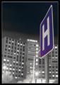
"Rising Healthcare"by KickDrum5150Comment: Nice effect, the background looks black and white which really enhances the sign. The sign is a little out of focus however. I like it. |
| 01/21/2003 05:07:19 AM |
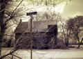
NOHEL(L)?by GekkerComment: Nice shot. Shame about the branches in the way of the sign though. |
| Photographer found comment helpful. |
| 01/21/2003 05:06:03 AM |
|
| 01/21/2003 05:04:33 AM |
|
| Photographer found comment helpful. |
| 01/21/2003 05:03:28 AM |
Riseby PaulkComment: Wonderful! Good composition. I love this one. 10 from me.
|
| Photographer found comment helpful. |
| 01/21/2003 05:02:43 AM |
|
| Photographer found comment helpful. |
| 01/21/2003 05:02:24 AM |
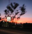
Drive 55?by r_sandlerComment: Good capture here. I like the blurred effect of the background. The sign looks as if it is just hanging there! Good job. |
| Photographer found comment helpful. |
| 01/21/2003 05:00:04 AM |
|
Home -
Challenges -
Community -
League -
Photos -
Cameras -
Lenses -
Learn -
Help -
Terms of Use -
Privacy -
Top ^
DPChallenge, and website content and design, Copyright © 2001-2026 Challenging Technologies, LLC.
All digital photo copyrights belong to the photographers and may not be used without permission.
Current Server Time: 07/17/2026 12:33:46 AM EDT.