| Image |
Comment |
| 04/14/2003 09:33:30 AM |
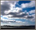
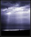
Something's Brewingby JackoComment: Lovely image, the clouds look so wild but then again friendly in their fluffy shapes. One of my favorites in the challenge - 10. |
 Photographer found comment helpful. Photographer found comment helpful. |
| 04/14/2003 09:32:23 AM |
|
| Photographer found comment helpful. |
| 04/14/2003 09:31:35 AM |
|
| Photographer found comment helpful. |
| 04/14/2003 09:30:47 AM |
|
| Photographer found comment helpful. |
| 04/14/2003 09:28:56 AM |
|
| Photographer found comment helpful. |
| 04/14/2003 08:20:46 AM |
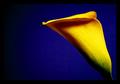
Colored Callaby stephanComment: Critique Club guten Tag:
Hiya Stephan, well I get to critique your photo. First of all congratulations on an excellent calla shot, (I only found out for the first time last week from John that these flowers are called callas).
The composition of this pic is very good. I love the way the flower curves in from the right side and flows into the center of the image. The negative space on the left is justified here and it gives the flower breathing room and I think anything less would have given this photo a cramped feeling.
The choice of blue for the background was ideal. Yellow and blue always go well together, you can never go wrong using that combination. The border is not overdone at all and fits in well especially with the added effect of the border disolving into the negative space from the left hand side.
There is a jagged edge on the top petal on the left which is a little disturbing if you look at it long enough, and the background blue is a tad noisy. But these are only "Kleinigkeiten" which don't really lower the quality of this image at all, just that I had to find something to "mecker" about right :-)
Overall and excellent image, one that is a pleasure to look at, and one you should definitely start offering as a print! It has also just jumped on to my favourite photo list.
Schöne Grüsse
Gary
|
| Photographer found comment helpful. |
| 04/14/2003 07:52:20 AM |
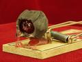
Cordial Temptationby autoolComment: Very funny!! Focus and DOF is excellent, the chocolate is very sharp and the blobs give this image so much more charachter. The red background fits in very well and I almost gave it a ten except one thing bothers me a little. The edge of the table is a little distracting in the background, I would have prefered to see an unbroken background - 9. Gary. |
| Photographer found comment helpful. |
| 04/14/2003 07:49:28 AM |
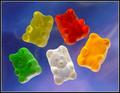
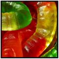
Dance of the Gummi Bearsby DougPazComment: Awesome! Good choice of background color, it fits to the gummi bears perfectly. Good lighting set up as well, although the left side seems a tad darker than the right - 9. |
| Photographer found comment helpful. |
| 04/14/2003 07:47:48 AM |
as the worm turnsby falveyComment: Excellent colors and choice composition. I can almost feel the softness of those sweets, choice - 9! |
| Photographer found comment helpful. |
| 04/14/2003 07:46:54 AM |
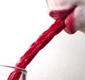
Diet Drink???by kosmikkreeperComment: I like this photo a lot. The deeps tones of red are very saturated and look good here, and of course I love the humor aspect. Good crop, good job - 9. |
| Photographer found comment helpful. |
Home -
Challenges -
Community -
League -
Photos -
Cameras -
Lenses -
Learn -
Help -
Terms of Use -
Privacy -
Top ^
DPChallenge, and website content and design, Copyright © 2001-2026 Challenging Technologies, LLC.
All digital photo copyrights belong to the photographers and may not be used without permission.
Current Server Time: 07/24/2026 09:31:01 PM EDT.