| Image |
Comment |
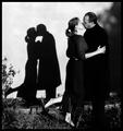
| 11/03/2003 02:34:52 AM |
Copy Catsby Firstrich1Comment: Great photo Richard, how many takes did you have to do? The more the better right :-) |
 Photographer found comment helpful. Photographer found comment helpful. |
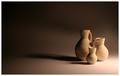
| 11/03/2003 02:30:29 AM |
Love by KonadorComment: Woohoo Ben! Congrats on ribbon number 3! |
| Photographer found comment helpful. |
| 11/03/2003 02:29:03 AM |
|
| Photographer found comment helpful. |
| 11/02/2003 03:12:03 PM |
|
| 11/02/2003 02:01:22 PM |
No Escapeby KonadorComment: My top favourite and only 10. This has gotta be up there!!!! |
| Photographer found comment helpful. |
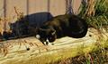
| 10/31/2003 06:46:32 PM |
Soaking up the Afternoon Sunby NeuferlandComment: Okay I just did Dsidwells's 30 second take on this pic. Looking for what you wanted to show us. The composition is good. The shadow shows me it is late in the day. Sharper would have done this a lot of justice, I am missing the details. |
| Photographer found comment helpful. |
| 10/31/2003 06:43:02 PM |
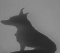
Of Dog and Manby LucidLotusComment: Pretty grainy and spotty, especially under the dog's nose. Also I would have left some more room in front of the dog's nose, it seems a little too tightly cropped on that side. |
| Photographer found comment helpful. |
| 10/31/2003 06:40:16 PM |
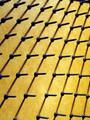
All Lined Upby Spork99Comment: I really like your idea here, the screws look as if they are floating above the background. It must have taken you a while to set this one up and get the lighting spot on. Something different for sure! |
| Photographer found comment helpful. |
| 10/31/2003 06:18:04 PM |
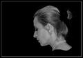
necklineby miss parkerComment: I like it! The curve of the neck coming out of the shadows and the angle of the head is very graceful. The lighting is spot on, highlighting the contours well. I just keep getting the feeling I have to pull that piece of hair under the necklace out...... |
| Photographer found comment helpful. |
| 10/31/2003 06:04:32 PM |
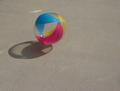
Sunny Ballby NukktaComment: The composition is good, rules of thirds etc. The whole image comes over a little on the flat side. A boost in the contrasts would have done this wonders, especially bringing out the colors in the ball more. |
| Photographer found comment helpful. |
Home -
Challenges -
Community -
League -
Photos -
Cameras -
Lenses -
Learn -
Help -
Terms of Use -
Privacy -
Top ^
DPChallenge, and website content and design, Copyright © 2001-2026 Challenging Technologies, LLC.
All digital photo copyrights belong to the photographers and may not be used without permission.
Current Server Time: 01/14/2026 05:38:42 PM EST.