| Image |
Comment |
| 11/08/2006 03:13:35 PM |
Marketby cabaComment: I think that wet stone roads are an absolute gift to photographers. :) The lights reflecting off the road here looks awesome! Your low angle worked perfect for this shot. Too cool that you captured some moonlight glow in the sky as well. :) |
 Photographer found comment helpful. Photographer found comment helpful. |
| 11/08/2006 03:10:29 PM |
Opening Night!by ralfwComment: Excellent framing. :) I love how you've included the silhouette of the palm tree in the top-left corner. It's also really nice that you shot this while there was still some light in the sky - it really helps the neon stand out. :D |
| Photographer found comment helpful. |
| 11/08/2006 03:08:21 PM |
Reflections IIIIIIIIIIIIIIIIIIIIIIby greslizzzComment: YAY star filters! ;) Very well done. The green lines of light reflected off the water look awesome. The differences between the star-pattern light beams and the way they've reflected off the water is too cool! Also like the white border, but personally would have gone with a slightly thinner one. Great photo! |
| Photographer found comment helpful. |
| 11/08/2006 03:05:20 PM |
Radio City Music Hall (2006)by pawdrixComment: Excellent perspective and great framing of the shot. What really makes it stand out to me is the glow behind the building (moon?). :) |
| Photographer found comment helpful. |
| 11/08/2006 03:03:32 PM |
striking a light chordby betelgeuseComment: GREAT perspective!!! Not only is the neon exposed just right, but I think the lights in the windows of the surrounding buildings really adds to the shot. :) |
| Photographer found comment helpful. |
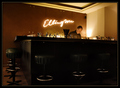
| 11/08/2006 02:56:48 PM |
Ellingtonby h2Comment: While it was a little risky to go with an entry with no neon-ish colors in it, I think it really paid off! The lighting in this shot is awesome. :) The composition is perfect, and I love how the light plays off the metal rings of the bar stools. This shot was a breath of fresh air after scrolling through so many random bar sign shots... ;) |
| Photographer found comment helpful. |
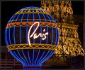
| 11/08/2006 02:49:15 PM |
Neon Paris by scarbrdComment: VERY well done shot and excellent perspective. :) In an insanely crowded town, you actually managed to capture and simple and uncluttered shot - great work! The composition is great and the balance between the cool blue neon and warm incandescent light is AWESOME. :D |
| Photographer found comment helpful. |
| 11/08/2006 02:45:57 PM |
Desert Flowerby PanderComment: Excellent lighting and perfect title! The composition works very well for the shot and I think the subtle border helps to finish it off. Good capture. :) |
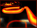
| 11/08/2006 02:43:50 PM |
"P" by DefyTimeComment: My absolute favorite of the challenge! In fact, I'm adding it to my favorites. :) I think this is one of the first macro shots of neon tubing I've ever seen. Not only is it incredibly original, but it is PERFECTLY done. The amount of exposure is dead-on. And the composition is perfect to boot!
I only have one VERY small criticism - and that's that the red portion of the border is varying in widths. That occurs when you increase the canvas size by an odd number. I've run into that before, and get around it by always increasing in increments of even numbers. For example, I usually just resize the image to 628, extend canvas height and width (in foreground color) by 4 pixels, then extend canvas by 8 pixels (in black). That always ensures that border lines are the same width. I know, I know - very nit-picky. Just thought I'd throw in my $.02 though. ;) Yet again, AWESOME shot! :D |
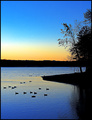
| 10/18/2006 07:14:11 PM |
The Morning Commuteby timfythetooComment: Great balance between highlights and shadows. The colors in this are amazing! I normally don't like shots split down the middle of the frame by the horizon, but I can see here that it was a compositional decision. Keeping the tree along the upper third without cutting the top off makes this composition the best choice. Well done. :) |
| Photographer found comment helpful. |
Home -
Challenges -
Community -
League -
Photos -
Cameras -
Lenses -
Learn -
Help -
Terms of Use -
Privacy -
Top ^
DPChallenge, and website content and design, Copyright © 2001-2026 Challenging Technologies, LLC.
All digital photo copyrights belong to the photographers and may not be used without permission.
Current Server Time: 06/21/2026 07:15:17 AM EDT.