| Image |
Comment |
| 05/30/2006 12:03:54 PM |
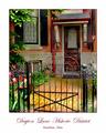
Welcome Gate Printby jpochardComment: Love the brochure/ad photo look youve given this. there is some odd "cloudiness" in this though around the top of the door. It extends off the door to the overhang supports and some of the brick as well. im not sure what that is. but would like this much better if that were removed. |
 Photographer found comment helpful. Photographer found comment helpful. |
| 05/30/2006 12:00:10 PM |
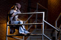
jstairs7.jpgby trnqltyComment: this pose is interesting. id love to see more of the face. but i like the hat too so maybe if there were a light shining up toward her face to illuminate it. and although i like the slightly harsh lighting on her and the tone of the light on the bricks id prefer a more even lighting on the bricks. either all yellowish light or all of it unlite. know what i mean? good composition. |
| Photographer found comment helpful. |
| 05/30/2006 10:49:56 AM |
|
| Photographer found comment helpful. |
| 05/30/2006 10:06:00 AM |
Hot Topicby CutterComment: 11th place is nice and all but how in the world did this not get the blue?!?! Its was by far my favorite. its amazing. |
| Photographer found comment helpful. |
| 05/30/2006 09:55:33 AM |
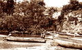
River Workby TuckersmomComment: This a great example of high key. I usually see it done in black and whites but this coloring really adds an old almost poverty like feeling and I think it brings out more detail. I see nothing wrong with this really. The best I can come up with is I would MAYBE crop a little tighter in the left hand side but it would be a shame to cut off any of the whole boat so thats a tough call. I'd also probably clone some of the trees into the open blown out sky area. great photo! |
| Photographer found comment helpful. |
| 05/30/2006 09:35:31 AM |
resized raw.jpgby notonlineComment: you did a wonderful job in post processing. didnt go too far. thanks for adding the original. its nice to see the difference. Message edited by author 2006-05-30 09:36:20. |
| Photographer found comment helpful. |
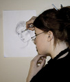
| 05/30/2006 09:31:14 AM |
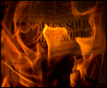
A Portrait Of A Portraitistby KrisbyComment: i gave you a seven apparently but the weirdest thing about this for me is the blue hands. like zombie hands. lol. not sure if thats lighting or just from holding that pose too long but its off putting.
edit for spelling Message edited by author 2006-05-30 09:31:45. |
| Photographer found comment helpful. |
| 05/30/2006 09:28:47 AM |
dimiso 040b1.jpgby KrisbyComment: Id like this better if the blurry girl were cropped out entirely, i love the left side though all the way up to the white space before the blurry girl. |
| Photographer found comment helpful. |
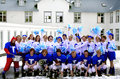
| 05/30/2006 09:26:24 AM |
Footballersby KrisbyComment: possibly a tiny bit too much contrast on the people. And maybe if the roof were a tad darker it would balance out the photo. otherwise very nice.
just realized there is a distracting line under the roof on the upper left hand corner. is that from post processing? perhaps a mistake? just wanted to point that out. Message edited by author 2006-05-30 09:27:18. |
| Photographer found comment helpful. |
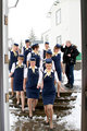
| 05/30/2006 09:23:42 AM |
Down the stairsby KrisbyComment: I love this one. the guy being blurry is a bit distracting but even the blown out sky works well with this one. the women are in fantastic focus. great capture. |
| Photographer found comment helpful. |
Home -
Challenges -
Community -
League -
Photos -
Cameras -
Lenses -
Learn -
Help -
Terms of Use -
Privacy -
Top ^
DPChallenge, and website content and design, Copyright © 2001-2026 Challenging Technologies, LLC.
All digital photo copyrights belong to the photographers and may not be used without permission.
Current Server Time: 04/27/2026 08:23:20 PM EDT.