|
|
|
Showing 951 - 960 of ~1133 |
| Image |
Comment |
| 05/08/2006 09:34:23 PM | senakulo :: old story, reenactedby blackenedwhiteComment: Hello from me via the CTP2 thread!
The color and model's expression are very good. However, here's where things get rough:
The crop is way too tight. The top of the head is cut off, along with most of the body and cross. Particularly the hands. The cross is an important element in the photo, but it's been truncated.
The noise is distracting. I know I tend to add noise when I'm trying to cover up an unsalvageable lack of sharpness, so it makes me wonder why that decision was made unless it's designed to hide a flaw like that. Otherwise, it seems rather unnecessary.
Finally, the biggest reason I think that photos failed in this challenge was that they just did not convey a sense of "old". "Old" needed to be projected as a concept, and that's just not the first thing that pops into my head when I look at this. The model is young. I think of religious pageantry. I don't automatically think "old". Most Western Christian portrayals of the Stations of the Cross will involve a crown of thorns, which is conspicuously missing from the photo. I don't think that Senakulo is very familiar to most of the DPC audience, and anything unfamiliar tends to get voted down.
My only suggestion here, really, is to give more consideration to what the DPC audience is going to want to see. On abstract concepts like "Something Old", make sure the photo screams "OLD!" as loudly as possible. |  Photographer found comment helpful. Photographer found comment helpful. |
| 05/08/2006 09:18:32 PM | Palistinians go to Work in West Bank and Gaza againby GunnsiComment: Hello Gunnsi!
My first impression when I saw this was that it didn't look much like the West Bank to me, and I couldn't tell what they were returning to work to do. I didn't like that I couldn't see the worker's face, which seemed to me like a rather important thing for a story like this. Putting a human face on the story is absolutely key.
For being such a low-demand image so far as color and detail go, I was surprised to see quality degradation around the man and the more intricate details of the machinery. It doesn't seem like it should be necessary to save it at just a low resolution.
I do like the color, though - the suggestion of early morning is good in a piece like this since it implies a certain honesty and wholesomeness - again that's part of making sure you get humanity in to the photo. | | Photographer found comment helpful. |
| 05/08/2006 09:08:02 PM | ~ Rhythm ~by yankoComment: The girl is gorgeous, with nice color and clarity. I especially like the definition around her shoulder. I scored this at a 7 in voting.
I think this photo probably suffered in several areas. First, from the dead space on the right. Second, she is obscuring the drummer behind her too much - seeing him in the background, even blurred, would have been cleaner and more interesting. There is also the assumption that a photojournalist wouldn't normally selectively desaturate nearly the entire photo (in addition to whatever other process was used to almost plasticize them), though I'm guessing this was done to visually separate the girl from the drummer. Finally, the shadow cast by her arm is a little distracting, though this would be a difficult variable to control in this particular setting. | | Photographer found comment helpful. |
| 05/08/2006 08:56:53 PM | E-71 wins again the World Championship of Windsurfby alexgarciaComment: Ok, I already left a brief comment on this during voting, but I want to touch base for CTP2 and maybe expound a little bit.
The color and clarity on this are gorgeous, and I do like the minimalist feel of the photo, with the sails looking a bit like sharkfins skimming through the water. However, I do still think that for a Photojournalism challenge I would have liked to see something a little more personal. We can't see the surfer behind the sail, and front page photos tend to really focus on the people involved in whatever is going on.
My one complaint with the photo as just a photo is that it feels to me like the sail in the foreground is way too close to the upper border. I think extending the sky up by about 30 pixels would do the trick to make it look more balanced. | | Photographer found comment helpful. |
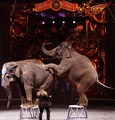
| 05/08/2006 08:51:28 PM | The Circus in townby DigiFotoBuddyComment: Greetings!
This isn't a bad shot for a small town newspaper. The elephants are in a good pose. I think this would be nice with a tighter crop to just the lower 2/3 of the photo, eliminating the too-dark background. We don't need to see the circus logo to know what's going on. Focus on the elephants. This will also help us to see the trainer, who currently is so small in the photo that he gets lost amongst their legs. I also wonder if a little sharpening might help? | | Photographer found comment helpful. |
| 05/08/2006 08:45:53 PM | Snohomish Invitational GU-13 Finalsby margiemuComment: Hello margiemu! Here's your CTP2C
Compositionally, I think action shots are difficult, so kudos for getting a fairly decent shot. The players' faces and the action are all clearly visible. The group in the upper left background is a distraction, however, particularly since they don't seem too interested in what's going on.
The shot is a bit too blurred, especially surprising to me since it looks overexposed. I think both could be addressed in post-processing with some contrast, turn the brightness down a notch or two, a turned up the yellow in highlights w/ color balance, a little burn in an adjustment layer, plus a bit of unsharp mask:
 | | Photographer found comment helpful. |
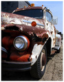
| 05/08/2006 04:48:55 PM | Characterby AeroglyphicsComment: I think the building behind the truck detracts from the composition, but mostly I think you probably suffered from rusted car overload. DPC sees way too many, especially in challenges where it's just much too easy to throw one in. | | Photographer found comment helpful. |
| 05/08/2006 01:04:25 AM | |
| 05/08/2006 01:02:42 AM | | | Photographer found comment helpful. |
| 05/08/2006 12:59:23 AM | | | Photographer found comment helpful. |
|
Showing 951 - 960 of ~1133 |
Home -
Challenges -
Community -
League -
Photos -
Cameras -
Lenses -
Learn -
Help -
Terms of Use -
Privacy -
Top ^
DPChallenge, and website content and design, Copyright © 2001-2026 Challenging Technologies, LLC.
All digital photo copyrights belong to the photographers and may not be used without permission.
Current Server Time: 06/25/2026 05:24:22 AM EDT.
|