| Image |
Comment |
| 05/11/2006 12:54:15 AM |
Seeking comfortby tannahComment: Beautiful. One criticism, and that is the wall line in the upper left corner. The way the light hits it highlights it a little too much. Either a burn to deemphasize it (though illegal for this challenge) or a crop to remove it would help focus the photo on your intended subjects. |
 Photographer found comment helpful. Photographer found comment helpful. |
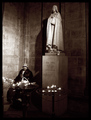
| 05/11/2006 12:52:33 AM |
|
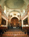
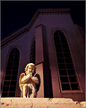
| 05/11/2006 12:51:12 AM |
Angel Outside Churchby wibingComment: Ooh, nice idea. I like the color, and the cherub has nice definition, though he's a little blown out. |
| Photographer found comment helpful. |
| 05/11/2006 12:49:13 AM |
|
| 05/11/2006 12:48:54 AM |
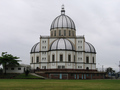
Santuário Santo Antônioby danilofComment: It's unfortunate that the weather didn't give you a nice sunny blue sky for this photo. I sympathize, but it makes the whole thing look dreary. |
| 05/11/2006 12:48:01 AM |
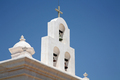
San Xavier Missionby pjangelComment: I think the choice to center the bell tower actually hurts this photo, since it leaves so much dead space off to the right. Perhaps moving it to the right would also help it fit better into the rule of thirds? |
| Photographer found comment helpful. |
| 05/11/2006 12:46:32 AM |
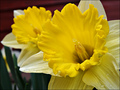
The motherby greslizzzComment: It's a nice photo, but I would classify this more as a study of a thing than a place. What makes a daffodil holy? This idea isn't made clear through the photo. |
| Photographer found comment helpful. |
| 05/11/2006 12:45:16 AM |
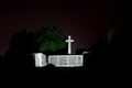
Night Shotby youngnovaComment: It's too dark, and it's not clear what I'm looking at, other than a lit crucifix. What is it standing over? It's also a bit unfortunate that light floodlights also light part of the trees behind it, since they distract focus from your subject. I might crop this tighter to get less dead space. |
| Photographer found comment helpful. |
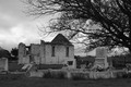
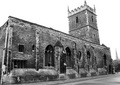
| 05/11/2006 12:43:24 AM |
Ancient, derelict, forgottenby edmartinComment: The sky is so blown out that it's actually impinging on the sides of the tower. I'm not crazy about the angle, and it looks like one of the pinnacles on the tower might be cut off just a teensy bit? I would try to take this photo again earlier in the day when the light isn't so harsh, allow more space at the top of the frame, and maybe try to emphasis less the entire building and more some of the more interesting architectural details, like the texture of the brickwork, the height of the tower, the shape of the doors and windows, etc. |
| Photographer found comment helpful. |
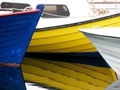
| 05/11/2006 12:28:34 AM |
Weekendby GunnsiComment: Hi Gunnar -
I like the rhythm of the boat lines - definitely a unique perspective on the challenge.
I'm not sure what to do about the overwhelming brightness of the white except maybe turn the shutter speed up a notch and let the color come out in post-production, perhaps via saturation and lightness controls? Overall, not a bad finish at 55, though. Good eye! |
| Photographer found comment helpful. |
Home -
Challenges -
Community -
League -
Photos -
Cameras -
Lenses -
Learn -
Help -
Terms of Use -
Privacy -
Top ^
DPChallenge, and website content and design, Copyright © 2001-2026 Challenging Technologies, LLC.
All digital photo copyrights belong to the photographers and may not be used without permission.
Current Server Time: 06/25/2026 02:22:35 AM EDT.