| Image |
Comment |
| 08/14/2006 09:14:58 PM |
Fire and Iceby DigiFotoBuddyComment: Nice color! I do think the flame needs to be more obvious - its location and shape make it look almost like some kind of leaf. The background has a bit of noise, as well, so it might benefit from a pass through NI. |
 Photographer found comment helpful. Photographer found comment helpful. |
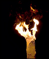
| 08/14/2006 09:13:40 PM |
Flaming Birchby rjksteschComment: Nice to see something a bit different from the other entries, but there's a lot of noise and the branch is oversharpened. |
| Photographer found comment helpful. |
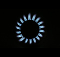
| 08/14/2006 09:12:57 PM |
Eighteen Petalsby redmoonComment: I like the minimalist idea here, but I feel as though there could be more clarity around the inner edge of the burner. |
| Photographer found comment helpful. |
| 08/14/2006 09:12:13 PM |
Fire Starterby agwrightComment: Nice! Great stop motion here. My one complaint is that the top of the fireball is cut off. |
| Photographer found comment helpful. |
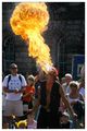
| 08/14/2006 09:10:13 PM |
Beginning of the Endby ImagineerComment: I like the idea here, especially since it gives the fire some context, but it's too obscured by the smoke. |
| Photographer found comment helpful. |
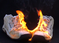
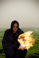
| 08/14/2006 09:09:44 PM |
|
| Photographer found comment helpful. |
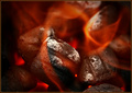
| 08/14/2006 09:08:40 PM |
• Incandescent •by Bear_MusicComment: Nice texture on the briquettes! Perhaps a bit too much noise in the flame, especially visible top center. |
| Photographer found comment helpful. |
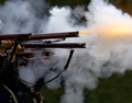
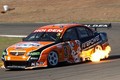
| 08/14/2006 09:07:38 PM |
Firepower - keep your sponsors happy!by boomeraklComment: Oooh, that's never good... This is a nice break from the monotony of matches and disembodied flames. I might clone out the white bucket and items around it in the upper left. |
| Photographer found comment helpful. |
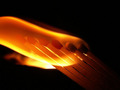
| 08/14/2006 09:06:31 PM |
hidingby eye has not seenComment: In a fire challenge, a successful match photo will do more than just light them. Aside from being yet another match photo, the trailing end of the flame is cut off at the left. I feel like I'm only looking at part of the action. |
| 08/14/2006 09:04:45 PM |
Warlock´s Fireballby russiComment: I like that you've given the fire some context. However, I think the lightness of the scene works against your druidic theme and there's too much negative space with the sky. This might work better as a square crop. |
| Photographer found comment helpful. |
Home -
Challenges -
Community -
League -
Photos -
Cameras -
Lenses -
Learn -
Help -
Terms of Use -
Privacy -
Top ^
DPChallenge, and website content and design, Copyright © 2001-2026 Challenging Technologies, LLC.
All digital photo copyrights belong to the photographers and may not be used without permission.
Current Server Time: 06/25/2026 12:48:03 PM EDT.