| Image |
Comment |
| 08/12/2009 08:41:52 AM |
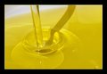
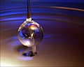
Just oil...by kivgaenComment: Greetings from the Critique Club!
I really like the simplicity of the image and the gradient of color. While the focus is good, the composition seems a little unbalanced to me. I keep tilting my head to straighten out the image.
The shadow is very distracting; shooting from a different angle would have helped to hide it. That, or trying different light setup (reflectors, etc). There are quite a few light spots that I would have liked cleaned up, especially since it was an advanced editing challenge.
I would also have liked to see it as a tighter crop (tighter from the right), with a focus on the beautiful light refractions.
I hope this helps. Feel free to PM me with any questions.
|
| 08/12/2009 08:27:39 AM |
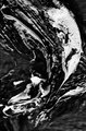
saxjazzby posthumousComment: Greetings from the Critique Club!
I must admit that it is really hard for me to critique this photo as I really, really like it.
Larus's comment captures pretty well what did not work for majority of the voters -- it is a b&w abstract.
I love the sense of movement, the contrast and a superb b&w conversion. I like how the brushstrokes lead my eye through the photo, letting me appreciate the textures of the old oil painting along the way. This is phenomenally moody and poetic photo that unfortunately appealed to a very small number of voters.
|
 Photographer found comment helpful. Photographer found comment helpful. |
| 08/12/2009 08:04:07 AM |
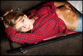
Hard at workby jeroweComment: Greetings from the Critique Club!
I like the idea that you were after. I think you could have pushed this further, I agree with the comments below that she looks too clean for an "oil" challenge. A bit of grease on her face would definitely improve the image. The oil smeared on the stomach looks too staged -- whoever applied it tried to carefully avoid her belly button.
The light on her face is a little harsh for me, as it makes her face too bright as compared to the rest of the photo. There are a few elements in this photo that I find a little distracting -- the harsh shadows on the ground, the silver foil on the model's stomach, her jewelry which seems to contrast with the dirty surroundings.
I really like the angle that you shot from, model's pose and how comfortable she looks in the shot.
I hope this is helpful. Feel from to PM me if you have any questions. |
| 08/12/2009 07:34:45 AM |
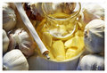
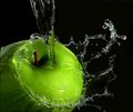
Garlic Oilby indridistefansComment: Greetings from the Critique Club!
I really like the texture of the paper thin garlic skins. I love the natural light here and the focus is spot on. Given that it was an advanced editing challenge, I would have done some dodging of the shadows in the top left.
For me, garlic seem to take over the shot. I think for an Oil challenge, I would have liked to see more emphasis on oil in the picture -- shooting from a lower angle might have worked better here. The texture in the cloth is a little distracting as well as dried up garlic stick. Composition seems a little unbalanced for me -- I would have liked to see it in a tighter crop.
I hope this helps. Feel free to PM me if you have any questions.
|
| Photographer found comment helpful. |
| 08/12/2009 06:36:58 AM |
|
| Photographer found comment helpful. |
| 08/03/2009 02:49:13 PM |
|
| Photographer found comment helpful. |
| 08/03/2009 06:53:50 AM |
|
| Photographer found comment helpful. |
| 07/29/2009 04:43:44 PM |
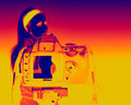
Nikon D40X-RAY by kingskingdomComment: Greetings from the Critique Club!
I must admit that when it came up on my screen, I was shocked by all the colors. In a good way. I love the bold editing.
I think your composition is good. I also like the negative space on the right, there is enough room that neither the model nor the camera feel cramped. I really like the difference in DOF between the model and the photo on the display; it created a nice contrast between the two.
My biggest problem with the photo is that the alignment of the photo on the display is a little off and does not line up with the model (it seems a little high). I would have also liked to see more details on the camera and camera straps, so that the camera straps don't disappear into the yellow background.
You've done a great job with this photo. Feel free to pm me if you want any clarification.
|
| 07/29/2009 02:45:59 PM |
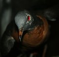
Ectopistes Migratorius (Passenger Pigeon)by danculwellComment: Greetings from the Critique Club and congratulations on your new personal best!
For a second I really thought it was a live bird! I really like how the lighting, DOF and the camera angle draw attention to the eye of the pigeon.
While the square crop works well here, I think a tighter crop might have worked a little better. I like the dark color but the light spots in the background are a somewhat distracting. Given that it was an advanced editing challenge, you could spot edit and tone them down. The grain from high ISO is also most noticeable in those areas.
I think a pass of sharpening on the head would have brought out more details and enhanced this wonderful image.
If you have any questions about this critique, please feel free to PM me. |
| Photographer found comment helpful. |
| 07/27/2009 09:18:13 AM |
|
| Photographer found comment helpful. |
Home -
Challenges -
Community -
League -
Photos -
Cameras -
Lenses -
Learn -
Help -
Terms of Use -
Privacy -
Top ^
DPChallenge, and website content and design, Copyright © 2001-2026 Challenging Technologies, LLC.
All digital photo copyrights belong to the photographers and may not be used without permission.
Current Server Time: 06/26/2026 08:38:54 PM EDT.