| Image |
Comment |
| 03/13/2008 01:37:47 PM |
Hey man don't pollute my world !by StagoleeComment: I like idea but the little oof bump of grass in the foreground is slightly distracting.. and the frog is turned away from the cigarette so they seem to be disjointed from each other and that doesn't go with your title of the frog acknowledging and detesting the cigarette.. Also the colours seem too pale.. bumping them up would have been good for the dpc voters. |
 Photographer found comment helpful. Photographer found comment helpful. |
| 03/13/2008 01:25:21 PM |
|
| Photographer found comment helpful. |
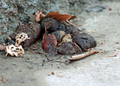
| 03/13/2008 01:23:06 PM |
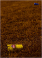
Greenhouse Effectby HeiSchComment: Great use of lighting and colours.. Maybe if you'd chosen to completely crop out the can or incorporated it in the image it would have been better.. The composition seems rather off balance and awkward with it framed like that in the picture.. |
| Photographer found comment helpful. |
| 03/13/2008 01:18:24 PM |
|
| Photographer found comment helpful. |
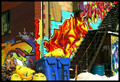
| 03/13/2008 01:16:41 PM |
Sins of The Cityby IvoryComment: Nice presentation of the vivid colours.. The only issue is that the garbage at the bottom is cut off.. just slightly distracting.. |
| Photographer found comment helpful. |
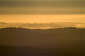
| 03/12/2008 04:12:17 PM |
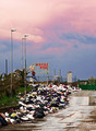
Dusk of a cityby Rino63Comment: I find the image perhaps a tad bit over exposed especially in the area with the garbage which consists of a lot of whites and the contrast is slightly too much.. Not sure about the grain though the colours on the sky look pretty |
| Photographer found comment helpful. |
| 03/12/2008 03:28:24 PM |
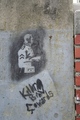
Cowardsby DesperadoComment: On it's own the picture seems almost too random [snapshot-ish].. but it has so much potential .. Firstly, I think, maybe going landscape would have been better.. The picture seems oddly composed because of that.. with the landscape you could have more of the nicely textured negative space.. We could have seen more of the brick wall which would lent more diversity.. Going black and white would have tied the different textures together while bringing them out and highlight the message on the wall more attractively.. |
| 03/12/2008 03:19:05 PM |
I used to be usefullby matrix_morpheusComment: I like the dof and simpleness of the composition here.. The only problem here is the colours.. It all seems a little brown-yellow ish and the contrast of that isn't exciting enough.. |
| Photographer found comment helpful. |
| 03/12/2008 03:16:38 PM |
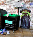
dont pollute feed me!!!by itchComment: The whites seem a bit too over exposed and make me sligthly cross eyed if I look at it too long.. other then that I think you should have added more of the clothes littered all over the floor.. they can definitely add more to your picture's storytelling ability and composition wise.. I think you should have chosen landscape rather then potrait to present your image.. |
| Photographer found comment helpful. |
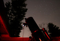
| 03/12/2008 03:10:28 PM |
Light Pollution... The Bane of my Hobbyby jlanoueComment: Composition wise the trees are definitely unwanted but getting rid of them was not exactly not an option :D I think you've been slightly unsuccessful in getting the exposure just right.. The stars are good but the telescope obviously isn't in focus.. I think you should play around with more different lighting and dof's to see what fits you criteria best.. |
| Photographer found comment helpful. |
Home -
Challenges -
Community -
League -
Photos -
Cameras -
Lenses -
Learn -
Help -
Terms of Use -
Privacy -
Top ^
DPChallenge, and website content and design, Copyright © 2001-2026 Challenging Technologies, LLC.
All digital photo copyrights belong to the photographers and may not be used without permission.
Current Server Time: 07/19/2026 03:47:08 AM EDT.