| Image |
Comment |
| 03/18/2008 10:59:08 AM |
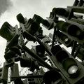
Congestionby spencerwoodComment: Unique idea and a great way of representing congestion.. I find the crop slightly awkward.. I wish the ones nearest the sky were not cut off and had more of the focus.. |
 Photographer found comment helpful. Photographer found comment helpful. |
| 03/18/2008 10:55:36 AM |
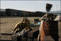
Littered Train Yardby bevilllComment: I think where you're at is a great place(train yard) but you haven't taken advantage of the setup.. The junk takes up too much of the foreground and doesn't frame the background right.. also the light is perhaps a bit too harsh.. |
| Photographer found comment helpful. |
| 03/18/2008 10:50:48 AM |
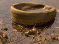
In my drinking water? by KelliComment: I would have liked the picture better if there had been more negative space.. The top half looks a little awkward cut of where it is.. |
| Photographer found comment helpful. |
| 03/16/2008 03:16:04 PM |
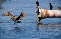
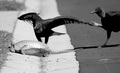
Please don't pollute our home...by RitaDComment: The whites seem just the slightest bit overexposed as if they've been sharpened too much.. I like how you've managed to capture the bird in action alongside the pipe but the composition still seems cluttered.. |
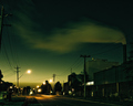
| 03/16/2008 03:14:46 PM |
Toxic hazeby FirstyComment: The editing you've chosen for this perfect.. even though it's a very simple image it's very appealing.. there's something very ghostly about the emptiness of the street |
| Photographer found comment helpful. |
| 03/16/2008 02:18:50 PM |
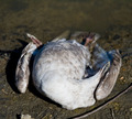
Stop Poisoning Our Lakesby brad177Comment: almost a beautiful image in spite of the gruesome-ness of the subject.. The lighting just starts being a bit harsh around the neck.. This might have looked nicer in duotone or b/w.. |
| 03/16/2008 02:13:48 PM |
Waters Edgeby pillikcamComment: This seems like quite a photogenic place.. It's full of textures and shapes.. The light here is rather harsh.. The bird is almost completely overblown because of this.. I would have liked to have the landscape view here.. it would have shown more context and make the composition seem less awkward.. |
| Photographer found comment helpful. |
| 03/16/2008 02:06:19 PM |
|
| Photographer found comment helpful. |
| 03/16/2008 01:56:22 PM |
Garbageby becky-leeComment: The light seems slightly harsh.. This seems like a great place to take pictures but there doesn't seem to be any actual focal point that could have added more interest.. |
| 03/16/2008 01:48:14 PM |
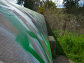
Graffiti Pollutionby MatrimComment: This would have been more interesting composition if there had been something that was being led to by the wall.. instead I end up not paying attention to what should have actually been the focus.. |
| Photographer found comment helpful. |
Home -
Challenges -
Community -
League -
Photos -
Cameras -
Lenses -
Learn -
Help -
Terms of Use -
Privacy -
Top ^
DPChallenge, and website content and design, Copyright © 2001-2026 Challenging Technologies, LLC.
All digital photo copyrights belong to the photographers and may not be used without permission.
Current Server Time: 07/18/2026 06:20:52 AM EDT.