| Image |
Comment |
| 05/25/2002 03:07:00 AM |
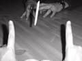
Footballby karmatComment: It's good! Oof foreground kind of works here. On-camera flash is double plus ungood, but you work with what you've got. Cam taped to forehead? |
 Photographer found comment helpful. Photographer found comment helpful. |
| 05/25/2002 03:12:00 AM |
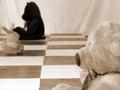
Bears vs. Bunniesby parloriComment: Cute idea. Applaud your patience getting the white squares on your floor. Composition could use a little work - maybe one more bunny and the fg bear one square further back? |
| 05/25/2002 03:28:00 AM |
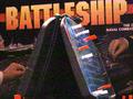
Battleshipby #1 Bronco FanComment: Photography is all about light. Where is it coming from (what kind of shadows does it make)? Is it hard light, like on a sunny day, or soft light like a day with lots of clouds? I like the way you used a light from above to light up the pins in the battleship board. They've got highlights on the top edge and shadows on the bottom, and the clear blue plastic catches the light nicely, too. You might think about zooming in on that for another picture. It looks like you used a high ISO setting for this picture (or the camera picked one for you). With most digital cameras, anything but the lowest ISO setting will not give you very good results. It's better to add more light instead of "turning up the volume" on the CCD by raising the ISO. That's what caused the colored speckles. To make this one better, you might try making it black and white. Then the colored noise will look more like the grain you see on fast black and white film. |
| Photographer found comment helpful. |
| 05/25/2002 02:35:00 AM |
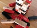
Jenga Dareby mciComment: Looks like fun. Something about the composition bothers me, but I can't put my finger on what it is. Possibly that the top of the tower is only partially visible. Maybe more or not at all would be better. I'd like dare #34 to be right side up, as well. Getting the light source up higher sould have made more natural looking shadows, and lit the tops of the pieces better. Good candidate for B/W. |
| 05/25/2002 02:46:00 AM |
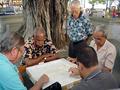
Dominos under the Banya Treeby rampbComment: Nice candid work - great catch on the expressions of the spectator and the player at L bg. Could be half as compressed (looks pretty jpeggy, esp on the board). Did you stretch this vertically to fit the frame? The heads seem elongated. |
| Photographer found comment helpful. |
| 05/26/2002 01:52:00 AM |
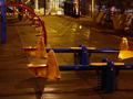
By Nightfall, We're All Grown Upby dequinixComment: Including the bright area at the top of the frame caused the camera to underexpose the foreground, so the area of interest is dark and lacks detail. This kind of shot would be really hard to do right. The see saws aren't very attractive or interesting. I guess from the title that you were going for someting moody here, but I find it more dull than anything else. Sorry. |
| 05/26/2002 01:49:00 AM |
|
| 05/25/2002 02:58:00 AM |
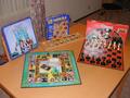
Monopolyby tomlewis1980Comment: Nicely lit and composed. DOF just a little too narrow, IMO, as the bottom of the 100 and the property card are just a bit too soft. Personal preference. |
| 05/25/2002 03:04:00 AM |
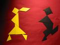
A really old game: Tangrams!by albright1Comment: Nice, simple graphic. More even lighting and an unwrinkled bg might have been more effective. Actually, the lighting kind of grows on me. |
| 05/25/2002 03:14:00 AM |
White to Moveby AndyLeeG4Comment: Very well lit, and I love the board floating in space like that. Maybe a reflector at R to bounce a little light back onto the white pieces? Composition is a bit static. |
Home -
Challenges -
Community -
League -
Photos -
Cameras -
Lenses -
Learn -
Help -
Terms of Use -
Privacy -
Top ^
DPChallenge, and website content and design, Copyright © 2001-2026 Challenging Technologies, LLC.
All digital photo copyrights belong to the photographers and may not be used without permission.
Current Server Time: 07/17/2026 05:03:18 AM EDT.