| Image |
Comment |
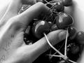
| 06/06/2002 07:02:00 AM |
after schoolby ritaardComment: Great tones and sharpness. An interesting shot, esp. with the indecipherable hand note. Why'd you rotate it? |
| 06/05/2002 11:13:00 AM |
Bubble Makersby rajronComment: Grab that stool and shoot down on them to avoid the distracting bg. Looks a little like the moment before the 'decisive moment'. |
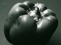
| 06/09/2002 04:15:00 AM |
Westonisedby GordonComment: IMO, the whites could be toned down just a touch - just enough to add a few more speckles of detail in the stem and the highlights at R. A non-textured bg might be better as well. Of course, this isn't really B/W, but voted as if it were. |
| 06/09/2002 04:28:00 AM |
|
| 06/05/2002 10:58:00 AM |
|
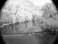
| 06/06/2002 06:43:00 AM |
Crystal Ballby DigipixerComment: Nice IR, and works well with the fisheye to make an 'otherworldly' effect. I'd rotate it CW a little to straighten the horizon and crop out the vignetting. Interesting. |
 Photographer found comment helpful. Photographer found comment helpful. |
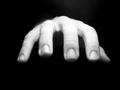
| 06/09/2002 03:33:00 AM |
Zzzzzzzz...by jochenComment: Very nice texture and controlled DOF. Wouldn't be nearly as good without the white at bottom, though I wish it were a little smoother in the shadows or less blown out at LLHC. |
| 06/05/2002 06:54:00 AM |
Not a care in the world...by geekmediaComment: The L is excellent. Very good clarity in that eye, and the addition of the hand is a great touch. The tonality falls apart over on the R, though - just a bit to dark, and lacks contrast particularly around the ear and hair. Tough call... |
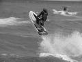
| 06/09/2002 04:39:00 AM |
Flying on the Waterby d95vetteComment: Tack sharp (B/W helps a lot there), and a great catch of the action. Slightly tilted (you could just crop out the horizon to take care of that, or, even better, crop to a vertical to emphasize the jump. The spray at R is good, but you don't need all of it.) Pretty good tones, although I wouldn't mind the whites just a touch brighter, but certainly raisies the question, 'why B/W?'. |
| 06/04/2002 06:03:00 AM |
Easy Lifeby rubadubComment: Needs more brightness. The highlights on the bag are pure white, but the rest of the image is too dark. The man's hair blends into the shadows behind him, and the wall is very flat (tonally). |
Home -
Challenges -
Community -
League -
Photos -
Cameras -
Lenses -
Learn -
Help -
Terms of Use -
Privacy -
Top ^
DPChallenge, and website content and design, Copyright © 2001-2026 Challenging Technologies, LLC.
All digital photo copyrights belong to the photographers and may not be used without permission.
Current Server Time: 07/16/2026 09:47:50 PM EDT.