|
|
|
Showing 211 - 220 of ~707 |
| Image |
Comment |
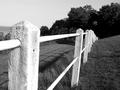
| 06/09/2002 03:50:00 AM | crooked fenceby mnewmanComment: Good subject, and nice tones. Maybe a bit more angle to the fence, to have it complete the diagonal to the URHC? Horizon looks wickedly tilted, but not too noticable. Nice work. |
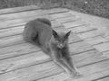
| 06/04/2002 03:22:00 AM | The Grey Catby Pete02tComment: Good focus and nice textures from the available outdoor light. Looks like an overcast day, which can produce vey nice, soft, portrait lighting. Personally, I avoid shooting down on subjects unless the perspective is important to the image. If that's the perspective you wanted, I'd have tried to frame the image to exclude the grass. You could still crop most of it out if you rotated the pic CCW a little. A bit more contrast might help, as well. |
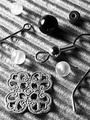
| 06/09/2002 03:38:00 AM | Pieces for One Earringby AmphianComment: Excellent contrast and sharpness here - highlights are bright white, but detail is preserved, and the blacks are nice and dense. Good choise of bg, too. The diagonals add interest to the layout. It does go ever so slightly soft at the bottom (don't mind it at top). |
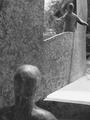
| 06/09/2002 03:49:00 AM | Helloby mattpgaComment: Here's one where an oof element in the fg doesn't hurt (IMO). Very good exapmle of using photography to add something to an existing artwork, and well photographed, to boot. |
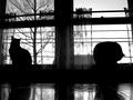
| 06/04/2002 11:18:00 PM | felinesqueby foot stepsComment: Very good exposure and detail. My nit is that the L side is more interesting than the R, but the R upstages it by being so much brighter. I'd have been tempted to crop this to a vertical and only include the L window, as the balled up cat and bouse in the bg don't add much to your composition. There is a nice little gradient to the sky there, though. |
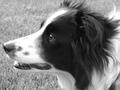
| 06/04/2002 05:57:00 AM | My dog Mollyby RWTaylorComment: This one could use just a little *less* contrast. The hightlights on her muzzle are blown out, and there's no detail in the fur around her eye. Judging from the grass and the fur on her back at the URHC, the focus was behind the subject. Nicely composed, though, and she's a beautiful dog. |
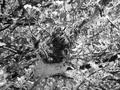
| 06/05/2002 12:02:00 AM | Life Beginsby TiggarrooComment: This would make an interesting abstract if it were a little more vague, but as a nature shot I think the subject is completely overwhelmed by the background. Probably shows better in color. Cropped very tight it might work in B/W. Contrast is very good. |
| 06/04/2002 05:58:00 AM | |
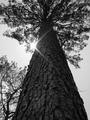
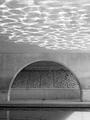
| 06/04/2002 11:39:00 PM | Reflections on Brush Creekby AndyLeeG4Comment: Nice, simple geometry and very nice reflections - you have the knack of thinking in B/W. The patch of sunlight on the water at R is a shame. I can't help but wonder how this would look from the other side of the creek. |
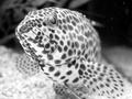
| 06/06/2002 12:58:00 PM | I look cool... don't I?by fsieradzkiComment: Yes, you do. Out in the world you could clean up those specks at UR. Maybe darken up his spots a little. Great composition, light and focus control. |
|
Showing 211 - 220 of ~707 |
Home -
Challenges -
Community -
League -
Photos -
Cameras -
Lenses -
Learn -
Help -
Terms of Use -
Privacy -
Top ^
DPChallenge, and website content and design, Copyright © 2001-2026 Challenging Technologies, LLC.
All digital photo copyrights belong to the photographers and may not be used without permission.
Current Server Time: 07/17/2026 12:31:20 AM EDT.
|