| Image |
Comment |
| 04/18/2006 09:03:14 AM |
Ummm.... Coffee!by ewillisonComment: I like the background colour choice, the picture overall. My only nitpick would be to make the colour of the coffee darker, more appealing. |
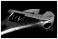
| 04/18/2006 09:00:42 AM |
Wrenchby MontagueComment: The darker tones and sharp contrast create the industrial feel to work perfectly with the subject. |
 Photographer found comment helpful. Photographer found comment helpful. |
| 04/18/2006 08:56:28 AM |
|
| Photographer found comment helpful. |
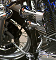
| 04/18/2006 08:47:59 AM |
Horns of Plentyby kawesttexComment: IMO, perfect dof to make the chrome pop while keeping the wheel in the background yet still recognisable as part of the whole. The colours add the perfect accent and any reflections aren't distracting. My top pick so far :) |
| Photographer found comment helpful. |
| 04/18/2006 08:44:11 AM |
Chrome Catch by TransitComment: Now I'm glad I didn't do the fishing lures; you did it so much better! |
| Photographer found comment helpful. |
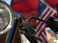
| 04/18/2006 08:42:37 AM |
American Chromeby swankFotoComment: I'd like to see more focus and light on the chrome itself for this challenge. The headlight catches my eye and is well done re: focus and lighting. |
| Photographer found comment helpful. |
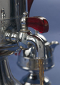
| 04/18/2006 08:39:36 AM |
Chrome Logoby TullyComment: Personally, I don't care for the reflections. I find myself spending more time trying to figure them out than looking at the logo, which is very nice against the black. If the reflection tied in that would be okay, but it isn't associated to the image. Just MY reaction :) |
| Photographer found comment helpful. |
| 04/18/2006 08:36:59 AM |
The Boxby vixenComment: It's a very cool box,fits the challenge, but a different angle may have made it more interesting. Shallower DOF would keep our attention on the box instead of trying to see what else is in the background. :) |
| Photographer found comment helpful. |
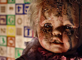
| 04/13/2006 07:41:35 PM |
Untitledby RyShuComment: This was one of my top-scorers. Personally I LIKE the choice of background, I think because it makes it scarier to think of it actually IN some child's nursery/playroom.
Then again, I'm known for going to thriftshops looking for dolls I can mutilate.... working on using a head for a Halloween fountain with blood coming out of the orifices...) |
| Photographer found comment helpful. |
| 04/13/2006 07:32:49 PM |
|
| Photographer found comment helpful. |
Home -
Challenges -
Community -
League -
Photos -
Cameras -
Lenses -
Learn -
Help -
Terms of Use -
Privacy -
Top ^
DPChallenge, and website content and design, Copyright © 2001-2026 Challenging Technologies, LLC.
All digital photo copyrights belong to the photographers and may not be used without permission.
Current Server Time: 07/20/2026 06:41:10 AM EDT.