| Image |
Comment |
| 12/01/2006 06:12:36 AM |
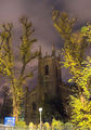
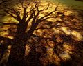
midnight chiorby GrandadComment: Three things hit me immediately - the blue sign, the road sign and the lens flare. I'm sure you know these are problems so I won't dwell on them.
The church is nicely framed by the trees, nicely lit and sharp. |
 Photographer found comment helpful. Photographer found comment helpful. |
| 12/01/2006 06:10:28 AM |
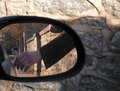
You going my way?by perotyComment: Do you know what really draws my eye - the writing on the mirror.
Overall the image is a little uninspiring, so lets examine it and work out what the various problems are.
The mirror is where you want the viewer to look I guess, so why have such a big area of wall in the frame? zoom in and get rid of unwanted space. Especially that ugly dark shadow.
Now the refelction. The hand is really not sharp, but thats your main subject. There is a stray hand just half in the mirror, you need to ensure that small problems are dealt with at the time of shooting.
The writing on the mirror ... theres not much you can do about that except use a different mirror or clone it out in PS. However, it IS distracting. The other option you could have gone for would be to make the writing THE central theme by making thats sharp and contrasty whilst the other elements recede.
As it is there are lots of learning points to work on here. |
| Photographer found comment helpful. |
| 12/01/2006 06:02:32 AM |
Macy's Parade Allstarby BanksonComment: Its always difficult to get good shots of these events. I tend to get there early and look for somewhere with a nice plain background, something which will not distract from the main activities.
In this you can see the background is a real competitor for the viewers eye. The colours clash (purple and green/orange), the lamp is another difficulty, but the bright face (left) and head (right) are the main problems. These need to come out or better still not included in the first place.
The main subject is nice and sharp, colourful and you caughtthe action just right. The next step is to think a little more about positioning yourself and anticipating the shot. |
| Photographer found comment helpful. |
| 12/01/2006 05:57:24 AM |
Preserving The Pastby BrianRComment: Nice sharp image. One of my pet hates is images which slant. Why not either straighten in post processing or hold the camera straight in the first place.
Compositionally you also chopped off the front wall at the left.
From a competition perspective these are cardinal sins and would be marked down severley. In DPC it will get away with such errors, but you should be made aware to help you in your next submissions. |
| Photographer found comment helpful. |
| 12/01/2006 05:51:29 AM |
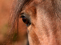
The Eye of Amadorrby sfmorrisComment: I like horse pictures, especially close-ups. One thing which is absolutely neccessary though is to manage the dof to make sure the main features are sharp. You have tried to put the viewers attention on the eye, but then left half the image on the right as a blank out of focus area. This part either needs cropping out or need to be pin sharp.
I would probably opt for cropping, moving the eye to the right 1/3 line and giving the viewer a little more space to the left of the hair. |
| Photographer found comment helpful. |
| 12/01/2006 05:48:14 AM |
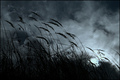
about a horrible Wednesdayby gazdiComment: I guess I should comment on this as its the sort of image many people will struggle to say anything about.
It conveys a gloominess, a dark mood, the title backs this up well. However, as a technical image it starts to struggle after this. There is not much to keep the interest of a viewer, nothing to make me wonder why you want to convey this gloominess. Its a 'OK lets move on' sort of image.
It is sharp enough and composed reasoably well. I just question whether its a 'competition' image. |
| Photographer found comment helpful. |
| 12/01/2006 05:43:55 AM |
Girl in a Pink Beretby SaraRComment: Shocking Pink draws the eye ;-)
I quite like this, but worry about the harsh lighting, especially the deep shadow to the right of her nose. Maybe a bounce or reflector might have softened that a little. |
| Photographer found comment helpful. |
| 12/01/2006 05:42:12 AM |
~FALL~by Prime_TimeComment: Nice idea, not sure you made the best use of this subject. It needs something up in the right corner to balance the image, maybe an older couple walking a dog, or a kid playing. As it is its just a little monotone. |
| Photographer found comment helpful. |
| 12/01/2006 05:39:49 AM |
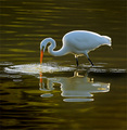
Early Birdby BrennanOBComment: Nice colours and reflection. Maybe a little detail lost in the feathers, but still beautiful |
| Photographer found comment helpful. |
| 12/01/2006 05:39:02 AM |
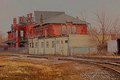
Potter Street Stationby bmartuchComment: The composition worries me here. The building is facing left and the way you have cropped this just hems it in a little too tight on the left edge. Whilst on the right you have tried to get the sweep of the track, but have left a wide open space behind the building.
I'm not sure if you could have moved further back and used a longer lens to get the sweeping track and then have the building positioned more to the right of frame.
As it is everything is crowded into the left 2/3 of the image. |
| Photographer found comment helpful. |
Home -
Challenges -
Community -
League -
Photos -
Cameras -
Lenses -
Learn -
Help -
Terms of Use -
Privacy -
Top ^
DPChallenge, and website content and design, Copyright © 2001-2026 Challenging Technologies, LLC.
All digital photo copyrights belong to the photographers and may not be used without permission.
Current Server Time: 07/17/2026 08:18:03 PM EDT.