| Image |
Comment |
| 10/14/2005 06:04:11 PM |
|
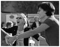
| 10/14/2005 06:03:51 PM |
Friendsby BradComment: Nice, love the close crop and the way the background is nicely blurred. Only one small crit and thats the old lady in the back, just a second later and she would have been out of the image. As it is she pulls the eye away from the main subject just a little too much. |
 Photographer found comment helpful. Photographer found comment helpful. |
| 10/14/2005 06:01:45 PM |
Be in awe of nature - You're part of itby saintaugustComment: I guess you are pushing the envelope here, for my interpretation of celebration anyway. I can see what you are trying to say and appreciate you are trying to differentiate your interpretation from the majority.
Unfortunately the image you have decided to use is fairly lacking in a main focal point, which means the viewer can safely skip over this without having to really look at it. My guess is its probably running at 5 to 5.5, and thats probably fair. |
| Photographer found comment helpful. |
| 10/14/2005 05:58:00 PM |
|
| 10/14/2005 05:56:15 PM |
|
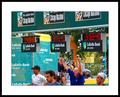
| 10/14/2005 05:55:35 PM |
Celebrating a Goal - Jumping for Joyby brens29Comment: Very strangely structured image. Your title makes me think that the kid jumping is whaere I should be looking, but he's placed too near the edge of frame to be the real subject. The other two kids have faces turned away and so neither of them can provide the main subject for me. So that leaves the ball, but that tends to get lost against the complex background.
Nope my eye still keeps jumping around all those places it just won't rest.
Try to keep an image simple, provide one place for the eye to rest on. In this case simply the kid jumping in close-up would have been my choice of image.
Hope that means something, and you don't see it as simply dissing your image. |
| Photographer found comment helpful. |
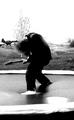
| 10/14/2005 05:50:08 PM |
Celebrate all 16 years of youth and punk rockby 4forfunComment: The place where my eye comes to rest on this image is the houses in the background. Thats the most restful place, and I guess not what you wanted.
Botton of the image has a solid black shadow which could be cropped off. White areas have blown out and could do with some detail (I know you probably meant this to be contrasty, but it doesn't work for me) |
| Photographer found comment helpful. |
| 10/14/2005 05:47:18 PM |
|
| Photographer found comment helpful. |
| 09/27/2005 07:51:10 AM |
|
| 09/27/2005 07:49:31 AM |
Good Evening Chicagoby beatles1-1Comment: nice colours, horizon falls off to right, needs foreground interest, boat is confusing the background, image does not use full 640 px - other than that 'nice' - 6 |
Home -
Challenges -
Community -
League -
Photos -
Cameras -
Lenses -
Learn -
Help -
Terms of Use -
Privacy -
Top ^
DPChallenge, and website content and design, Copyright © 2001-2026 Challenging Technologies, LLC.
All digital photo copyrights belong to the photographers and may not be used without permission.
Current Server Time: 06/11/2026 08:06:35 PM EDT.