just do-it like Terryby
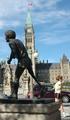
clictacameraComment: OK lets have a good look at this image and try and work out ways of improving elements of it which will help you in future.
1. The most obvious thing for me is the statue, thats the main element in the photograph, so we should try to emphasise that a little more. The statue is actually quite dynamic, in that the figure is depicted as walking, so give it some room to walk into ... move the statue to the right hand side of the frame.
2. In order to empahsise the statue you have to make the background less cluttered. The eye and the viewers brain usually likes things simple. So next thing - the cars, they have to go. Try and get there early before the traffic builds up or the tourists arrive. I know thats not easy, but it pays off so many times. Photography = Early Mornings (at least for me)
3. The Parliament building and the lamp post. OK the Parliament building is part of your 'theme' and therefore needs to have a little more prominence. By moving the statue to the right to make space for the figure to walk into you have also made room for the tower, and best of all with 2 or 3 steps left you might also be able to hide the lamp post behind the statue. This would help with reducing the 'clutter'. Of course you could always decide to throw all the background out of focus and gie just a faint impression that the Parliament Building was there by shape and colour. The other way of getting rid of the cars is to take the shot from a slightly lower angle, which would put them behind the statue plinth - bend down a little.
4. The jogger. I like the inclusion of the jogger, but the main problem is she has her back to the statue, again give her some room to move into. Place her over to the left of the frame.
5. Lighting. I'm guessing this is mid morning or mid afternoon. The light is high up and left. Now by visiting this in the early morning/late evening you would get a more horizontal light which would pick out the textures and detail in the building. It might if you are lucky also light up the statue. Morning and Evening light has a beautiful 'warm' quality which also helps the final image.
So next time take a good look around the frame before you press the shutter, consider what your main element is and frame it to best advantage. Try to remove as much background 'clutter' and get up early ;-)
Hope that helps some.
Good Luck everyone.
Keith