| Image |
Comment |
| 08/15/2006 10:19:20 PM |
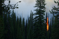
Fischer Creek Fireby die2boardComment: Eeek. I hope everything was okay.
Visually not too bad of a shot.. good colors and contrast. I love the deep, rich greens.
I think that the fire does not have enough focus however. When I look at this I see a nice photo of trees that happen to be on fire, instead of seeing "fire". Maybe a different cropping would have helped this - personally I would have been interested to see it cropped just to the left of the tree in the foreground (the one to the left of the fire area) to form a portrait-orientation, with the fire as more of a major element.
But then again, I think that so far I've seen a lot of shots of just fire. The fire in these shots is perhaps more dramatic visually but the fire does not have a context to provide any impact in my mind. This photo, however, will definitely stay with me. It makes me appreciate the *potential impact* that this fire could have on *all* that is around it, thus making the trees a hugely important part of this shot.
I thought I was going to mark you down and I am so glad that I took longer to think. Thank you for sharing this image. |
 Photographer found comment helpful. Photographer found comment helpful. |
| 08/15/2006 10:11:59 PM |
She Hates To Be Betrayed by De SousaComment: Hm, I'm a little confused by this shot and title... but visually, it is a good image. I think it is composed well, and looks like a very artistic shot but one that manages to keep from looking too set up. |
| Photographer found comment helpful. |
| 08/15/2006 10:09:11 PM |
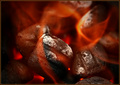
• Incandescent •by Bear_MusicComment: I find the border a bit off as a more orange or red tone would have complimented the photo more. But that is just a nitpick. Regarding the image, I love how you have captured the sharp detail in the coals and a soft, abstract quality to the flame. I really like that balance. |
| Photographer found comment helpful. |
| 08/15/2006 10:07:49 PM |
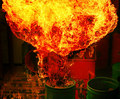
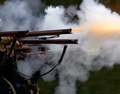
Boom!by bvoiComment: I love the way the flame made such intricate patterns. Very dramatic image. |
| Photographer found comment helpful. |
| 08/15/2006 12:29:49 AM |
|
| Photographer found comment helpful. |
| 08/14/2006 09:21:40 PM |
|
| Photographer found comment helpful. |
| 08/14/2006 08:07:12 PM |
Electric Fire Powerby RUEDISCHMUTZComment: A little bit more contrast between subject and background colors may have helped. Otherwise I think this is great - it seems alive with motion, as if the cord is being dragged along the floor. You captured "fire" in a creative and beautiful way. |
| 08/14/2006 08:05:21 PM |
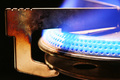
Heatby gregaRComment: It's neat to see an image with blue flame instead of red/orange/yellow. I like the pattern of colors on the left corner of the metal - but unfortunately, the beauty of it distracts my eye from the flame. I think that could be just me, though; I think overall the composition is good. |
| Photographer found comment helpful. |
| 08/14/2006 08:03:24 PM |
Beginning of the Endby ImagineerComment: This is a very creative shot... um.. photo. A very creative photo. :-) I like the colors in the background as well as the cut-off composition. An all around great job in my opinion. |
| Photographer found comment helpful. |
| 08/14/2006 08:01:52 PM |
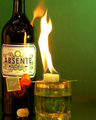
Burning the green fairyby bryantbusComment: Something about the composition seems a bit off. Maybe with the flame in the location it is in, there is more attention drawn to it - but with the brightness of the flame I think anywhere it is positioned would have worked. I don't know what type of composition I would prefer.. it just seems off. If I could put my finger on it I might mark down for it but as it stands now I will not. There is haloing around the glass and bottle and while not immediately obvious, it is noticable.
I like the colors - no, I adore the colors. I also love how the flame seems to be coming from the glass as well as the bottle. The lighting is good too, and while some people might not prefer the flash reflection on the bottle I think it adds a nice touch. |
| Photographer found comment helpful. |
Home -
Challenges -
Community -
League -
Photos -
Cameras -
Lenses -
Learn -
Help -
Terms of Use -
Privacy -
Top ^
DPChallenge, and website content and design, Copyright © 2001-2026 Challenging Technologies, LLC.
All digital photo copyrights belong to the photographers and may not be used without permission.
Current Server Time: 07/17/2026 01:38:30 PM EDT.