| Image |
Comment |
| 05/16/2007 12:45:17 AM |
D.O.by undieyatchComment: To me this doesn't fit the challenge as much as some other entries I have seen. I really love the contrast though - you did a very good job with that. |
| 05/16/2007 12:32:09 AM |
|
 Photographer found comment helpful. Photographer found comment helpful. |
| 05/15/2007 11:18:17 PM |
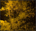
Deranged Psychotic Linensby DefyTimeComment: With this type of photographic technique it is so easy to let things get too orange. I've learned that using selective color to darken the blacks and whiten the whites helps a lot, as well as using levels to balance out the too-orange feel. Overall though I like this! Composition especially is nice. |
| Photographer found comment helpful. |
| 05/15/2007 11:18:12 PM |
|
| Photographer found comment helpful. |
| 05/15/2007 11:17:43 PM |
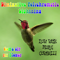
drugs.porn.liquor.by meneleComment: Font = amazing. I think the band Like Summer used or used to use it, and... hm wait a minute, I think they might have even used the dot things too. Weird... 'cause it's not a very well-known band. |
| Photographer found comment helpful. |
| 05/15/2007 11:16:25 PM |
|
| Photographer found comment helpful. |
| 05/15/2007 11:16:10 PM |
|
| Photographer found comment helpful. |
| 05/15/2007 11:16:06 PM |
|
| 05/15/2007 11:15:49 PM |
|
| Photographer found comment helpful. |
| 05/15/2007 11:15:45 PM |
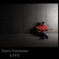
Data Processing Logicby splidgeComment: Awesome. A photo that has a graphic-design-ey feel... Don't know if this makes sense but, I want to say that this stands out from a lot of others because it looks like it was just MADE to be an album cover, instead of an album person just happening to pick a picture that fit. |
| Photographer found comment helpful. |
Home -
Challenges -
Community -
League -
Photos -
Cameras -
Lenses -
Learn -
Help -
Terms of Use -
Privacy -
Top ^
DPChallenge, and website content and design, Copyright © 2001-2026 Challenging Technologies, LLC.
All digital photo copyrights belong to the photographers and may not be used without permission.
Current Server Time: 07/24/2026 05:21:10 AM EDT.