| Image |
Comment |
| 07/27/2007 01:20:57 PM |
|
 Photographer found comment helpful. Photographer found comment helpful. |
| 07/27/2007 01:13:27 PM |
Study in Shape and Formby SaraRComment: This is fantastic. I have no idea what it is, but I really want to! I'll check your comments after the challenge. So far, this is one of my favorites. My only complaint is that I think I would prefer a bit more contrast. |
| Photographer found comment helpful. |
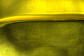
| 07/27/2007 01:11:59 PM |
Crescendoby IreneMComment: Ah, the old paper shot. This is well done and different from any others that I can recall at the moment. I like the composition a lot. The yellow is a bit brownish and not so appealing in the top left. Perhaps a little more light there might have helped. There also appears to be quite a bit of banding in that area. |
| Photographer found comment helpful. |
| 07/27/2007 01:07:21 PM |
Growing in Stepsby ShangoYComment: This is a cool idea and well executed, but I think it needs a bit of help in the processing. I would like the circle to be closer to white, and I think it needs more contrast. |
| Photographer found comment helpful. |
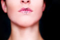
| 07/09/2007 04:26:49 PM |
Lipsby lovethelightComment: This is a cool idea. I like it. Since you asked for feedback, I'll lay it on ya!
Good things:
The general concept is great. I like the idea of interesting lips and/or funky things on the lips.
Cool color and processing in general.
Things I would change:
DOF seems way too shallow to me. I generally love a super thin DOF, but I think it's too thin here. I would prefer to see all of the lips nice and sharp. As it is, the corners of the mouth are already out of focus.
I think I would like to see a little bit more of the nose just to give the nostrils a bit more context.
The pose is begging to be symmetrical, yet it isn't quite. It looks like it was supposed to be and you missed by a bit.
I think that's it. Don't get me wrong regarding the changes above, I think it's a great photo! |
| Photographer found comment helpful. |
| 06/27/2007 12:08:59 AM |
• untitled •by Bear_MusicComment: This is fantastic. One of my 2 10s in the challenge. I didn't make it back to comment before rollover, so here it is now. Great job! This is a truly beautiful abstract. You was robbed, man! |
| Photographer found comment helpful. |
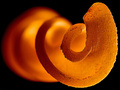
| 06/26/2007 11:57:45 PM |
Proboscisby MCsabaComment: This is very well done. It looked like a curled up orange peel at first, but the more I stare at it the less I think that's what it is. Great color, lighting, and focus. Nice title, too. |
| Photographer found comment helpful. |
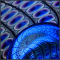
| 06/26/2007 01:29:29 PM |
Fantasy in Blue by wildirisComment: Unless 2 different people in the world have this same object and they are both on DPC taking abstract macros of it, this would be a wildiris shot. I'll assume it is. If you are not wildiris, sorry! I like your shot from Abstract Macro II better, mainly because it is so sharp. The composition here is good, but the color and sharpness of the other one are better. Oh yeah, my guess. It's whatever you said it was in the notes on the other shot! A bit of glasswork as I recall? |
| Photographer found comment helpful. |
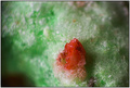
| 06/25/2007 01:50:34 PM |
Tiny Bit of Joyby ShaneBlakeComment: Fantastic. I haven't had any in a long time, but that sure looks like an Apple Jack to me! |
| Photographer found comment helpful. |
| 06/21/2007 01:53:23 PM |
|
| Photographer found comment helpful. |
Home -
Challenges -
Community -
League -
Photos -
Cameras -
Lenses -
Learn -
Help -
Terms of Use -
Privacy -
Top ^
DPChallenge, and website content and design, Copyright © 2001-2026 Challenging Technologies, LLC.
All digital photo copyrights belong to the photographers and may not be used without permission.
Current Server Time: 06/12/2026 12:33:44 AM EDT.