|
|
|
Showing 311 - 320 of ~1053 |
| Image |
Comment |
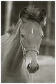
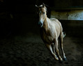
| 09/07/2008 01:14:29 AM | Portrait of a Future Championby CitadelComment: **Critique Club**
First off, good choice with the B/W. It certainly draws the attention to the horse himself. It also emphasizes the fantastic sharpness of face/eyes/etc. I think the DOF is just perfect. As you can probably tell by the score breakdown, this is a good shot. In other words, most thought it was good, fewer thought it was great and fewer thought it was poor.
I think that the main things holding this image back from a higher score would be the composition and the contrast. Specifically, I think (as did some of your commenters) that more contrast would be preferable (especially, I find, with B/W images), and the composition isn't very dynamic (just a bit off center). Also, there isn't really any emotive element. That isn't necessarily a bad thing, just something that might give the score a little boost.
Overall, I think it's a decent image and it scored fairly well. Good job!
Please PM me if you have any questions or comments.
Nathan |  Photographer found comment helpful. Photographer found comment helpful. |
| 09/07/2008 12:50:45 AM | Il prigionieroby Rino63Comment: **Critique Club**
As an ignorant viewer, I can understand why this image received the score that it did. I had to look up the title myself. Knowing (now) what the title means, I can see the shot in a different light and I find the concept beautiful. Unfortunately, I doubt most voters who didn't understand the title took the time to look it up (or really look at the image) to help them truly understand your meaning. I'm pretty sure you also got hit by the "I see some noise, and I don't like it." crowd.
Overall, I'd say this is a beautiful, intelligent entry that just wasn't DPC-friendly enough to hit the 5+ mark. I say great work, and keep 'em comin'!
Please PM me if you have any questions or comments.
Nathan | | Photographer found comment helpful. |
| 09/07/2008 12:23:33 AM | I breathe the windby alexjackComment: **Critique Club**
Beautiful image. As I see from your photog comments, you knew going in that this was probably not super DPC-friendly. I'm always very pleased when someone enters a shot that he/she likes knowing it may not be the bee's knees (to the masses). Enter what you love, I say. If it turns out to be popular, so be it. If not, at least there will be some that share your vision (as evidenced by the commenters average!).
Personally, I really like various aspects of this shot. The B/W looks great (I'm a sucker for high contrast), I love the tight crop, and the selective blur/sharp works like a charm. Really the only thing I don't like is the border. It's close, but not quite right. I would have made the top and bottom black bits larger (so as to emulate a wide screen movie look a bit more).
All in all, a fantastic job. Keep on keeping on. Now I'm off to browse your portfolio a bit more!
Please feel free to shoot me a PM if you have any questions or comments.
Nathan | | Photographer found comment helpful. |
| 09/04/2008 04:27:41 PM | Tableau by BrinComment: **Critique Club**
I think you might have found yourself a decent image, here. :)
You're no stranger to the DPC-friendly formula of beautiful landscape/sky with a captivating subject in the foreground, and you have executed this one flawlessly. The colors are fantastic, and the composition is just perfect.
You've got mad skillz, what else is there to say?
Do you have any advice for me? :)
Nathan | | Photographer found comment helpful. |
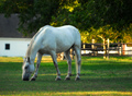
| 09/04/2008 12:00:55 PM | American Creamby PatsfanComment: **Critique Club**
First off, this is a very pleasing image. I like the sense of tranquility created by the whole scene. I can imagine sitting in the grass on a cool evening just watching this guy wandering and grazing. I'm not usually a fan of horses in general, but this is well done and would have garnered a 6 from me had I voted. I think for the DPC masses, a 5.76 is a very good and appropriate score for this shot.
If I were to try to improve the score, there are a couple of changes I would make. First, the horse is obviously the center of attention, and the surrounding area helps set the mood, but it is a bit distracting in a couple of places/ways. I would recommend cropping out the brighter grass at the very bottom of the image and cloning out (or not including in the first place) the black rectangle in the water on the left. Your processing looks really good except for the (to me) overly saturated yellows. This shot would probably look really good as a B/W or duotone even.
Overall, great job!
Please feel free to shoot me a PM if you have any comments or questions.
Nathan Message edited by author 2008-09-04 12:36:48. | | Photographer found comment helpful. |
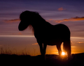
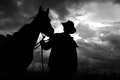
| 09/03/2008 03:23:42 PM | Against An Angry Skyby LadyKComment: **Critique Club**
Well, I think you already know that this is a great image. A well executed silhouette can certainly score highly, and a nice dramatic sky never hurts! I really like the angle from which you were shooting. It helps give a sense of the majesty of the cowboy and horse. I think the emotive quality that this image exudes helped propel it to the top as well. Even in silhouette it's obvious that the cowboy is communing with his steed. The B/W was a great choice and an excellent conversion.
If pressed to try to make the image even better, I would probably change a couple of things. There was certainly a very high dynamic range in the scene, and a bit of HDR or shadow/highlight might have helped even out the darkest darks and the little bit of blown out sky. Also, on the processing side of things, it would be interesting to try warming it up with a touch of sepia (or similar) colored duotone. I think just a hint of that yellow/brown would punch it up a bit.
I see from your comments that there were mixed feelings about the composition. Put me in the camp of the "too much empty space on the right". I think putting the cowboy closer to the thirds line and having a little more horse in the shot would give it more balance.
Congrats on your top 10 and new PB! It's really a great image all around.
If you have any questions or comments, please feel free to shoot me a PM.
Nathan | | Photographer found comment helpful. |
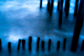
| 09/03/2008 10:28:37 AM | stalwarts of the deepby krnodilComment: I knew I recognized this image when I stumbled across it again today! I gave you a 9, by the way. I just love the soft blues. Sent you a PM about the zone plate. :) | | Photographer found comment helpful. |
| 09/01/2008 12:04:39 AM | Rioby ace flymanComment: Fantastic! Really well done. I knew this was the one! Congrats on your new PB and top 10! | | Photographer found comment helpful. |
| 08/29/2008 03:48:40 PM | |
| 08/27/2008 10:36:31 AM | the closed doorby magenmarieComment: Fantastic shot, Magen! You were one of my 2 10s in this challenge. I absolutely love it! | | Photographer found comment helpful. |
|
Showing 311 - 320 of ~1053 |
Home -
Challenges -
Community -
League -
Photos -
Cameras -
Lenses -
Learn -
Help -
Terms of Use -
Privacy -
Top ^
DPChallenge, and website content and design, Copyright © 2001-2026 Challenging Technologies, LLC.
All digital photo copyrights belong to the photographers and may not be used without permission.
Current Server Time: 06/11/2026 01:23:22 PM EDT.
|