| Image |
Comment |
| 02/22/2006 04:41:43 AM |
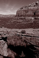
Devil's Bridgeby LoudDogComment: I don't like the framing. The mountains in the background draw away the attention from the main subject. |
 Photographer found comment helpful. Photographer found comment helpful. |
| 02/22/2006 04:18:32 AM |
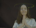
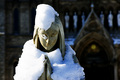
Sevenly Virtuousby MistyMuckyComment: I know, it looks a bit grey and blurred. I thought it could pass as a touch of heaven or something like that, but not a lot seemed to see it this way. I used a flash for lighting up the face and a reflector bound to a thin thread, rotating around her head and illuminated by a weak halogen lamp. This was my mistake because I set the white balance on flashlight and the portrait had a strong yellow cast. When I corrected that on the computer, the hallow was barely visible anymore and I had to apply a lot of filters which gave this blurr and greyish tone!
If I have ever again to make a picture of a halo again, I will rotate a light source instead of a reflector and it should work fine. |
| 02/21/2006 11:32:25 AM |
|
| Photographer found comment helpful. |
| 02/21/2006 11:29:34 AM |
My Moneyby ThunderSkyEyesComment: I don't like the colours. I would have put the dark cloth further away, to blurr it and increased the depth of field to get the hand sharp. |
| 02/21/2006 11:27:24 AM |
|
| Photographer found comment helpful. |
| 02/21/2006 11:21:27 AM |
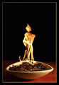
The Guardian! by Ecce_SignumComment: This flame looks terrific, it's my favourite! Was it just luck or uncountable shots? |
| Photographer found comment helpful. |
| 02/21/2006 11:13:01 AM |
|
| Photographer found comment helpful. |
| 02/21/2006 11:09:37 AM |
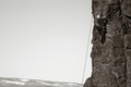
Fortitudeby fluxnComment: Would a colour picture not be better? As the climber is the subject, I would have tried to get a good contrast between him and the wall. |
| Photographer found comment helpful. |
| 02/21/2006 09:34:00 AM |
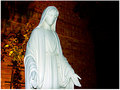
Mary full of graceby garrfosterComment: The lighting is not very good, IMO. I would have used a weaker flash to illuminate the statue only + a long exposition time if you want the background as well. |
| 02/20/2006 03:53:02 AM |
Faith by mciComment: Perfect execution. But a bit cheesy for this subject... 8 |
| Photographer found comment helpful. |
Home -
Challenges -
Community -
League -
Photos -
Cameras -
Lenses -
Learn -
Help -
Terms of Use -
Privacy -
Top ^
DPChallenge, and website content and design, Copyright © 2001-2026 Challenging Technologies, LLC.
All digital photo copyrights belong to the photographers and may not be used without permission.
Current Server Time: 07/17/2026 06:59:08 AM EDT.