| Image |
Comment |
| 01/15/2003 06:19:06 PM |
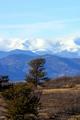
Hop, Skip and a Jumpby rll07Comment: The mountain with the clouds are realy great and are an eye catcher. However, they are too bright to be able to see any details and the various things in front of them (bush, tree, the powerline and the hills) attract the viewers attention, although they shouldn't. It's a little soft too. Still a great piece of nature you captured. |
| 01/15/2003 06:13:32 PM |
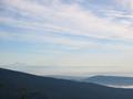
Mount Bakerby lamentComment: the picture has some very interesting parts: the mountain range in the back, the mountain at the right with the low clouds and the nicely structured clouds of the sky. However the woods in the front (also the treetop to the left) attract the viewers eyes first and because they are not so interesting, the viewer has to search for what he should look at. Also it could be darker. Then some nice orange colors of the sky would get visible (I have a laptop on which I simply tilt the screen to see how brightness variation alter the apperence of an image). |
 Photographer found comment helpful. Photographer found comment helpful. |
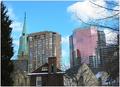
| 01/15/2003 06:05:16 PM |
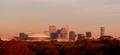
On a clear day...by decoteauComment: Now that's what I call cityscape: the view is awesome. The buildings are arranged like the trees of a small forest or it looks like a small hill. Cropping is a little tight, but I guess that the effect mentioned above would otherwise be disturbed by bulidings on the left or right. I have a little problem with the color though. Too brown/orange to me. This is probably the result of the sunset, but because it's not obvious to the viewer, it feels somewhat un-natural. Still a great cityscape and the best example that cityscapes fit the challenge. |
| Photographer found comment helpful. |
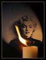
| 01/15/2003 03:27:08 AM |
Candle in the Windby Harz_JoergComment: Thanx Betty and James for your nice comments and also Justine for your critique.
As written by me before, I'm very happy with the result and when I look at the Top 10 I don't feel my picture would belong there. And being on place 11 or 28 does not matter much to me. As jusitne said: it was a strong and fun contest. And my submission did a lot better then I thought!
Jörg |
| 01/13/2003 12:01:41 PM |
Lanscape became Cityscapeby jgillardComment: I like the variety of buildings in your cityscape, it's almost like a historical review with the old church and the brig house, the older and the new office building. Also the trees frame the picture well. They are of course needed to make it fit to the title of your submission. Sky fits well too.
My major concern with this image is that it is very tight, i.e. all elements are so close together and fill the whole picture that there is no space. IMO space is an important element in landscape pictures. A wide-angle shot or a shot from the distance would have probably reduced this issue. Colors could be stronger too (or maybe B&W?!).
|
| Photographer found comment helpful. |
| 01/13/2003 05:37:28 AM |
High Jumpby imagesloyolaComment: Oh man, why is it so small? Could be a winner because of it's wonderfull colors and composition. But it's hard to see something! Still thumb up from me. |
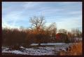
| 01/13/2003 05:26:19 AM |
Down On The Farmby GekkerComment: The scenery, especially the center tree is great. Like the cow too. Could be brighter though |
| Photographer found comment helpful. |
| 01/13/2003 02:08:33 AM |
Candle in the Windby Harz_JoergComment: Thanx for the many nice comments and for making it the best candle shot!
This was more or less a last chance submission, I wanted to do something different on the last day of the challenge. Didn't find the time.
I was also pretty sure that this woudn't be the only submission and that people would vote the picture down after they already looked at several ot them. So 28th place is great and I'm very happy.
This was acctually the 16th shot after everything was set right. I couldn't get a nicer flame in the 80 shots afterwards.
Thanx also for the comments on the border: the color is from the flame, but from an outer part, not from the brightest region. A darker inner line could is nicer though, tried it later.
I realized that the flame didn't illumnitate MM correctly (see comment of johnny) only after the submission. However, it wouldn't have worked with the flame covering the bright part of the MM-picture. So I was lucky.
So once again, I'm very happy,
Jörg
|
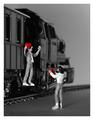
| 01/12/2003 06:56:26 AM |
Keep My Heartby Harz_JoergComment: Thanx ambaker an all other for you comment and critique.
Setting the light was for sure the hardest problem of the picture and could have done better. The train itself is illuminated by the light reflected from the white cardboard that makes the background. The figures are illuminated by a single spot-light from behind the camera. This light leads to the reflection on the lower left tracks. Couldn't get it away, otherwise the man would be in the shadow.
That the light is so harsh on the figures is not only the result of the light itself (I need better controllable light sources) but also from the too strong unsharpen-mask I used.
DOF is really a big problem for me. Although I like my camera for it's image quality and features given for about 300 Euro, the two aperture settings (I used the highest f-number 11) don't really vary the DOF. At the moment this lack of aperture control would be the major reason to switch to an different camera.
But of course, this has been real macro: the figures are 20 mm in height and I had to use a +4 lens to make this picture. DOF is simply to low with the added lens.
Thanx again for the helpful critique,
Jörg
|
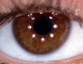
| 01/09/2003 05:32:33 AM |
Brown Eyed Girl /// Van Morrisonby Fibre OptixComment: The eye is captured great and the hairy structur of the iris is awesome. Light could have been better, i.e. softer without the strong reflections. Softness fits better to the song too. |
Home -
Challenges -
Community -
League -
Photos -
Cameras -
Lenses -
Learn -
Help -
Terms of Use -
Privacy -
Top ^
DPChallenge, and website content and design, Copyright © 2001-2026 Challenging Technologies, LLC.
All digital photo copyrights belong to the photographers and may not be used without permission.
Current Server Time: 07/16/2026 02:27:09 PM EDT.