DPChallenge: A Digital Photography Contest You are not logged in. (log in or register
 
Browse Settings
Currently viewing:
Registered UserHarz_Joerg

Show comments:

Per page:

Order:

Comments:


Comments Made by Harz_Joerg
Pages:   ...
Showing 11 - 20 of ~463
Image Comment
Classic Black
02/18/2004 04:00:42 PM
Classic Black
by dan_pendleton

Comment:
Great, clean entry with wonderfull variation of blacks/grey. The suit itself does not say to much to me though.
Photographer found comment helpful.
Hands of Sorrow...
02/18/2004 03:54:31 PM
Hands of Sorrow...
by theodor38

Comment:
While I would never put this on my livingroom wall, I like this strong entry very much. Great texture, awesome pose and how you set the contrast/levels is just on the spot. Good luck.
Photographer found comment helpful.
Teapot
02/18/2004 03:51:19 PM
Teapot
by maelms

Comment:
Great arrangement with an awesome light and a very clean white. The image could be from a design study. Hope you do very well.
Black Charcoal
02/18/2004 03:48:18 PM
Black Charcoal
by ScantyNebula

Comment:
While I like the way you did set the light and how you arranged the charcoal, I wonder why you did put them upside down! It moves the viers eyes away from the image, because he/she tries to read what is written on them.
Anyway, a very godd submission. Good luck to you.
Photographer found comment helpful.
As the Crow Flies
02/18/2004 03:45:36 PM
As the Crow Flies
by soup

Comment:
I like this very much: the angle of view with you on the same hight as the flying bird is awesome and seldom seen. The background works great too. Also like the cropping. The bird could be a bit larger though. Good luck.
Photographer found comment helpful.
Mysterious
02/18/2004 03:42:56 PM
Mysterious
by crabappl3

Comment:
Wonderfull! One of my very favorits! Very mystic with great clarity. The selective decoloration works like magic her. Hope you win. good luck.
Photographer found comment helpful.
Plumage
02/17/2004 11:56:23 AM
Plumage
by amsmyth

Comment:
Hi Anne;

I do have to admit that I didn't vote your image very high: I'm not so much a flower fan. But that's my personal view and not important when discussing an image with respect to composition and technique.

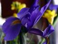
What I really like here is how you worked with the light, the colors and the background: the variation of blues is great and putting the yellow flowers in the back adds a nice contra-point (I hope this term makes sense in English). I like the reddish-brown parts of the background too. Only the bright part at the very upper left disturb me a bit: the light does come from the right side (at least for the foreground) and thus one gets surprised when seeing a bright region on the left.
I think that the exposure is OK, although it might appear a little dark. But I tried to adjust the levels and then the colours do not turn out as good as they are right now. I do think that some commenter saw it as being too dark was because the left part of the flower with the orange portion (which is somehow the focal point) is a bit too dark. However, the right part of the flower is on the bright side already. Maybe the flower should have been turned a bit.
Regarding the composition of the foreground I have to say that I do not like the crop at the top: that part of the bottom leaf of the flower is cropped away is fine and do not disturb me, but the cutting of the upper leafs makes the image unbalanced.
I do not know if this always holds, but I would say that one should avoid to crop the main object of an image on two opposite sides. If it is cut at two adjacent sides it's not so problematic.
Technically, i.e. regarding the noise, the image is a lot better than others we discussed. However, the file size is still rather small: 35 kB is a bit more than 20% of the allowed file size.
The sharpness is fine, although one could sharpen the image more without loss in quality (i.e. production of noise, too bright edges). However, more sharpening would reduce the softness produced by the subtle variation of the foreground colours.

Jörg
Photographer found comment helpful.
Comb & Hair
02/16/2004 05:18:08 PM
Comb & Hair2nd Place
by Harz_Joerg

Comment:

Here's a tip on how I made the border:
I used Photoshop for it and used a very simple procedure:
1. rectangular selection where the inner part of the border should be
2. inversion of the selection
3. Gaussian blur of the outer part of the border
4. back-inversion of the selection
5. with Edit/Stroke I made a 2 px wide line out of the selection.

It's rather easy and you might apply other effects/filters to the border too.

Greetings,

Jörg
Every Droplet counts in the Distillery
02/16/2004 02:58:40 AM
Every Droplet counts in the Distillery
by Harz_Joerg

Comment:
Thanx to all voters and especially all of the plenty commenters to make the image 4th place!
Making the image was a hard job, but more for the shutter due to the many images that needed to be taken to get nice drops.
I once did this with a wine bottle in 2002 with my A40

Acctually the A40 worked better for this job.

I allways wanted to redo this and this challenge came just right.
Here's the original. It is only rotated and reduced in size:


And here are some outtakes:

The dropletts are sometimes not round because they vibrate when the are large enough.

And finaly the setup I used:

Most important is a good control of the water flow. But fortuanetely I'm a chemist:)

So thanx again to all of you,

Jörg
Hoar Frost and Holly
02/16/2004 02:31:59 AM
Hoar Frost and Holly1st Place
by dsidwell

Comment:
Also congrats form my side! Well deserved!
The great leaf would have work for texture too.

Jörg
Photographer found comment helpful.
Pages:   ...
Showing 11 - 20 of ~463


Home - Challenges - Community - League - Photos - Cameras - Lenses - Learn - Help - Terms of Use - Privacy - Top ^
DPChallenge, and website content and design, Copyright © 2001-2025 Challenging Technologies, LLC.
All digital photo copyrights belong to the photographers and may not be used without permission.
Current Server Time: 09/16/2025 01:07:55 AM EDT.