| Image |
Comment |
| 12/31/2003 03:35:59 AM |
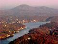
Disneyland's Gateway to Fantasyby dr rickComment: Greetings from the Critique Club
Initial thoughts - My opinion
Well-made night shot which has some problems to get the association with the challenge topic on the first glance.
Composition/Content
The nicely lit castle is captured very direct in full frame without any direction to strengthen the intention. The tree and the two bushes in the foreground are not used as compositional element but rather appear as obstacles to the free view to the castle. Same holds for the reflection of the castle in the lake: because it's only showing a small part of the castle, it's hard to recognize it as for what it is.
A lower position, using the bushes as frame and zooming closer to the gate might have been way better. It is not necessary to get the whole castle. Cutting of parts of an object most times increase the interest, because the viewer can use his/her imagination to fill in the rest in his mind.
Camera work -technically
No particular issue here. Exposure is good, maybe only a tad on the dark side. Focus is good as well.
Digital Processing - Technical
Might have been sharpened a bit more.
Fits the challenge
As stated above, boundary or better transition is not easy to see on the first, even the second glance.
Good luck for you further submissions
PS: As this is my first Critique Club critique, it would be helpful to get some feedback if you like.
|
 Photographer found comment helpful. Photographer found comment helpful. |
| 12/31/2003 02:10:13 AM |
Where two worlds meet.... by byshenComment: Also congrats form my side for the first ribbon!
Way to go! Nice to have it here in the frontpage for the upcomming week. |
| Photographer found comment helpful. |
| 12/30/2003 06:44:40 PM |
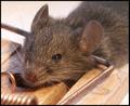
Set the limit!by kinksComment: Technically well made and fits the challenge well, but way to harsh for my taste, allthough I see dead mices almost every morning when they are brought to our frontdoor by our cats. |
| 12/30/2003 06:39:45 PM |
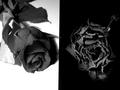
Death After Life or Life After Death ?by Charles PhilipComment: Well suited concept, the image might only just need some compositional enhancements.
The dividing line should be rotated a bit to the left to make it vertical and the dark part in the upper left corner disturbs.
Light is set very good, especially on the left rose. The right, dead rose is somewhat undefined: hard to indentify it as a rose if one would only see it.
What I like is that the red rose crosses the boarder a littlebit and that you chose B&W of course. Good luck. |
| Photographer found comment helpful. |
| 12/30/2003 06:30:27 PM |
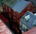
It looks higher up here :Sby poxyComment: What I like is the variation of reds on the house and roof. Also the roofs texture is great. It's also well exposed and crisp.
To me the association to the challenge topic is a littlebit difficult, even with the title. Maybe you should have focused more to the roof edge in the title as well as in the image. |
| 12/30/2003 04:57:24 AM |
Waters Edgeby vernabethComment: While the landscape is very nice, expecially the colors, the image lacks of severe jpeg-artifacts (I'm probably not the first to tell you this). If this is due to the cameras resolution submit somewhat smaller images next time. Otherwise don't compress that strong, use the whole 150 kB given to us.
|
| Photographer found comment helpful. |
| 12/30/2003 04:52:44 AM |
Edge of Bankruptcyby PaulMdxComment: Looks better then my account, and it's on the rise by 1% LOL!
The image needs the title to be understood for this challenge, but this applies for most entries this time, so it's OK.
Technically I like the B&W, the shallow DOF and the contrast, leading to the nice texture on the paper.
Good luck to you |
| Photographer found comment helpful. |
| 12/30/2003 04:46:32 AM |
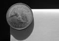
Life on the edgeby GoldBerryComment: To be honest, the image does not give me an edge-felling. My first thoughts were: a coin on a white paper that is palced on a black paper.
A different angle, maybe from below might have been better. I do like the texture in the white part: makes the image more 3D. |
| 12/30/2003 04:42:27 AM |
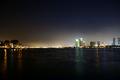
City Glowby CANiSLAYuComment: Wonderfull cityscape, too sad that it is not very crisp. Also the conection to the challenge topic can't be seen at a first glance.
What I like is the diffuse glow of the sky. |
| 12/30/2003 04:37:54 AM |
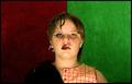
Arrested Development. On The Edge of Punk.by Evil_MunkyComment: Great concept and well executed. Only the punk part could be a little brighter. Switching the nicely textured background, so that the green one would contrast the dark cloth might have been better.
Anyway, good look with this great submission |
| Photographer found comment helpful. |
Home -
Challenges -
Community -
League -
Photos -
Cameras -
Lenses -
Learn -
Help -
Terms of Use -
Privacy -
Top ^
DPChallenge, and website content and design, Copyright © 2001-2026 Challenging Technologies, LLC.
All digital photo copyrights belong to the photographers and may not be used without permission.
Current Server Time: 07/16/2026 03:50:44 PM EDT.