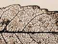
DPChallenge: A Digital Photography Contest You are not logged in. (log in or register
 
Browse Settings
Currently viewing:
Registered UserHarz_Joerg

Show comments:

Per page:

Order:

Comments:


Comments Made by Harz_Joerg
Pages:   ... ...
Showing 161 - 170 of ~463
Image Comment
natural nerves network
01/03/2004 03:15:19 AM
natural nerves network
by kenbo

Comment:
Greetings from the Critique Club

Initial thoughts/My opinion
What a wonderful subject! Too sad that it comes short in its technical representation

Content/Composition
The content itself could have been a winner in my opinion: the fragile leaf structures, the remaining parts of the leaf between the veins are a wonderful object. Something that has a woow effect to the viewer. One of the best contents shown in the challenge IMO.
However, it comes short in its representation: it's presented rather flat, in a way that it might be printed in a text book for biology student. It almost could have been scanned in by a scanner.
The reduction of a 3-dimensional object to just 2 dimensions often results in new perspective to the object. However, if the object is already 2-dimensional by itself, keeping it at 2 dimension is not a good choice. Adding the 3rd dimension could make the point !
For your leaf it would for instance I suggest to bend it, play with light to produce structure and depth. Also showing it's shadows on a surface might be great.
An artistic approach is somehow missing (beside placing the center vein in the lower third). Also the background is not to well suited, especially due to the darker spots and the homogeneous illumination.

Camera work -technically
Sharpness could be a little better. Exposure is on the dark side.

Digital Processing - Technical
A little bit more of sharpening might have helped to make the image more crisp. Also exposure and contrast could have been enhanced.

Fits the challenge
Of course it does!

This critique sounds a little harsh, but that's because I think you could have done better if only some technical aspects would be enhanced. The creativity in selecting a subject is just great. This also shows in many of your other submission.

Hope to see you with a ribbon.
Good luck for you further submissions
Portraiture of  A Vase
01/02/2004 09:27:03 AM
Portraiture of A Vase
by katlyn

Comment:
Greetings from the Critique Club

Initial thoughts/My opinion
Nice colours and textures of the vase; it's hanging to the right side and the background disturbs a lot

Content/Composition
It's a close-up, but that's fine. The main object, the vase is well selected and showing it only partially is a good choice. Also the way you turned it with the orange triangle as the centre works well. If it would be better to see more or less of it at the top and bottom? Don't really know.
It should have been turned CCW also.
Unfortunately there is a second object: the wall paper. While not really sharp it still not just a background and thus the viewers eyes automatically look at it and start searching for .... well, nothing. A homogeneous background, maybe with some gradual variation of brightness would have been better: there is no need for a textured background, texture is already in the vase.
Another issue is the light: you have set it rather flat. My suggestion: play with a desk lamp by moving it around the object and look for the best effect. Especially when you have something with a 3-dim., grooved structure like the vase, the right angle of the light makes it all.

Camera work -technically
Focus is OK and you shouldn't have used a narrower DOF here. Of course the background shouldn't be focused too (see above). Exposure is at least 1 EV too dark. Whitebalnce is a little off.

Digital Processing - Technical
Nothing that has been done wrong, but you could have made considerable improvements: rotation, increase of saturation to bring out the colours, increasing overall brightness and blurring of the background (would have been allowed this time).
It's not oversharpened but could be more crisp. But that's more a light issue.

Fits the challenge
Of course it does. Maybe a slightly closer look might have been better in the eyes of the voters.

Good luck for you further submissions
Peckish
01/02/2004 08:50:04 AM
Peckish
by Imagineer

Comment:
Greetings from the Critique Club

Initial thoughts/My opinion
First thought: awesome pose of the pigeon. It's one of those pictures where one looks and waits for the next thing to happen. To me a special kind of "stopped motion".
Second thought: wonderful contrast between the colourful bread and variation of greys.

Content/Composition
It's a close-up, but that's just right. Everything is well arranged (rule of third) and the two elements (sandwich and bird) are well linked by the look of the pigeon. Focus is set very well: sharp on the objects of interest. The narrow DOF works very well on the feathers of the birds wing: reduces it to a nice texture and thus leads the viewers eyes to the bird's head.
However, the narrow DOF doesn't work for me at the very bottom: it results in an diffuse, a little brighter appearing band. Maybe that can be darkened a little using PS.
The sandwich is arranged just right: looks tasty (beside the dirt of course), "shiny" and bright. Also that it's taken partially apart is nice.

Camera work -technically
Nothing worth mentioning beside that is very good.

Digital Processing - Technical
The partial desaturation works wonderful to produce the right mood. Also it's neither too smooth or oversharpened: just on the spot

Fits the challenge
Of course it does.

Good luck for you further submissions
Photographer found comment helpful.
Eat Drink and Be Merry!
01/02/2004 08:15:03 AM
Eat Drink and Be Merry!
by lizzyc3

Comment:
Very creative! To sad that it's so dark and fuzzy. Still a 7 for me.
Photographer found comment helpful.
Screaming Windshield Osmosis
01/02/2004 08:13:19 AM
Screaming Windshield Osmosis
by librodo

Comment:
Wonderfull colors! Something for a color-cahllenge.
Nice perspective too. It does not fit the challenge too well, but it's nice to see something different here.
Photographer found comment helpful.
Expect to see the reindeer calves in their yard next Christmas!!
01/02/2004 08:11:03 AM
Expect to see the reindeer calves in their yard next Christmas!!
by jpb323red

Comment:
LOL! Very creative! technically It cold have been improved by not using the flash but rather a lamp. But maybe that wasn't possible! A 8 for me.
Photographer found comment helpful.
A Christmas pickle!!??
01/02/2004 07:03:49 AM
A Christmas pickle!!??
by Jason

Comment:
Very tacky! At least in my eyes, because I just recently read in the internet that the pickel in the christmas tree is supposed to be a German tradition in the eyes of the US-americans. It ain't! Totally unknown in Germany.
Anyhow, technically it's well made, nice use of light and DOF. Great background too. Maybe the pickle is captured too straight. Taking the image more from the side might have been better.
And of course it fits the challenge. Good luck!
Photographer found comment helpful.
Does a Bear Pee in the Woods?
01/02/2004 06:47:07 AM
Does a Bear Pee in the Woods?
by Coley

Comment:
Is the pope catholic?!
Of course and this fits of course well to the challenge too. make me LOL!
Technically flawless. Hope you end up high!
Photographer found comment helpful.
Sponge Bob
01/02/2004 06:45:25 AM
Sponge Bob
by saalwaechter

Comment:
Like it much! I'M a big Sponge Bob fan. It's of course tacky and you made it tchnically perfect: sharp on the subject and great background with well set lights onad "tre"-branches to not make it too boring.
Well done, hope to see you at the frontpage over the next week.
Photographer found comment helpful.
Meet the Griswolds
01/02/2004 06:42:47 AM
Meet the Griswolds1st Place
by alanfreed

Comment:
One of my few favorits: sharp, well exposed and I like that the whole house can be seen in this nice brown color. It's also pretty tacky, although I'm still not sure about the term tacky.
Good luck with this great submission.
BTW: your house!?
Photographer found comment helpful.
Pages:   ... ...
Showing 161 - 170 of ~463


Home - Challenges - Community - League - Photos - Cameras - Lenses - Learn - Help - Terms of Use - Privacy - Top ^
DPChallenge, and website content and design, Copyright © 2001-2025 Challenging Technologies, LLC.
All digital photo copyrights belong to the photographers and may not be used without permission.
Current Server Time: 09/16/2025 02:38:22 PM EDT.