|
|
|
Showing 151 - 160 of ~463 |
| Image |
Comment |
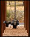
| 01/06/2004 05:01:35 AM | Opposite Reactionby crabappl3Comment: One of my favorits this time: lives from symmetry, the combination of sharpness with blured motion and from the earthy colors. Most amazing to me is how well you made all swings and post sharp and the grass and far distance blurred to produce the right background.
Very well done. Good luck to you. |  Photographer found comment helpful. Photographer found comment helpful. |
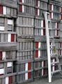
| 01/05/2004 04:33:52 PM | Apple Boxesby amsmythComment: Hi Anne;
This image is amazing for its shape and texture and of course due to the great choise of color. As some other did already point out, the ladder disturbes the natural structure of the wood of the boxes. I think this too.
An old wooden ladder would have been great her: it would not disturb, because it would be of the same material as the boxes, but would bring in a dynamic, living element. Otherwise it would look to artificial.
Jörg
|
| 01/05/2004 04:23:54 PM | Still Watersby amsmythComment: Hi Anne;
Wonderful picture of a truly sacred natural place. One can hear the silence and feel the refreshing, calm morning.
A slight issue is of course the foreground bush: cropping it away wouldn't work here. The symmetry would get broken and most important the lake would get too narrow. But it needs to be enough distance between the lower border and the rock to make the rock "fly" in the sky.
So you did choose it just right.
Congrats afterwards for your 4th place,
Jörg
| | Photographer found comment helpful. |
| 01/05/2004 03:55:02 PM | On the edgeby bormicComment: Content/Composition
The content is of course very simple, but by taking the challenge topic very literally it fits just right. You also did chose a fully symmetric composition, which was a strong, hence good choice. There might be different interesting angle of view to the same subjects, but then it wouldn't be your image anymore. So you did a great job here.
Also the relation between the pea and the plate was well set by your cropping.
Speaking of cropping: that's of course one of the most important part in your image. It makes a great balance between the black and white part. Very well done!
Light is also set greatly. I like the variation of bluish greys on the plate and the same subtle variations of green on the pea. Also that any harsh reflections has been avoided has to be noted. Thumb up!
Only the black should be featureless (first I thought it was dust on my screen:)). Of course, pure black (as well as pure white) is one of the most complicated tasks.
Camera work -technically
Nothing special to mention here: focus is great (not much to focus though) and exposure excellent.
Digital Processing - Technical
Can't see anything special worth mentioning.
Fits the challenge
Of course it does.
Good luck for you further submissions.
Jörg | | Photographer found comment helpful. |
| 01/05/2004 12:21:16 PM | Little Creekby bioshoreComment: Greetings from the Critique Club
Initial thoughts/My opinion
What a wonderful place: everything looks so fresh, especially the plants. One even can hear the water bubbling. It has some compositional imperfections and also some regarding the light.
Content/Composition
As already mentioned the place for itself is beautiful and using the little creek as guiding line to the waterfall is well thought out. The post in the foreground is however disturbing a lot: it's not meant to be a focal point (at least it's not sharp) and it's also not helping to pass your intention to the viewer. Therefore it should have been avoided in the first place or cropped out later (works fine, I tried it). Maybe zooming in a bit more would have helped too: it would have focused the attention more on the water fall.
Also there is something looking like a lake or so on the upper right: it reduces the feeling of looking into a rain forest a bit. Cropping wouldn't have helped here, because then the creeks waterfall would stop just at the image border. Maybe moving somewhat to the right would have helped.
Camera work -technically
Focus and colours are great, only the exposure has some problems IMO: the suns shines too bright onto the stones, making them a little overexposed. Of course, going one EV down or so would not help, because then the nice leafs on the left would have turned out to dark. While the sun light works fine on the palms, for the stones they are too much. Probably taking the image at a different time of day (early evening) would have been better, but that might have not been possible. As you see, my comment on exposure is actually a compositional comment.
Digital Processing - Technical
It seems as if you sharpened digitally after the frame was added. This leads to a two pixel wide artefact around the image. Better sharpen first and as the last step add the border.
Otherwise sharpening is well done and hue/saturation are nicely set
Fits the challenge
It does not depict "on the edge" to strong, but still, it somehow fits, especially compared to other entries.
Good luck for you further submissions
| | Photographer found comment helpful. |
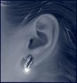
| 01/03/2004 07:39:11 PM | Sapphire and Diamondsby kncoughlinComment: Greetings from the Critique Club
Initial thoughts/My opinion
Great, eye pleasing concept but regarding the image quality rather poor executed. The glare as focal point is a fine idea, but a little overdone.
Content/Composition
This is one of the few images where one sees the tumbnail-version and says "Great, that's gone be interesting" and after you click on it one is somewhat disappointed.
Have a look at the thumbnail: it shows an image of wonderfully flowing lines. The hair and the beautiful ear are building a homogeneous, very appealing background/surface with nice soft contrast. On this background one sees a well placed earring, which is shiny and bright and one looks forward to see its details.
Now click on the thumbnail: At least I was disappointed: the hair and ear are not as smooth as expected, they are grainy and full of artefacts. Some of the brighter hairs look fine, as long as they are include into the flow of the rest of the hairs. Other hairs, especially right below the ear do not add to this flow, you might have combed them too.
Now to the earring: it should be the contra-point to the nice female ear and hair. Shinny and crisp in contrast to the soft skin and hair (actually, I think this contrast is the big point of any jewellery). It's shinny, of course but not crisp, because it's as fuzzy as the background.
And as already mentioned the artistic feature of the glare is overdone.
Otherwise the light, especially on the head itself is well set.
Camera work -technically
Assuming that the fuzziness is the result of post-processing, to me the image seems to be taken well.
Digital Processing - Technical
Overdone regarding the fuzziness.
If it's the result of the quality right out of the camera, reducing the size of the whole image might have been an easy solution.
Fits the challenge
Of course it does!
Conclusion
The image shows that you have an eye for creating a fine image, just some (easy learnable) technical aspects might be addressed better.
Good luck for you further submissions |
| 01/03/2004 06:13:37 PM | DSC02961second.jpgby amsmythComment: Like this version a lot more: less nervous, almost tranquilling. It's now an image working with shape and lines. Therefore the crop is better then the on I did: keeping the upper part of the ice complete works way better. |
| 01/03/2004 01:13:57 PM | Tacky Santaby jwstyersComment: Subject is nice and fits well. It's very small, isn't it?
Too sad that the focus isn't where it should be. Also the plane could be positioned better: further to the right and a little up.
Colors (especially on the tree) are nice. |
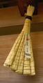
| 01/03/2004 01:10:49 PM | Simple japanese winter decorationby radurComment: Interesting subject. Not tacky, but very different so it fits well for me.
It's captured a little to straight: while the angle of view is just right (it hangs from a roof, doesn't it?) light is not very attractive. The background is nice. | | Photographer found comment helpful. |
| 01/03/2004 07:06:32 AM | What Time Is It?by StevePaxComment: Greetings from the Critique Club
Initial thoughts/My opinion
Not very special, just another jewellery image, why is there so much space on the upper left. What happens to the glass of the watch, seems turbid.
Content/Composition
Presenting jewellery in a macro challenge is a good idea, while not new. The watch you selected looks fine to me: not very shinny and new, one sees that it has been used for some time. The chain segments are solid made and strong, that's also good in my opinion.
Placing it on a white surface is also fine: very neutral. And you managed it to make it pure white: thumb up for that. Also the shadow of the watch is well made: no harsh and sharp edges and also the shadow is not too dark.
This part shows the effort you put into the image!
In your composition the element of negative space is a bit too much: to me there is no need for having it. Also the watch is reduced to a 2-dimensional object (only the shadow give some depth). Of course a watch is more or less 2D, that's why they are most times shown rolled up, thus giving some volume, or by using a lower angle of view.
The watch is to me not too appealing because of the turbid glass: can't tell if its an artefact of the image or the glass itself. Also the overexposed reflections are too much: some bright spots are fine to make an object look shiny, but here there are too large sections overexposed.
One personal suggestion: because the watch isn't brand new, you could have gone much closer and try to work out the signs of usage. Together with an appropriate title this would have scored probably higher. Your technical skills for sure are great.
Camera work -technically
Could be a little sharper, but overall fine. Beside the reflections, exposure is good too.
Digital Processing - Technical
You could have increased the contrast a little bit to make the image more dynamic. Also a little more sharpening would have helped in the same direction
Fits the challenge
Of course it does!
Good luck for you further submissions! | | Photographer found comment helpful. |
|
Showing 151 - 160 of ~463 |
Home -
Challenges -
Community -
League -
Photos -
Cameras -
Lenses -
Learn -
Help -
Terms of Use -
Privacy -
Top ^
DPChallenge, and website content and design, Copyright © 2001-2026 Challenging Technologies, LLC.
All digital photo copyrights belong to the photographers and may not be used without permission.
Current Server Time: 07/16/2026 09:41:53 AM EDT.
|