|
|
|
Showing 131 - 140 of ~463 |
| Image |
Comment |
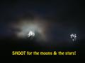
| 01/09/2004 09:41:00 AM | Goal Orientedby channeledComment: Greetings from the Critique Club
Initial thoughts/My opinion
I do see the artistical approach and the message in combination with the text, but the message could have been presented better. Like the glowing, nicely coloured sky surrounding the "moon"
Content/Composition
I'm not completely sure what I see: is it the moon on the left side and some street light on the right? I do see some thin, moon lit clouds (best part to me) and also something like a horizon. And I do see the lines connecting the bright spots on the right side. They are nice too.
The shaking of the camera makes the image of course interesting, but if everything is vague and fuzzy, it's not that easy to understand, even with the text below it.
Speaking of text, I have to say that I neither like the font or colour of it very much. The colour should somehow match with the rest of the image.
Camera work -technically
Not much to say about it: exposure seems fine for this type of image and it seems to be focused also well, according to the light-lines a right.
Digital Processing - Technical
Seems also OK to me
Fits the challenge
Yes, it does, only the message didn't get to me very well.
Final remark
What I do appreciate very much with your submission is that you tried to go beyond the usual concepts and compositions shown here on DPC.
Doing so is always a courageous step that I honour very much, because it is a very important ingredient to DPC.
Good luck for you further submissions
|
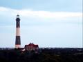
| 01/09/2004 09:14:38 AM | "All who wander are not lost" -JRR Tolkenby phaedrusComment: Greetings from the Critique Club
Initial thoughts/My opinion
Lighthouses are always great. Colour somehow odd, too soft and the house next to the lighthouse disturbs. Title is nice, but I do not get a "guiding home" feeling.
Content/Composition
The content of your submission is of course well chosen for the title: lighthouses and "not getting lost" always work together well. However, this feeling does not come up in me: there are several things that disturb. Each thing only a little but combined they do it a lot.
First there is the colour: the image seems to be taken either in the morning or evening with the orange glowing sun in the back. This glow is reflected in the lighthouse and the houses shown in the image. That's not bad, but it does not fit to the cyan of the sky. Selective desaturation might have helped here. Actually I would suggest B&W or some duotone image.
Next the problem for me is with the houses: by seeing them the "being lost" feeling is gone. It makes the lighthouse stand in a probably friendly neighbourhood, a guiding light for the wanderer is not needed. Especially the house next to the lighthouse results in me with this feeling.
Also if there are too many features in an image the viewers eyes walk around too much. However, they should just rest on the lighthouse.
I thing a different position, where the negative space (which is important for your image) is only sky and featureless earth or ocean would have worked better.
If there is now better position to find, drastic cropping is a possible solution.
Camera work -technically
Camera-wise focus seems OK, but everything is too soft.
Exposure is very problematic here: you did use the full dynamic range from pure black to pure white/overexposed. Still, the lighthouse as focal point is too dark. +1 EV or even more would have of course made the sky brighter (that's OK) but also brighten up the houses. Again, a different point of view would have been helpful to get the lighthouse into the "right light" and the background dark.
Digital Processing - Technical
The image for sure needs some more sharpening and it could have been improved considerably by changing brightness, contrast, colour saturation etc.
Also the addition of a border and the text would have been great here as one can see from the other submission for this challenge.
Fits the challenge
Of course it does: main focal point of the image and the title work very well together, just some technical and compositional improvements should be made to make the image stand out more.
Good luck for you further submissions
PS: if there is any interest, I could put a suggestion from my side into my portfolio and we can discuss it. Just send me a PM. Message edited by author 2004-01-09 12:30:38. |
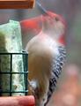
| 01/09/2004 07:20:43 AM | Headache In The Makin'by DrakeComment: Fits wonderfully to the challenge and the title is great too. Like the background too.
What disturbs me though is the green/cyan coloration of the plastic: selective desatuaration might have helped here a lot to take a way the viewers attention from this not so important part of the image. |  Photographer found comment helpful. Photographer found comment helpful. |
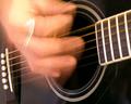
| 01/09/2004 07:14:28 AM | Guitar Basicsby wickedpeteComment: Like the strong motion in this one and the glare from the ring: it allows to realize the upward and downward motion.
However, I do think the hand is a little too red for my taste. |
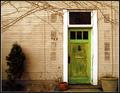
| 01/09/2004 04:16:07 AM | The cave you fear to enter holds the treasure you seek.by melongrindComment: Greetings from the Critique Club
Initial thoughts/My opinion
Nice, friendly looking door scene living from pleasantly looking pale colours and a variation of textures. Title not well suited though.
Content/Composition
I do like the overall composition, how the door, pots and bush are placed. It's also nicely framed at the top and bottom by the ivy and the small piece of garden that can be seen.
The image is living from texture (the wall and the old paint on the door) and shape (mainly the rectangular door and the dark spots on the wall, where probably post-boxes once were placed).
The light is looking fine to me: no sharp shadows, everything is smooth.
The colours are also very pleasant: everything has some patina, no bright shiny colours are shown. However, the scenery does not look rotten. One could envision that behind this door an elderly, friendly couple is living in old Victorian furniture. Old but nice.
At this point comes the biggest drawback of your submission: the title and image do not fit together well. There is nothing that brings up fear or cave in my mind when looking at the image. "Treasure" is fine, but to me the possibility that there are treasures behind the door is already visible when looking at the outside.
In this particular challenge, in which title/added text was much more important then usually, this was probably the reason why voters didn't vote much higher.
Camera work -technically
I think you did well very on exposure: you used the full range from dark to bright and that the lower left is underexposed fits to the overall composition. Focus could be a tad sharper (seen best on the ivy): it's just on the edge between looking soft and slightly out of focus.
Digital Processing - Technical
Looks mostly good to me: if you adjusted the saturation of this image digitally, you did just great. A bit more unsharpening mask might have been better though
You made the framing suitable for normal submissions. For this challenge however, adding a wider border with the text in it would have been the better way to go.
Fits the challenge
The image is for sure suitable for a motivational poster, the title too, but their combination not so much, as already stated above.
Good luck for you further submissions
| | Photographer found comment helpful. |
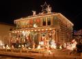
| 01/07/2004 03:15:32 PM | Tacky but Tasty by Harz_JoergComment: Originally posted by Bela45:
One of my 10's, great pic
Now, Harz, how can I send Kaja lots of swedish köttbullar???????
Congratulations:-) |
Are those the same "Karllson on the roof" liked so much?
If so, please pass them to us the next time you drive from Sweden to Portugal, I live almost on the way.
However, I'm not sure if Kaja will get all of them ;)
Jörg
|
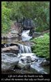
| 01/07/2004 09:54:41 AM | Life isn't about the breaths we take, it's about the moments that take our breath away.by NatatorComment: Greetings from the Critique Club
Initial thoughts/My opinion
Wonderful tranquilling and peaceful scenery. Easy understandable, well fitting text. A joy to look at.
Content/Composition
While the topic you chose is not new, i.e. showing a waterfall with long exposure, you selected a very nice one and didn't use a too long exposure time. The 0.7 s just made the water soft enough to make the overall mood quiet and peaceful (one does not think about a gurgeling creek as one would at faster shutter speed), but the water still looks natural because it is not just featureless white, especially at the central fall and in the very back.
On your composition I also like that the creek serves very well as a guiding line: the viewers eyes can walk it up and down and sees everywhere some nice spots and features which are all of equivalent quality. Same holds for the plants and rock.
Maybe that's the most important part of this composition: nothing is particularly standing in the foreground and nothing serves as a background for something. Very homogeneous while there is still plenty to see.
Hence, the title you gave it fits very well, because it's a calm, peaceful and philosophical title. Something to contemplate on.
As it has been commented, the image itself might not be breathtaking for everybody, but it's the best image to start contemplating about life and the own breathtaking moments one had. So image and title are very well chosen.
Camera work -technically
You for sure know how to handle your camera: the aperture is set great to not bring anything in the foreground or back by blurring it, exposure is on the spot, very balanced (the white portion of the water seems to be overexposed, but hey: they are just white).
Digital Processing - Technical
Also well done: well cropped, like the border and text.
It could be sharpened a little more, but really only a tiny bit. Too crisp would disturb the atmosphere.
Speaking of atmosphere: a slightly warmer tint, less bluish might have been better IMO.
Fits the challenge
Of course it does!
Good luck for you further submissions and hope to see you with a ribbon soon.
|
| 01/07/2004 04:07:54 AM | Tacky but Tastyby Harz_JoergComment: Just quickly made up a small video-clip of the making of this shot.
Load Tacky Kaja here. Caution: 2 MB!
To view it, you need the free DIVX-codec.
Hope you like it.
Jörg Message edited by author 2004-01-07 05:55:04. |
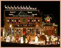
| 01/07/2004 03:18:56 AM | Wonderfully Tacky by richComment: Woow!
Way to go! You are a shooting star with getting a ribbon to the second entry!
Keep up the good work. | | Photographer found comment helpful. |
| 01/07/2004 03:17:01 AM | Meet the Griswolds by alanfreedComment: Congrats for your very tacky shot (although I'm still not sure about the translation to German).
Was one of my favorits and I knew it was impossible to beat: right on the intention of the challenge and very well made!
Thumb up!
Of course you have to go to the families living in the house and congrat them too!! | | Photographer found comment helpful. |
|
Showing 131 - 140 of ~463 |
Home -
Challenges -
Community -
League -
Photos -
Cameras -
Lenses -
Learn -
Help -
Terms of Use -
Privacy -
Top ^
DPChallenge, and website content and design, Copyright © 2001-2026 Challenging Technologies, LLC.
All digital photo copyrights belong to the photographers and may not be used without permission.
Current Server Time: 07/16/2026 06:27:08 AM EDT.
|