| Image |
Comment |
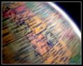
| 01/10/2004 04:24:46 AM |
As the World Turnsby dsidwellComment: I like the spinning motion very much: not to strong so one gets where one is looking at. Also like how you set the light: the overexposed right edge with its blue tint is looking great. don't know if a portion of the globe with some ocean might have been better though. Good luck! 8 |
 Photographer found comment helpful. Photographer found comment helpful. |
| 01/10/2004 04:19:57 AM |
HIGH FIVEby ColeyComment: Great concept and very well arranged. Like the colours of the wall and the clothes of the girl. Also that only her right leg is in motion. Was it hard for her to achiev that? Good luck. |
| Photographer found comment helpful. |
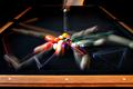
| 01/10/2004 04:16:14 AM |
GERONIMO!by scrum8Comment: Great stop motion with well used DOF. The exposure is a little on the dark site for the dog, however, that's not an issue of your camerawork, it's just due to the though light situation. Good luck. |
| Photographer found comment helpful. |
| 01/10/2004 04:12:40 AM |
Break! by wingyComment: Great shot! Like the composition and how you manged to get the exposure fairly well on the non-moving and moving parts. Was probably hard to achiev. The lines coming from the reflections are just great. How many balls made it into a pocket?
A 9 from me |
| Photographer found comment helpful. |
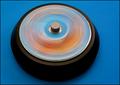
| 01/10/2004 04:10:13 AM |
cd spinnerby ScantyNebulaComment: Like the colour play very much. The angle of view and cropping could be improved though. Still, a 9 from me. |
| Photographer found comment helpful. |
| 01/09/2004 12:55:39 PM |
Wedding dayby MrAkamaiComment: Wonderful use of selective desaturation: works great here. Also the angle of view is well choosen and cropping is also good. Good luck! |
| Photographer found comment helpful. |
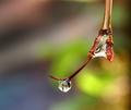
| 01/09/2004 12:53:19 PM |
THAWby ellamayComment: Wonderfull clarity and colorful background. Like the cropping too.
The star reflection is just so well set and not too strong that it increases the briliance of the image while not taking overhand.
Good luck! |
| Photographer found comment helpful. |
| 01/09/2004 12:45:54 PM |
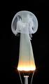
Fingering Ghostby kiwinessComment: That's just a great idea! Does the bulb wire produce the wonderfull smoke by itself or did you add some smoking stuff onto it?
And yes, I do see the hand and finger too, so the title fits very well. Good luck |
| Photographer found comment helpful. |
| 01/09/2004 12:19:32 PM |
Enrich your life with music...by WILDBLUEComment: Greetings from the Critique Club
Initial thoughts/My opinion
Like the strong red colour and the way you cropped the image. Text would be great on the right side. The digital glow effect is too much.
Content/Composition
I do see the artistical concept of this submission, but somehow this concept does not get through to me very well. While a guitar and the title fit very well together and also fit to the challenge topic, I don't really get why the message gets better to the viewer when the guitar is glowing and is loosing due to that almost all details. For electric guitar this might have worked better, but for an acoustic everything looks too hot and "loud".
Beside of that I do like the composition and crop: it follows the roll of third and works mainly with shape and lines (very appropriate for a guitar).
Not adding the text into the image itself was however not a so good choice: text in a well chosen (probably red) colour with some shadow and maybe curved along the guitar would have increased the overall look considerably.
Camera work -technically
Can't tell much about it, seems to be well focused. Exposure seems fine too but because of the post processing hard to judge.
Digital Processing - Technical
See my comments made above.
Fits the challenge
Yes, it does.
Personal remark
I looked through your portfolio and other submissions and one thing is striking: you are extremely versatile and you are trying to work out new perspectives and techniques. This shows in many of your very good pictures: they are all very different and creative. Like this a lot.
And in this context this image gets a new perspective to me in the sense that you tried to see what's possible for you and the voters. I appreciate this very much.
Good luck for your further submissions
|
| Photographer found comment helpful. |
| 01/09/2004 10:03:03 AM |
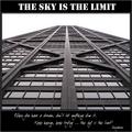
Sky is the Limitby flip89Comment: Greetings from the Critique Club
Initial thoughts/My opinion
Just excellent: full of symmetry and leading lines, with a well-chosen title and subtitle. Very good
Content/Composition
Not much to say that has not already been said: very well composed, B&W is a great choice, good text. As others, I do think that different fonts could fit better to the strong, esthetical lines of the building though.
Also the lower text is hard to read at this size.
Camera work -technically
You did it just right and it shows.
Digital Processing - Technical
Also very well done. The border is well chosen
Fits the challenge
Of course it does.
Taking 14th place in such a strong contest as this was is almost like winning a ribbon in one of the less strong ones, so thumb up and lets wait for your first ribbon.
Good luck for you further submissions
|
| Photographer found comment helpful. |
Home -
Challenges -
Community -
League -
Photos -
Cameras -
Lenses -
Learn -
Help -
Terms of Use -
Privacy -
Top ^
DPChallenge, and website content and design, Copyright © 2001-2026 Challenging Technologies, LLC.
All digital photo copyrights belong to the photographers and may not be used without permission.
Current Server Time: 07/16/2026 11:53:53 PM EDT.