| Image |
Comment |
| 04/08/2003 11:21:57 PM |
Colors of the Nightby hauntedcrimsonComment: I like the color in this picture. This one is a pretty tough one to pull off because there isn’t a lot going on to keep the viewer’s attention but the lighting makes the picture. The thing that weakens the picture for me the most is the small amount of the lower windows that are showing at the bottom right side of the frame. The thing that really makes me like this picture is the play of color between the yellow light in the upper windows with the gray of the roof and the deep blue of the sky. I would definitely crop some off the bottom and maybe rotate the picture some to get the top of the roof parallel to the bottom of the frame. I like this picture because of the color and lighting so I gave it a 5.
Greg
|
 Photographer found comment helpful. Photographer found comment helpful. |
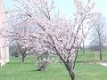
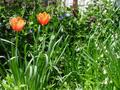
| 04/08/2003 11:16:57 PM |
A Miracle Bloomerby NicNic101Comment: I like the colors in this photo but I think it could be improved quite a bit overall. The focus seems off to me but I do like the way the trees in the background are out of focus. It might be more pronounced if you could open up the lens more (use the largest aperture available). The problem with doing this is that the focus on the subject becomes very critical. I would try to take this picture from a slightly different angle to exclude the roof of the building. Another suggestion would be to use the maximum resolution allowable for your challenge submissions. I gave this one a 3 but I think with some work it could do much better.
Greg
|
| Photographer found comment helpful. |
| 04/08/2003 11:10:20 PM |
Colors of Peaceby pclongComment: I like the play on color in this image. The composition and exposure look good as well. The main thing that I think could help this picture is a little more sharpening. As it is now it looks a little soft to me. I also am a little bothered by the very dark area in the top left corner of the photograph. I gave it a 5.
Greg
|
| Photographer found comment helpful. |
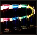
| 04/08/2003 11:06:28 PM |
Chromaticityby AleciaComment: You have a very nice submission for the color challenge here. This image is technically very well done I love the colors, the composition and the use of depth of field. It is a very tastefully done rainbow without it being too obvious. This picture blows away any of the other entries that I have seen so far. There isn’t anything I can think of that could improve this picture at all. I gave it a 10.
Greg
|
| Photographer found comment helpful. |
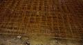
| 04/08/2003 11:00:13 PM |
devoid: colorless constructionby the sycamore samuraiComment: Did you take this picture at night using the on-camera flash? This picture doesn’t do much for me. The lines and pattern are nice but not enough to hold my attention for very long. Color is nice but there isn’t much here for me to comment on. The focus and exposure do look good. I can’t find any major technical problems. I gave it a 5.
Greg
|
| Photographer found comment helpful. |
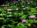
| 04/08/2003 10:18:55 PM |
Blooming Spring Colorby BeckyComment: I like the subject of your picture but I think there are a lot of things that you could do to strengthen your photograph. The first thing that comes to mind is that the colors look very washed out, almost as if the picture was overexposed by a stop or so. The second thing that comes to mind is that there are a lot of distracting objects in this photo. To list a few, the building on the left, the phone pole in the background, the driveway(?) on the right side and the yellow object that appears to be next to the driveway. A lot of these things can be eliminated by using a wider aperture to throw the background out of focus. I would increase the contrast and saturation also. It might also help to just walk around the tree and take pictures from all different angles and distances and see what works the best. It took me 4 days of trying to get pictures of my peach trees to get some shots that I liked. What worked for me was a low angle and close to the tree. Every tree is different and it will probably take time to find the best angle and lighting situation. Usually early morning and late afternoon give the best light. I hope some of this is helpful to you. I gave this one a 4 but I think you could produce much better with a little more work.
Greg
|
| 04/08/2003 09:49:55 PM |
Frozen mixed vegby marboComment: Great idea for the color challenge. Focus and composition look good as well as the depth of field. If it were my picture I would probably boost up the contrast by about 10% or so and increase the saturation some to make the colors a little more vivid. The frost tends to wash the colors out a bit and I think more saturation would increase the impact of this photograph. I gave it a 5.
Greg
|
| Photographer found comment helpful. |
| 04/08/2003 09:45:18 PM |
A Streak of Lightby mariomelComment: I think this is a very cool picture and is quite well done. I am guessing you had the shutter opened for a relatively long period of time and “painted” the streak of light using a flashlight or something. If this is the case I am very impressed with the lack of noise in the picture. The lighting is very appealing for me. I can’t think of a single suggestion to improve this photograph. I gave it a 7.
Greg
|
| Photographer found comment helpful. |
| 04/08/2003 09:42:13 PM |
"My garden ...really!"by pt2meComment: This photo is a good entry for the color challenge but I wish it was in sharper focus and had less depth of field. It would be good to shoot with the lens wide open and focus on the orange flowers. You probably want to use a tripod for this but I think it would drastically strengthen the photo. The wire and post in the background really take away from the picture for me. The way it is now I give it a 4.
Greg
|
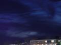
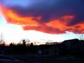
| 04/08/2003 09:35:10 PM |
Sunset on a standing wave cloudby cathysappComment: This picture would work wonderfully for either the color challenge or weather challenge. I wish I could see a storm like this so I could get a good shot for this week. I wish there was more dynamic range in this picture. It is nearly impossible to get the houses exposed well and keep the color in the clouds. At least I can see some detail in the houses and in the storm clouds. The blue part of the sky does look a little blown out. This lighting situation is very difficult to handle and I think overall you have done a good job working with it here. It is a strong photo but I think the blown out part of the sky and the underexposure of the houses weaken it. I gave it a 5 but have to say that you did a very good job with it.
Greg
|
Home -
Challenges -
Community -
League -
Photos -
Cameras -
Lenses -
Learn -
Help -
Terms of Use -
Privacy -
Top ^
DPChallenge, and website content and design, Copyright © 2001-2026 Challenging Technologies, LLC.
All digital photo copyrights belong to the photographers and may not be used without permission.
Current Server Time: 07/17/2026 03:00:21 AM EDT.