| Image |
Comment |
| 04/23/2003 12:31:38 PM |
|
| 04/23/2003 12:30:05 PM |
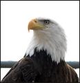
Majesticby JackoComment: Nice closeup. Pity about the bar behind the eagle - in my thinking, the picture could be better without it, or with something more than just that portion of the bar. |
 Photographer found comment helpful. Photographer found comment helpful. |
| 04/23/2003 12:20:12 PM |
|
| Photographer found comment helpful. |
| 04/23/2003 12:16:37 PM |
|
| Photographer found comment helpful. |
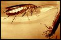
| 04/23/2003 12:13:10 PM |
Roachlandby TiNComment: Yuk! Nice picture though, and you must be a "brave" person to get this close to the roaches. Good colour choice. (7) |
| 04/23/2003 12:10:19 PM |
|
| Photographer found comment helpful. |
| 04/23/2003 10:12:20 AM |
|
| Photographer found comment helpful. |
| 04/23/2003 10:09:22 AM |
|
| Photographer found comment helpful. |
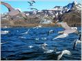
| 04/23/2003 10:08:25 AM |
the Birds by finnurComment: I love this picture! Where was it taken? I'd like to live there :) Seriously, I like the colours, and the splash in the water from the one gull close to the middle. The only thing I find a bit distracting is that the horizon line (water line) seems a bit tilted. (9) |
| Photographer found comment helpful. |
| 04/23/2003 10:04:10 AM |
The Honeymoonby cercyComment: Hey, maybe they've been married for a long time and still do it! |
| Photographer found comment helpful. |
Home -
Challenges -
Community -
League -
Photos -
Cameras -
Lenses -
Learn -
Help -
Terms of Use -
Privacy -
Top ^
DPChallenge, and website content and design, Copyright © 2001-2026 Challenging Technologies, LLC.
All digital photo copyrights belong to the photographers and may not be used without permission.
Current Server Time: 07/17/2026 12:30:13 PM EDT.