| Image |
Comment |
| 04/28/2003 10:18:33 AM |
thrice a catby justineComment: Good composition and colours, nice cat ... the two tone tan inner border is too heavy. |
 Photographer found comment helpful. Photographer found comment helpful. |
| 04/28/2003 10:15:39 AM |
Redby SonifoComment: Nice idea. The buttonizing distracts. Simple borders might have been better. |
| Photographer found comment helpful. |
| 04/28/2003 10:15:10 AM |
O Canadaby JackoComment: Like the colours, like the beer (although I prefer Canadian or Rickard\'s Red). One nitpicky comment, I think a bit or extra space between \"O\" and \"Canada!\" would be better. Also, the pictures need to be aligned a bit more carefully. |
| Photographer found comment helpful. |
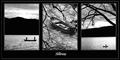
| 04/28/2003 10:13:24 AM |
Stillnessby NatashaComment: Pretty good. The composition might be better if there were no outside white edge (around everything), that is, just a big black border. The letters need to be much bolder, possibly off-centre? |
| Photographer found comment helpful. |
| 04/28/2003 10:11:53 AM |
Jeni's Etudeby sagestudioComment: Nice. I like the colours, in particular the yellow and the two blues at the opposite top corners. Possibly the composition would have been more effective if the interior margins (the blacks between the three pictures) would have been smaller than the outside edge. |
| Photographer found comment helpful. |
| 04/28/2003 10:09:55 AM |
Joy, Comfort, and Loveby dacrazyrnComment: Beautiful concept, good use of B/W. I like the top right black vs. bottom left white. I think the composition would have been better if the sections were not buttonized (simple frames rather than "elevated" frames), and without the cast shadows. ~7 Message edited by author 2003-05-05 07:45:36. |
| Photographer found comment helpful. |
| 04/23/2003 04:09:31 PM |
Colibriby amonteforteComment: Where I was born, we used to call them "picaflor". Nice picture! |
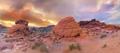
| 04/23/2003 12:49:17 PM |
Nevada Desertby picsoComment: I really like this shot, the colours are great, so is the comp. But, why in "Fauna" (and not in "Weather")? Is it the desert habitat? |
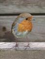
| 04/23/2003 12:34:12 PM |
Robinby gandersComment: All right, this is a pretty good picture of a robin! Nice. |
| 04/23/2003 12:32:58 PM |
|
Home -
Challenges -
Community -
League -
Photos -
Cameras -
Lenses -
Learn -
Help -
Terms of Use -
Privacy -
Top ^
DPChallenge, and website content and design, Copyright © 2001-2026 Challenging Technologies, LLC.
All digital photo copyrights belong to the photographers and may not be used without permission.
Current Server Time: 07/18/2026 06:50:30 AM EDT.