| Image |
Comment |
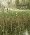
| 04/28/2003 04:07:31 PM |
Dawnby RefocusedComment: Post-challenge comment: I really wish this picture would have done better. It's not perfect "technically", but it's so beautiful, and it gives the feel of dawn just right. I like the "fuzzyness", I think it adds to the picture. Oh well. |
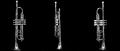
| 04/28/2003 03:58:07 PM |
Trumpetby EJComment: I think this composition would have worked better vertically, that is, three pictures of the trumped placed horizontally. |
 Photographer found comment helpful. Photographer found comment helpful. |
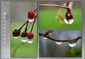
| 04/28/2003 03:56:49 PM |
Raindropsby drdab99Comment: The pictures are beautiful! Overall, I think the pictures would speak for themselves, that is, I\'m thinking the word and background take away from the impact of the composition. Maybe that\'s just me. |
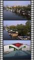
| 04/28/2003 03:55:34 PM |
|
| Photographer found comment helpful. |
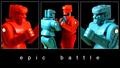
| 04/28/2003 03:55:17 PM |
ROCKem SOCKemby scab-labComment: Nice! My kids love it! I like the colours, and the layout. I like the words all in lower case. One nitpicky comment: it looks to me as if the picture to the left is just a tad bigger than the other two? |
| Photographer found comment helpful. |
| 04/28/2003 03:50:24 PM |
|
| Photographer found comment helpful. |
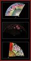
| 04/28/2003 03:47:17 PM |
Oriental Breezeby bruster54Comment: Beautiful idea! I like the colours, the layout, and the way the fans point from one side to the other. I think the composition would be more effective if the middle fan were stronger, consistent with the colour strength of the other two. |
| Photographer found comment helpful. |
| 04/28/2003 03:45:52 PM |
|
| Photographer found comment helpful. |
| 04/28/2003 03:45:20 PM |
|
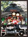
| 04/28/2003 10:40:01 AM |
Neo-Classical Monkeysby GeneralEComment: I was thinking of doing this, went with something else. Good job! I like the stripes behind the kid. Love the smile in the middle pict. I like the composition. Overall, I think it might be more powerful if the little one were not so happy - oh well. |
| Photographer found comment helpful. |
Home -
Challenges -
Community -
League -
Photos -
Cameras -
Lenses -
Learn -
Help -
Terms of Use -
Privacy -
Top ^
DPChallenge, and website content and design, Copyright © 2001-2026 Challenging Technologies, LLC.
All digital photo copyrights belong to the photographers and may not be used without permission.
Current Server Time: 07/17/2026 02:10:43 AM EDT.