| Image |
Comment |
| 05/05/2003 09:52:55 AM |
|
 Photographer found comment helpful. Photographer found comment helpful. |
| 05/05/2003 09:46:27 AM |
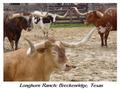
Longhorn Ranchby AnachroniteComment: Nice picture - I think it would score higher if the letters had the "anti alias" turned on (so that they don't look so rough). |
| Photographer found comment helpful. |
| 05/05/2003 08:51:23 AM |
|
| 05/05/2003 07:48:18 AM |
|
| Photographer found comment helpful. |
| 05/04/2003 10:51:03 AM |
X-ray frames by kiwinessComment: Very good! In my opinion, the best of this challenge. ~10
ADDED LATER ON - I think I just figured out who this girl is!!! It's Julia, right? From Kiwiness\' portfolio??? If it's not, I'll be soooo embarrased ... |
| Photographer found comment helpful. |
| 05/03/2003 03:40:31 PM |
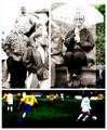
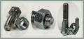
The Boldt Familyby autoolComment: Love the concept, and the layout! My husband was looking at this picture, and he thought it was kinda "sexy". One nitpicky comment: I wish the little bolts in the picture to the right weren't "cut off". |
| Photographer found comment helpful. |
| 05/01/2003 07:26:31 PM |
Travel, Back In Timeby bobgaitherComment: Love this picture! All the green makes the red Vanagon stand out beautifully. And the yellow road lines ... very nice! I hope you do well. |
| Photographer found comment helpful. |
| 05/01/2003 04:16:07 PM |
|
| Photographer found comment helpful. |
| 04/28/2003 09:13:14 PM |
What's under the hood?by WILDBLUEComment: This has to be a guy picture! I like it very much. It's nice how you can see not only "inside" the hood, but also the reflections (sun, trees). |
| Photographer found comment helpful. |
| 04/28/2003 06:13:53 PM |
Narcissusby salparadiComment: Very nice! The big black space at the bottom brings is together very well. Although this is more a "poster" than a photo tryptich. ~7 Message edited by author 2003-05-05 08:52:04. |
| Photographer found comment helpful. |
Home -
Challenges -
Community -
League -
Photos -
Cameras -
Lenses -
Learn -
Help -
Terms of Use -
Privacy -
Top ^
DPChallenge, and website content and design, Copyright © 2001-2026 Challenging Technologies, LLC.
All digital photo copyrights belong to the photographers and may not be used without permission.
Current Server Time: 07/17/2026 11:10:14 AM EDT.