|
|
|
Showing 5801 - 5810 of ~6008 |
| Image |
Comment |
| 05/26/2003 05:06:46 PM | America's Pass Timeby WarnercableComment: Respectfully, I'm assuming it's baseball you're talking about (America's passtime), and not throwing stuff at the flag :) |
| 05/26/2003 04:37:10 PM | |
| 05/26/2003 04:36:37 PM | secondary curvesby shutterflyComment: From the Critique Club
Hello, Wendy,
First impressions: The photo is beautiful, almost more like graphic art than like a photograph. It's funny, when you stare at it it looks flat (as in one plane) and has a lot of depth, both at the same time. Very interesting. Meets the challenge without problems.
You must have turned the brush over before taking the photo. My one nitpick here are the words on the brush, I'm wondering if cropping just a little higher (eliminating the words) might improve the picture. Something to try.
Focus is excellent, all that needs to be in focus is. Lighting is very good. The colours really shine in this picture. The metal on the brush doesn't have any annoying glares. A bit better light on the right side (to minimize/eliminate the shadow of the brush and the slight grey cast to the edge of the paper) might have helped.
Overall this is a very good entry to "Secondary Colours", not much to complain here. You seem to have a liking for graphic design type shots, and you do them quite well.
Keep up the good work!
Ursula (uabresch)
Comments, questions, complaints ... feel free to contact me. |  Photographer found comment helpful. Photographer found comment helpful. |
| 05/26/2003 11:12:13 AM | [purple to green] hey! where's orange and who's that guy?!?!?by tomzinhoComment: FROM THE CRITIQUE CLUB
First Impression: Great title. Nice pattern (repetitions).
Technical: Focus is a bit soft. Lighting is OK, but the reflections (flash?) on the pink chair are distracting.
Composition: Pretty good. I think you cropped a bit too tight, especially at the top - I think it would be good to include the full sweep of the chairs' back. I like the repeating "3s" throughout the photo. IMO the colours are a bit harsh to the eyes. Also IMO, I think it would have been nice to have a different coloured background (grey or white or black, not greenish).
Overall: It's an interesting idea, and it could be a striking picture, but it needs some refining to make it real good.
Ursula (uabresch)
Questions, comments, complaints ... feel free to contact me.
| | Photographer found comment helpful. |
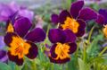
| 05/25/2003 02:57:12 PM | Zecondary Colorzby Pep VentosaComment: FROM THE CRITIQUE CLUB
Hi, Pep, I got another of your pictures to critique!
First impression: Interezting picture, meetz the challenge without problemz. I'm wondering what it is. Looks like coloured pencils (or straws) with some sort of glass or plastic (ruler?) over them in part to create the abstract effect?
Lighting: The secondary colours are good. The white glare, especially towards the bottom right, hurts, but the glare, as it makes the "Z" pattern on the glass (plastic?), is very nice.
Focus: Quite good. To my eyes, the picture looks slightly out of focus to the bottom right. Going bottom right to top left, the focus gets better and better. It's hard to have sharp focus over an entire surface when taking macros - I haven't quite figured out how to do it, I've tried playing with the F stops, but it hasn't made THAT much difference. Just steadying the camera seems to help the most.
Composition: I like looking at the photo, but my eyes tend to go out of it, that is, out of the photo because of the strong bottom left/top right line. I agree with one of your commenters below that the black at the left is distracting. I like it that there's no border (I don't think it would have added anything here).
Overall: Good shot, interesting abstract. Not your best (you know that already, duh!). Keep going!
Ursula (uabresch)
Comments, complaints, questions ... feel free to contact me. | | Photographer found comment helpful. |
| 05/23/2003 11:30:20 PM | Evening Star (Oranges and Purples in the Sky and Ocean)by loz1Comment: From the Critique Club
Hello, Loretta,
Well, so you wanted to get your first 5, and you went almost to 6! Now that's the way to do it. And you have the second spot for your camera. Congratulations!
Your "Secondary Colours" photo is very beautiful. The colours are the best part of the picture. I would not crop the top, not at all, the purple sky is perfect as it is. I think it's a good idea that you went with your gut feeling on this. I love the low horizon line, the reflections on the water, and the little tiny dark clouds in the middle and to the right.
The photo looks ever so slightly out of focus to my eyes, but in this case I think it actually helps. I don't think good photos have to always be perfectly sharp - clear, yes, but that's different. I like the way you managed to keep the purple sky so smooth.
The border is a bit uneven, at least that's the way it looks to me. The outside black line is wider on the right and narrower on the left than on top and bottom. Also, the inside black border merges with the picture at the bottom, making the purple border look slightly like an optical illusion. IMHO, this picture would look better without a border, or with a very simple border (e.g. a white mat). The picture speaks for itself, the border it has now doesn't really enhance it.
A couple of your commenters below mention the person's head, but on my monitor it hardly shows (it's amazing how different pictures look on different monitors). One idea that I've been using is to create 2 copies of my entry, one lighter and the other darker than the actual submission, and view them to try and see how my picture might look on other people's monitors. You pick up stuff about your picture that way that you might miss otherwise.
OK, I'll quit before I bore you to death. Again, congratulations on a very good entry. I'm looking forward to seeing more of your pictures. Take care,
Ursula (uabresch)
Comments, questions, complaints ... feel free to contact me. | | Photographer found comment helpful. |
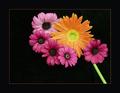
| 05/22/2003 10:35:48 PM | Daisiesby LindaEComment: From the Critique Club
From reading the comments below, it seems that everyone had a bit of a different take on your picture. I'm glad it did well in this challenge - it is a beautiful shot, unusual, almost more like a poster than like a photo.
I love the big border and the simple red line! Excellent choice.
The green stem ... is it a stem or something else? I can't make up my mind if I like it or not ... it seems artificial, yet it works here. Interesting.
Focus/lighting: No problems at all.
Overall: a good, sharp (in more than one way) entry, and your score shows that. I really wouldn't change anything in it. This one is fine the way it is.
Take care,
Ursula (uabresch)
Questions, comments, complaints ... feel free to contact me.
| | Photographer found comment helpful. |
| 05/22/2003 09:19:18 PM | Secondary Colorsby snowleopard10101Comment: From the Critique Club
Hello, Nitin,
First impression: Your entry is a beautiful picture of secondary coloured pansies. It's a pity that there were so many flower pictures, a number similar to yours.
Lighting: Good. Really makes the secondary colours shine. The green of the grass/leaves looks a little bit unreal.
Focus/DOF: I think DOF is excellent. Focus is good, but I'm having a hard time seeing exactly where the main focus is. The three main flowers are in focus, but seem ever so slightly blurry, but only a very little bit. Actually, that might be good in this case.
Composition: Very good. I like the way the flowers all "look" to the left and bottom, making your eyes go right and up, and then stop without leaving the photo. The flowers fill the frame without crowding it. The thin orangy outlines on some of the petals are charming. Did you take this photo in the evening?
Overall: A good picture, but, in this challenge, probably unnoticed because of the quantity of flower pictures.
BTW, I like your "From Above the Hill" photo - I love the colour/mood, and all the power lines crisscrossing the sky!
Keep up the good work!
Ursula (uabresch)
Comments, questions, complaints ... feel free to contact me. | | Photographer found comment helpful. |
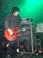
| 05/22/2003 08:59:51 PM | B.R.M.C.by KIKIComment: From the Critique Club
Hi,
First thing that came to my mind when I saw your entry was, "How did you get that picture without getting the back of a bunch of heads at the bottom?" (You know, other spectators.)
I like this picture (I am one of the two 8s you got). I have no idea who B.R.M.C. is, but I liked the guy's concentration on his guitar, how he seems to be absorbing the music ... and this from a 50 year old woman who listens only to classical! I like his hair. I love the graininess of the picture - in this case, makes it more real, not like a glossy promo picture, but like being at a real concert. The green is beautiful, it kind of radiates from the corner.
That said, the photo is more a personal memento than a picture that would do well in a contest, or mean much to the casual viewer. It is a grainy shot, the spots are noticeable (especially the big one over his right shoulder). It is a bit out of focus. I don't really know how you could get a better shot under the circumstances and with your 775; I'm assuming you couldn't set up a tripod or use special lighting :)
For what it is, it's good. I say, add some words (or the name of the band) to it, and make yourself a poster!
Take care,
Ursula (uabresch)
Any questions, comments, complaints ... feel free to contact me.
| | Photographer found comment helpful. |
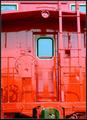
| 05/21/2003 10:55:43 PM | Primary Red Cabooseby cmrk74Comment: From the Critique Club
Hello Mark,
First impressions: Your entry to "Primary Colors" is a nice, clean shot, that meets the challenge, but might have done better if it weren't showcasing only red. Like one of your commenters below wrote, it's interesting how many shades of red one can see in this photo.
Technical aspect: No problems. Focus and lighting are very good. I like all the different colours shown in the shadows.
Composition: The perspective is very normal, which probably makes it less interesting: the caboose is shown in the picture as a person would see it when walking by. The picture fills the frame nicely, although to my eyes it looks slightly tilted to the left. My nitpick here is that there is not really a story being told, or something to hold my attention, thus, it might not be the most effective way to show the caboose.
Overall: Nice, clean picture, good colour, but lacking in excitement (the "wow" factor). By the way, I like your cactus2 picture! The greys are so soft and almost shiny! Good work.
Take care,
Ursula | | Photographer found comment helpful. |
|
Showing 5801 - 5810 of ~6008 |
Home -
Challenges -
Community -
League -
Photos -
Cameras -
Lenses -
Learn -
Help -
Terms of Use -
Privacy -
Top ^
DPChallenge, and website content and design, Copyright © 2001-2026 Challenging Technologies, LLC.
All digital photo copyrights belong to the photographers and may not be used without permission.
Current Server Time: 07/17/2026 05:12:24 PM EDT.
|


![[purple to green] hey! where's orange and who's that guy?!?!?](https://images.dpchallenge.com/images_challenge/0-999/97/120/Copyrighted_Image_Reuse_Prohibited_21437.jpg)